6. The Godfather Part III (1990)
What it can teach you about: Lighting, Make-Up.
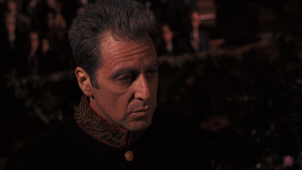
There’s not many things that the third Godfather film does better than its two predecessors. However, it manages to successfully age its central character without drawing too much attention to the make up. When done wrong, bad make-up can kill an audiences sense of disbelief in a film (think of Guy Pearce’s unintentionally hilarious portrayal of an old man in Prometheus).
Scene to examine: The scene where Kaye confronts Michael, shows Al Pacino’s mafia Don look worn and and old. Pacino’s hair is dyed white, and subtle make-up has been used to add bags under his eyes and to add emphasis to the lines on his face.
What really makes Michael’s age stand out however, is the use of lighting; it adds shadows that are ever present around his eyes – and adds further definition to his facial lines. After Kaye has chewed Michael out, he retreats to the darkness. The shadows swallow his features, as his thoughts slip further into darkness and despair. The only part of him that remains well are his hands; symbolizing the control that he’s still able to wield.
7. The Matrix (1999)
What it can teach you about: Lighting, Colour, Camera Lenses.
It’s often the action sequences and eye-popping special effects that people talk about after seeing The Matrix. Yet, even the most basic of dialogue sequences have nuances that offer hints and inferences that subconsciously help the viewer to stay orientated during the complex narrative.
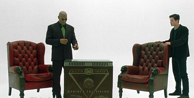
Scene to examine: While standing on the bridge of the Nebuchadnezzar, Morpheus asks Neo “You wanted to know what the Matrix is?” In the background we can see a blue glow emitting from the computer screens and this light creeps through into each shot even when the screens aren’t visible. All of the characters who surround Neo are shot using a long-lens which lift the characters from the background.
After Neo is plugged into the matrix, the colour scheme changes. Gone is the vibrant blue, and it’s now replaced with a mundane green (similar to the matrix code) that’s visible both in Morpheus’s tie and Neo’s t-shirt. Using a normal camera lens, the characters also look slightly softer in terms of focus, subtly inferring that they have just become slightly less “real” than they’d been a moment before.
8. Lord of the Rings: The Fellowship of the Ring (2001)
What it can teach you about: Lighting, Camera Angles, Editing.
Considered a modern classic, The Fellowship of the Ring used a smorgasbord of filmmaking techniques to create Middle-Earth. In order to get tiny Hobbit’s interacting with normal sized men they used: forced perspective (where an actor stands way in the background to appear smaller than they are), giant sets, short body-doubles, a smattering of CGI, as well asking some actors to walk along using stilts.
It is however, in employment of artful lighting and cinematography where The Lord of the Rings really stands out from most fantasy blockbusters.
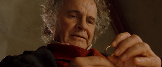
Scene to examine: When Bilbo agonizes over leaving his magical ring for Frodo, the camera’s position actually makes the ring a character in the scene. Using both shot-reverse-shot positioning (where the camera is placed from either a character’s point of view or just behind the character), the ring’s power over Bilbo becomes all the more obvious.
The light on Bilbo’s face, half illuminated and half in darkness, illustrates the conflict that he’s facing while he’s thinking about the ring; he’s in two minds, one dark and one light. The scene ends with the ring gazing directly at Gandalf with a point-of-view shot that helps to imply the ring’s sentience.
9. Adaptation (2002)
What it can teach you about: Screenwriting.
While struggling to adapt the non-fiction book The Orchid Thief into an interesting screenplay, Charlie Kaufman out-bonkersed himself by writing himself into the screenplay. So, instead of a story about finding and cloning a rare plant – we have a story about Kaufman attempting to adapt a story about finding a cloning of a rare plant.
While it’s consistently a head-scratcher, Adaptation lays out all of the conundrums that screenwriters face while at the same time champions (sort of) the Hollywood conventions of conflict and crisis that seem compulsory for writing a watchable story.
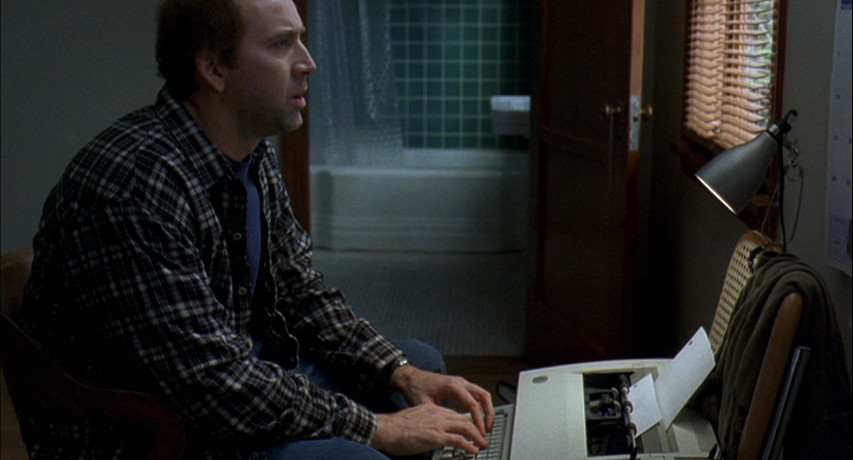
Scene to examine: When Charlie desperately tries to think of a character arc for a flower, we get a highly exaggerated version of what most screenwriters must go through at least once in their life. He desperately considers starting his film with Darwin explaining the journey of evolution before having a momentary epiphany: “start right before life begins on the planet”.
The hopelessness of the scene should be an explanation of why some screenplays will never work, yet the fact that the film was made (and that you’re watching it) means that the meta-narrative works as a testament to how original thinking can still prevail to make remarkable (and watchable) stories.
10. The Master (2012)
What it can teach you: Why filming on film is still so worthwhile.
There’s an intense debate currently raging in the movie community over how filmmakers should technology to create the most immersive experience possible for cinemagoers. The answer from Hollywood is almost emphatic: “use 3D”. Recently, Peter Jackson has tried to push the medium even further with The Hobbit films by recording in 48 frames-per-second. The use of higher frame rates is a trend that’s set to increase with James Cameron’s Avatar sequels having been widely tipped to use this technique.
With this technology – turmoil in mind, it’s doubly refreshing that Paul Thomas Anderson chose to shoot on 65mm film. Outside of IMAX, the use of 65mm has been dormant in western cinema since Kenneth Brannagh’s Hamlet in 1996. The result? A hypnotic, jaw-dropping aesthetic that delivered a picture clarity of a cinematic quality that hasn’t been seen on screen since the sixties.
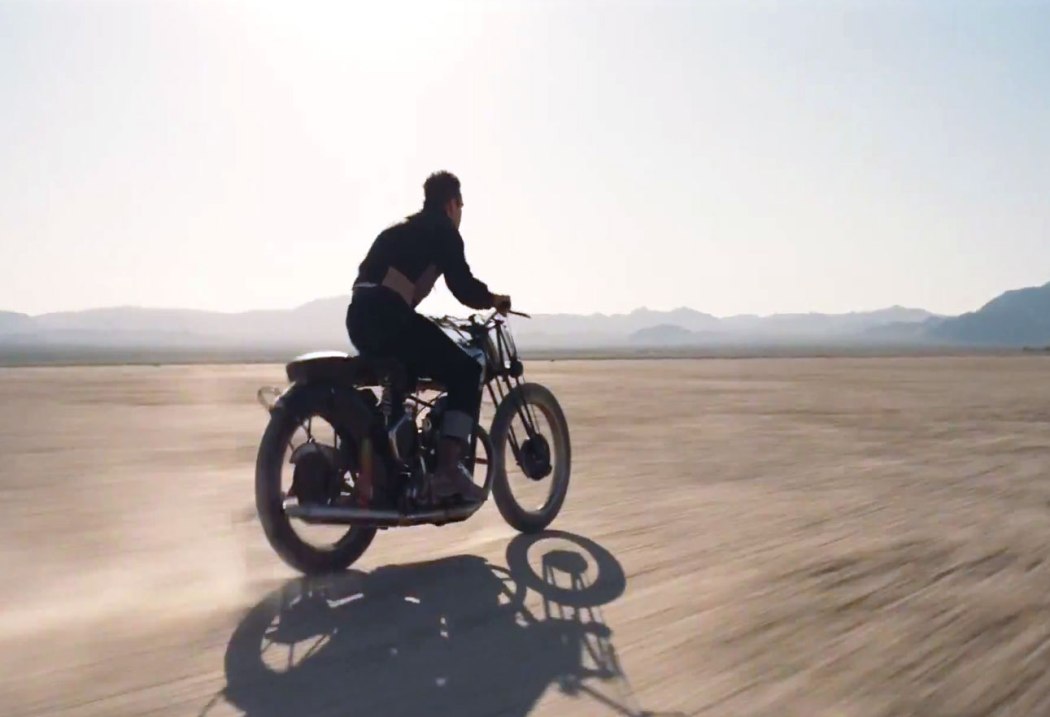
Scene to examine: It’s hard to choose because it all looks great. When Joaquin Phoenix’s troubled Freddie is asked to “Pick a point” in the vast American desert, he speeds off on a motorcycle into the vast (but beautiful) wasteland. The scene juxtaposes the noise of the bike with the silence of Philip Seymour Hoffman’s masterful stare.
The result? You’re immersed in both the watched, and the watcher; thought and void. As loud as the bike may be, when we look at him from his master’s point of view, he’s just a pinprick on the enormous cinematic horizon à la Lawrence of Arabia.
Author Bio: David Biggins is a film graduate and marketeer from England. He’s been published on the BBC website, and used to present a film radio show in Norfolk. Before joining Taste of Cinema he was a film critic for Reel Whispers.You can follow David on Twitter @MrMilktray.
