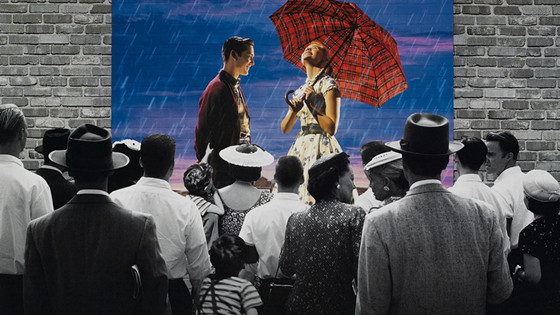
Any film maker possessed of any level of competence places the visual appearance of their film at the very top of the priority list and rightly so. Films are images first and foremost and the look of those images can not only sell the film but also conjure just the effect the director wishes to convey. Yes, there are such elements as script, acting, editing, sets, costumes, score and many others, but if the film doesn’t look as it should, nothing will come off quite as well as it should.
For many years, black and white photography was the dominant mode for film making. In the late sixties, color started to dominate and filming in black and white became a courageous choice (and one that was usually a hard sell to producers and studio heads).
Oddly enough, the mixture of color and black and white within the same film was a not uncommon occurrence in the early decades of film history. Often color, which was an expensive, difficult and problematic process during this era, was saved for notable sequences in otherwise black and white films. Noted silents such as Ben-Hur, The Phantom of the Opera, The Wedding March, and The Ten Commandments included color sequences as special highlights.
After the three strip Technicolor process was perfected in 1935, several films such as The Little Colonel, The House of Rothschild, and The Cat and the Fiddle burst into color for their finales. This practice continued for several years, including such films as the 1949 war drama Task Force and the 1956 comedy The Solid Gold Cadillac. These efforts, however, were more novelties than anything else.
There is also a tradition of more serious artists mixing the different modes of expression in order to achieve a greater dramatic and/or creative effect. Following is a list of films which fit into that category.
1. Raging Bull (1980)
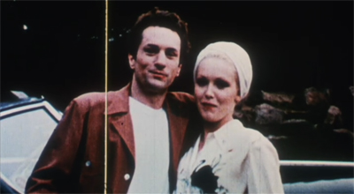
Director Martin Scorsese has richly earned a place in the pantheon of film directors by creating several fine films. No film stands out more in his canon than Raging Bull. The film got great reviews, a few Oscars (not for the director, though), but not an abundance of viewers originally. However, the film’s standing has only increased with the years.
The film profiles the life of champion boxer Jake LaMotta (Oscar winning Robert De Niro’s finest hour). Looking at that life through the lens of the film, the final judgement can only be that it was violent, in and out of the ring, brutish, cruel and quite unpleasant.
Scorsese tempers this harsh truth telling by cloaking the action in a high stylized black and white mode of expression, which also suites the period setting of 1940s and 50s New York City quite well. This was a decision which was quite daring for the time when black and white was almost extinct.
This monochromatic tour-de-force is also punctuated by color sequences, illustrating the LaMotta family’s home movies. This depicted idyll is a world away from the eternal battles and strife which make up the rest of the world surrounding the main character and those in his orbit. All in all, this film is a triumph of both style and content.
2. Schindler’s List (1993)
Steven Speilberg hasn’t risen to the lofty heights to which his career has ascended by being ignorant, stupid, or talentless. Though many have lamented the passing of the early era of that career and the light hearted and popular entertainments it produced, the director obviously felt the need to tackle more adult and issue oriented projects.
Though not his first film in that vein, Schindler’s List was a major turning point in his filmography. Unlike some earlier films, such as The Color Purple, this story contained relevance to the director’s own Jewish roots. Taken from a novel by Thomas Kenneally, Schindler’s List tells the true story (lightly fictionalized) of Oskar Schindler (here played by Liam Neeson), a businessman in the Germany of the 1930s.
The Nazis will not bother the prosperous and Aryan Schndler, but he is a man of principle and thinks their persecution of Jews is horrible. To that end, he risks his life employing Jewish workers in his factory and sheltering them and their families inside of the factory.
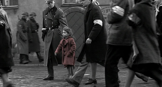
Spielberg had obviously learned lessons from Scorsese. The black and white photography is perfect for the period, capturing the elegance of the pre-war era and also providing stylization for the devastating events which follow. It also allows a depth of field which captures a somber and complex feel contained in the plot.
There is a modern day epilogue filmed in color, but the true color moment is one which no one seeing the film ever forgets. As a group of Jews is herded to horror and death in the camps, the viewer and the on screen characters notice a little girl. Her red coat, the only color in a sea of black and white, stands out, haunting any who will view it.
3. A Matter of Life and Death (1946)
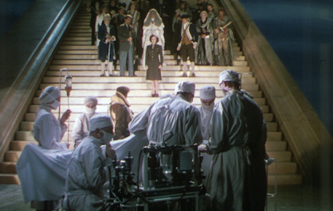
The Archers, the name given to director Michael Power and writer Emeric Pressburger, created some stylish cinematic treats during their partnership, but the fantasy A Matter of Life and Death always stands out as one of their best. This story of a fighter pilot (David Niven) spared from death during the later days of World War II and battling it out with Heaven, which didn’t claim him at the due time thanks to a mixed up messenger, is remarkable in many ways.
One notable point is that the earth is bathed in the Technicolor the duo often used to such great effect, while Heaven is strikingly monochromatic. (The flighty messenger, a beheaded French aristocratic of the 18th century played by Marius Goring, laments that Heaven is starved for Technicolor upon visiting earth!). One can’t help but find a message in this.
The next year, the pair made the triumphantly color Black Narcissus in which nuns battle temptation while setting up a convent in an abandoned castle used as a harem. The nuns are all in black and white, of course, but the surroundings and natives are bursting with color.
Were the two saying that while Heaven may have its points, the earth and all that goes with it (including relaxed, fun people) are much more colorful and, therefore, enjoyable? Well, in this film, the full color world is surely more tempting that colorless Heaven. Just saying.
4. Bonjour Tristesse (1958)
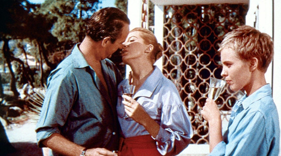
Director-producer Otto Preminger wasn’t a film maker for all tastes. He could make terrible films as easily as good ones. Sometimes it was hard to tell which was which, in fact. Bonjour Tristesse was a terrible flop in its own day and isn’t thought to be a masterpiece today, but it still looks far better than it once did.
Now it can be appreciated that though the director might not always have the best acting or writing and that his notorious technical gaffes (visible camera shadows on film, the film crew reflected in windows, etc) were present, he was also quite good at visual design in his films.
This film is a fine example of wide-screen composition, but the use of both monochrome and color is equally good. The film opens with color credits and then fades in on an elegant black and white Paris. There lives the main character, Cecile (Jean Seberg), a stylish and lively but shallow and aimless young woman who regularly hucks it up with her widowed playboy father, Raymond (David Niven) and the various meaningless playmates they collect.
While dancing with one, Cecile reflects in voice over about how empty she and their lives are and how it was once different. During this reflection, bubbles of color come and go on the screen until a color flashback to the Riviera a year earlier fills the screen.
Cecile and Raymond don’t seem much different from their present day selves, but then Anne (Deborah Kerr), a mature woman and significantly, a friend of Cecile’s mother comes to visit. She and Raymond start a serious romance and she means to turn the group into a real family, something the seriously frivolous girl won’t have. Cecile hatches a cruel plot to get rid of Anne which ends up working way too well, leaving all concerned broken shells and worse.
The essential shallowness of color is perfect for the more innocent flashback while the in depth black and white is best choice of the present day sequences. Cecile and her father can pretend that things are the same but they aren’t. They now have a depth bought with real pain and will live in this colorless world the rest of their days. How could this have been better illustrated than this mix of mediums?
5. Wings of Desire (1987)
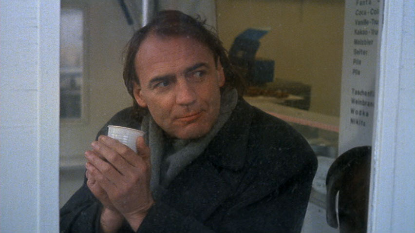
Has there ever been another film quite like Wings of Desire? (Yes, there was a Hollywood remake, but the question still stands.) This parable concerning two angels (the great Bruno Ganz and Otto Sandler) hovering and observing in and around a still divided Berlin and how one of them comes to earth for the love of a beautiful trapeze artist, is widely considered one of the most deeply moving emotional experiences the cinema has to offer.
No small part of this effect is superlative cinematography by Hans Alekan, who had so hauntingly photographed Jean Cocteau unforgettable Beauty and the Beast in 1946. This was no coincidence as director Wim Wenders sought him out for this special project.
Like Stairway to Heaven, the spiritual world is in black and white and no one seeing this films can forget the angels standing on clouds above the city or atop the Brandenburg Gate. Then, when Ganz’s Cassiel descends to earth, the physical realm is once again in color. The thing is that he discovers the beauty of the earth as well.
The fact that Wenders can love both is a clue as to this film’s greatness and that he knew to chose someone as skillful as Alekan is a tribute to his own. (Note: West Germany submitted the film as their entry for the Foreign Film Oscar, and it had already won many prizes. The Academy in its wisdom said no.)
6. Ivan the Terrible Part II (1948)
Why would anyone want to become a film maker in the Soviet Union? If they did create a film worth seeing, the authorities virtually always cracked down on them, censoring their work, banning them from continuing, or worse. After creating Strike and Battleship Potemkin in 1925, Sergei Eisenstein was considered one of, if not the, best film maker the Soviet Union had to offer. Did this prevent him from receiving such treatment? Not hardly.
Censorship and long periods of not being allowed to work started with his next film after those masterpieces, 1927’s October. After having a popular, state sanctioned success with 1938’s Alexander Nevsky (not one of his great films), the director was allowed to plan a three part biography of Tsar Ivan I. Dictator Josef Stalin caught that Ivan was really a disguised version of himself and that the course of the films dictated that the theme was that absolute power absolutely corrupts and, boy, he didn’t like it!
Part II was withheld for years (in fact, the director and dictator were dead by the time of its release) and the planned third part aborted after a few scenes were shot. Frankly, Eseinstein made so few sound films that he never quite got the knack of making them.
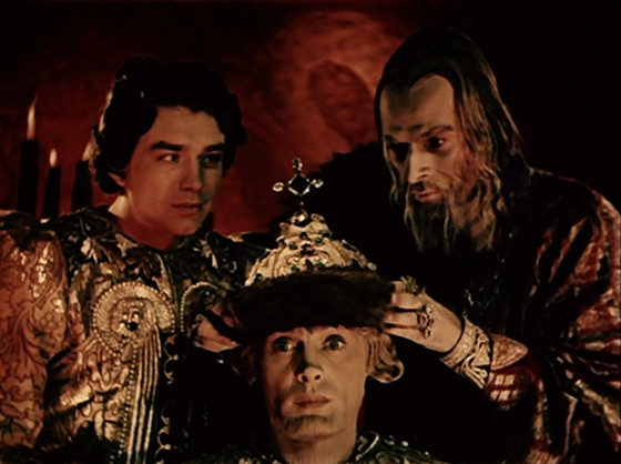
Alexander Nevsky and the Ivan films are more like silent films with sound for the staging and heightened acting looks more like the silent than talking era. However the director was always innovative and the climax of the second Ivan film contains his only color footage. The state had expected a tribute to Russian authority and had allotted a good deal of money to this project and it all shows on the screen in lavish sets and costumes.
However, the color sequence doesn’t show off these qualities. The scene depicts an elaborate palace celebration. The scheming nobles who have wished to destroy Ivan (Nickolai Cherkasov) since the first film have decided to use the distraction of the event’s music and dance as their chance to assassinate him. However, he has grown wise and turns the tables on them. While the jubilee is festive, the method of shooting it is not.
The colors are primarily red and black with pale shades of green and gold mixed in. The effect is nightmarish and rightly so. Ivan wins but he loses in another sense as more of his humanity is sacrificed. This footage was promising but, as with so much of the director’s career, it wasn’t to be.
7. Andrei Rublev (1966)
The more things change, the more they stay the same. Cut to some twenty years later and arguably (though not so much) the best Soviet film maker of his generation was the cerebral Andre Tarkovsky, one of the cinema’s great intellects. His much acclaimed films didn’t make the authorities jump for joy either. The odd fact is that he wasn’t a political film maker. The mysteries of the human soul were his thing.
Like Eisenstein, his career consisted of little more than half a dozen films but each one was worthy. Perhaps best of all was this bio-pic of Russia’s great religious icon painter of the middle ages. This was also the film which got the harshest treatment from the government. The theme was simply that artistic creativity tied to deep spirituality were the only viable relief from repressive authoritarian rulers. What was the authorities’ problem with that?
The film was shown once in 1966 and quite sporadically thereafter, building a prize winning legendary reputation along the way, though often shown in truncated prints. Thankfully it is now easily available and restored to its very long full length. The plot and film style are very somber and deeply emotional with much demanding content.
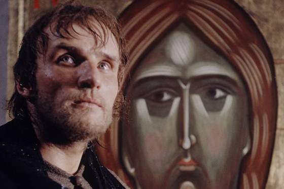
The film’s final episode finds the painter arriving at an liberating turning point while helping a young artisan create his first major bell (a quite important event in medieval communities). This triumphant episode also provides a break from the film’s heavy content and matching monochromatic style. As the bell is delivered into the world, the screen bursts into color to show the Rublev’s icons, aged understandably yet still vibrant, survivors of a hard period and rising above those who would suppress their creator….not unlike this film.