6. In the Mood for Love – Value

Kar-Wai Wong’s In the Mood for Love (2000) tells the story of a man, Mr. Chow (Tony Chiu Wai Leung), and a woman, Mrs. Chan (Maggie Cheung), neighbors who are drawn together through the extramarital affairs of their spouses. The film’s cinematography is built on lushness and intensity of value. Illustrating the strength of the two neighbors’ bond in even in the dullest of conditions.
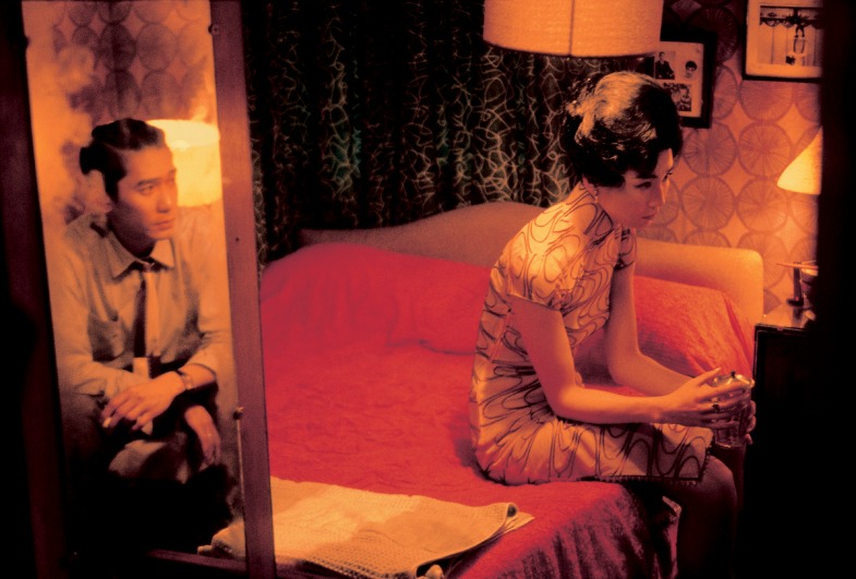
Value plays a key role in the juxtaposition of the private and public realms of Mrs. Chan and Mr. Chow. The cramped setting amongst their habitually mahjong-playing neighbors, forces the couple into establishing their relationship in private. In one scene half way through the film, a secluded bedroom is ignited with the couple’s passion as indicated by the vibrancy of hues surrounding them.
As Mrs. Chan finally departs from the bedroom after sharing a meal with Mr. Chow, the camera faces the doorway. This view compares the bright saturated color of the bedroom and the dull hallway.
The bedroom is a whimsical environment, as established through bold values of pink, purple and blue. The bedroom reflects the feelings of affection that Mr. Chow and Mrs. Chan share for each other. The vibrancy of the pink in Mrs. Chan’s blanket reflects the intensity of the couple’s affection.
On the contrary, the corridors have unadorned dull white walls. The warm and loving feelings the characters have for each other are sterilized when in the presence of others. Any fulfillment they have found through their friendship is completely censored in the hallway that lacks the vivid values of the bedroom.
7. The Cremator – Space

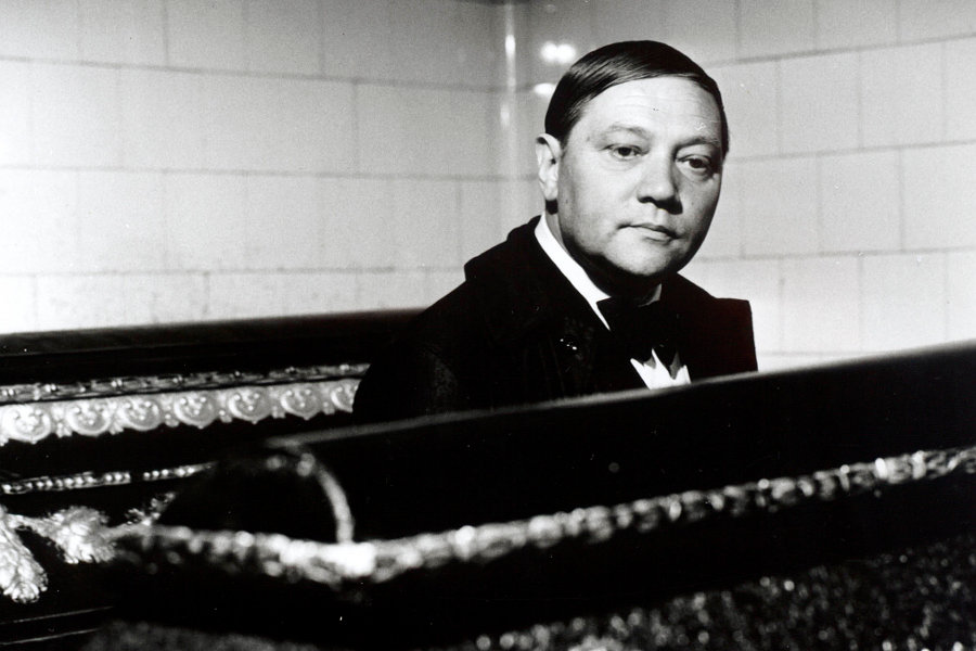
The Cremator (1969), directed by Juraj Herz, lies on the fringe of the Czechoslovak New Wave. The film tells the story of of Karl Kopfrkingl (Rudolf Hrusinsky), a cremator who holds high value in his duty of liberating souls from the human world. As the Nazi party enters Kopfrkingl’s life, his obsession for his responsibility becomes evident through the film’s distorted relationship with space.
The Cremator uses optical devices to defamiliarize the recognizable and establish parallels between the moral and the monstrous. Extreme close-ups magnify insignificant features to illustrate unsettling truths.
In the opening scene, Kopfrkingl’s eyes, nose, mouth, and even the wrinkles on his forehead are paired with the features of dangerous zoo animals who wield the power to destroy. There is little negative space in these alternating shots, leaving an overwhelming sense of dread and claustrophobia.
Furthermore, as the scene progresses the shot widens to include the entirety of the Kopfrkingl family. The family is distorted by a convex mirror that mimics fish-eye perspective, a motif in the film that continually serves to illustrate disturbed quality of Kopfrkingl’s mind. In this instance, he declares his family to be the image of perfection, a statement that will soon be nullified by the extremity of his beliefs.
Rapid cutting and extreme close-ups confuse the audience’s perception of space, contributing the the film’s psychological horror. However, the crematorium that Kopfrkingl works in is displayed in perfect spatial harmony.
The crematorium is placed centrally in shots and dominates the frame. It is illustrated as Kopfrkingl’s holy sanctuary. While the world illustrated in The Cremator lacks spatial rationality, Kopfrkingl sees perfect rationality in his responsibility of liberating souls.
8. Daisies – Color + Texture

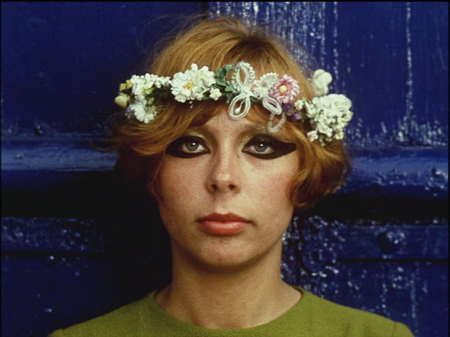
Vera Chytilová’s Daisies (1966) is a battlefield of jarring colors and textures. The film follows two young women (Ivana Karbanová and Jitka Cergová) and their bizarre and irresponsible behavior. The film is about the excessive, which is evident in the use of color and texture.
Daisies’ explosive anti-invisibility editing masks social commentary for playful fun. The film alternates between color, tints, and black and white. Commentary is explored through feminist, anarchist and communist lenses.
Communist critique is most evident in the vibrantly unstable final scenes of the film. When the girls enter a massive dining room it becomes evident that the room is fit for highly-ranking party officials.
A lengthy table is filled with an unnecessary excess of food. The overabundance is reinforced through the lavish colors and diverse textures that compose the spread. The dining room scene begins in black and white.
A shift to color marks the introduction of the girls’ chaos. the directorial choices from Chytilová match the two young women’s unpredictability. Color shifts in the film, from tinting to sepia to full color, break the rules of continuity editing.
In Daisies, color and texture are paired with chaos. Kaleidoscopic effects are overtly present in the girls’ apartment, which covered in textural foliage and overlaid with collage effects employing various colors and textures.
It is in this setting that the girls are at some of their most destructive points, ripping their sheets, teasing suitors and cutting everything from sausages to their own appendages. However, in the end, the girls’ final downfall comes from a texturally lavish chandelier.
9. Meshes of the Afternoon – Shape + Space

Maya Deren and Alexander Hammid’s 1943 short, Meshes of the Afternoon, depicts a woman who enters a vivid dream that dances with actuality. A surrealist world is illustrated through motifs and distortion of reality through camera angles, time, and editing.
The distortion of space that characterizes the film is established in the opening, as an out of place and proportion female hand descends from the sky to place a flower on the pavement.
The feminine figure continues to be out of proportion as she steps through the beach to soil and concrete, all with a seemingly large and heavy foot. Furthermore, space is distorted in the woman’s reflection in the knife, a prominent motif.
A sense of the incomplete is created through shape. The woman character is introduced through the two-dimensional shape of a shadow cast upon the wall and ground. Throughout the film, there is a sense of incompleteness to her character, her figural entirety seems to never be fully presented to the audience.
Additionally, negative space is carved out in a grim-reaper like hooded figure central to the dream. The figure’s face is gone; a mirrored organic shape employs the space in which unique facial features would reside.
While the mirrored surface itself is two-dimensional, its reflective quality adds another dimension in which the distinct character of its onlooker is reflected back. Positive and negative space conveyed through shape is used a device of ambiguity that contributes to the film’s overall surrealism.
10. Cries and Whispers – Color + Value

In Cries and Whispers (1972), Ingmar Bergman illustrates the tangled lives of three sisters, living at the turn of the century in a dreamy mansion. Agnes (Harriet Andersson) is dying of cancer, which contributes to the heightened tension between Karin (Ingrid Thulin) and Maria (Liv Ullmann.)
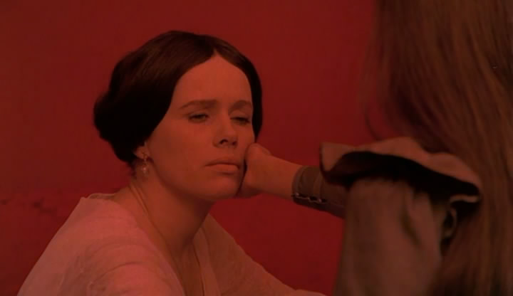
Through a series of flashbacks, the messy lives of the sisters are explored. However, while Karin and Maria are exceptionally flawed, Agnes’ character remains unblemished. With a focus on the most intense values of red, white, and black, the mansion serves as a laboratory type setting for viewers to dissect the women’s lives in terms of life and death.
Ingmar Bergman once wrote “All my films can be thought of in terms of black and white, except for Cries and Whispers.” Cries and Whispers plays on the extremes of color. The lightness of a memory on a summer day contrasts against the heaviness of the deep red mansion that emotionally traps the women.
Red is closely associated with bodily imagery, blood and flesh. The intensity of red blood indicates death in its loss, but also life. When the women close their eyes a red color washes over them, this alludes to the intensity of the physical and emotional pain they suffer from. Additionally, scenes transition through fades to red, as opposed to traditional black.
In Cries and Whispers, red is countered by white and black. The deep red interior contrasts against the women’s pure white dresses. There is an overwhelming bluntness to the juxtaposition of these extremes.
As nurse Anna (Kari Sylwan) holds Agnes towards the end of her life, the audience cannot help but to think of Michelangelo’s Pieta, one of the purest depictions of love. Covered in white, Agnes approaches the black (death) in purity and grace.
Author Bio: Emma Roberts is an art history major at Temple University in Philadelphia, PA. Her primarily concentration is on modern and contemporary art as well as curatorial practice. In addition to art history, she loves films, specifically films of the French and Czech New Wave movements.