6. The Silence of the Lambs (Demme, 1991)
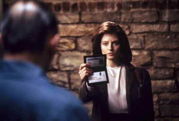
Few other films have caused nightmares using lighting than “The Silence of the Lambs.” There are only a few situations where the lighting really stands out and “shows off,” so to speak, but throughout the film it combines with the great cinematography to create dread and horror.
The best example comes during Clarice’s explanation of the lambs on the farm. Not only is Jodie Foster’s delivery perfect and haunting, and not only is Anthony Hopkins’ delivery terrifying, but also the composition of the shot and the use of lighting amplifies the terror of the scene.
The light is poured entirely onto Lector’s white shirt, leaving a bounce card to highlight his devilish eyes as he pries for more information from Clarice. The composition is a tight close up, but not an extreme close up – just close enough to create discomfort. Clarice, in comparison, is bathed in darkness, reminiscent of her internal struggle to explain what happened to the lambs.
And, of course, a discussion of lighting cannot leave out the incredible ending scene with Buffalo Bill. Using night vision goggles as the camera and lighting breaks down the barrier between the viewer and Buffalo Bill – they are, in fact, the same person for the duration of this scene. Had the entire scene been shot a different way, terror could certainly have been evoked, but not the same kind of terror that comes with breaking down the walls between viewer and villain.
The lesson to be learned is that lighting can change a viewer’s perspective, especially in terms of character, which can amplify the atmosphere or tone of the narrative.
7. Lolita (Kubrick, 1962)
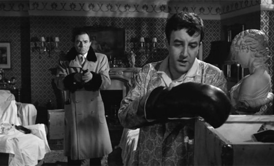
“Lolita” is not one of Kubrick’s most well-known or popular films. It’s also not especially “Kubrick” in the way we think of when it comes to visuals. But it does utilize some very interesting lighting to call attention to its main plot and themes.
The film revolves around a middle-aged man who becomes enamored with a fourteen-year-old girl. The lighting in this film, as you can imagine, is mainly focused around this central theme of lust. Lolita is bathed in light whenever on screen, practically glowing. Her hair reflects the light, her legs are often lit to draw attention to them, and her face is bright.
Compare this to Humbert who is often cast in shadow. His face isn’t bright or cheery; it is carved with shadows to show his age. In some sequences, especially later in the film (and in the beginning) the sets around him are bathed in shadows or lit in such a way that the set looks damaged and run down.
These lighting scenarios not only call attention to the central themes of the film, but also create emotion of their own. When the viewer sees Lolita, they are likely happier – because of the lighting situation – than they are when they see Humbert. This puts the viewer in Humbert’s shoes in some respect, subtly breaking down the fourth wall.
8. Seven (Fincher, 1995)
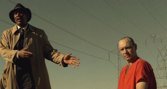
David Fincher’s films – even the less than savory ones – always look beautiful. He places a lot of emphasis on composition and lighting. “Seven” is the best example of this.
The inspection of the first murder scene is taken directly from noire films like “The Maltese Falcon.” The set is dark, the flashlights are beams that cut through the shadows, and everything is a varying shade of black or gray.
Later, the color (while still washed out, like the rainy city the film is set in) scheme changes, as does the lighting; as the mystery becomes more demented and confusing, the lighting becomes brighter and brighter, until they end up in an open field with the sun beating down on them.
This not only reflects the nature of the mystery – the sets becoming brighter as more clues are discovered – but also subverts the usual stereotype of the detective film climax (usually set in the pouring rain, as “Blade Runner” is for example). The contrast of the bright sun puts an odd spin on the disturbing ending. Moreover, when the villain, John Doe is the sun, he is placed directly in front of the light source, which gives him a sort of halo.
Again, lighting can reflect not only the themes of a film, but also the emotion of a scene.
9. The Exorcist (Friedkin, 1973)
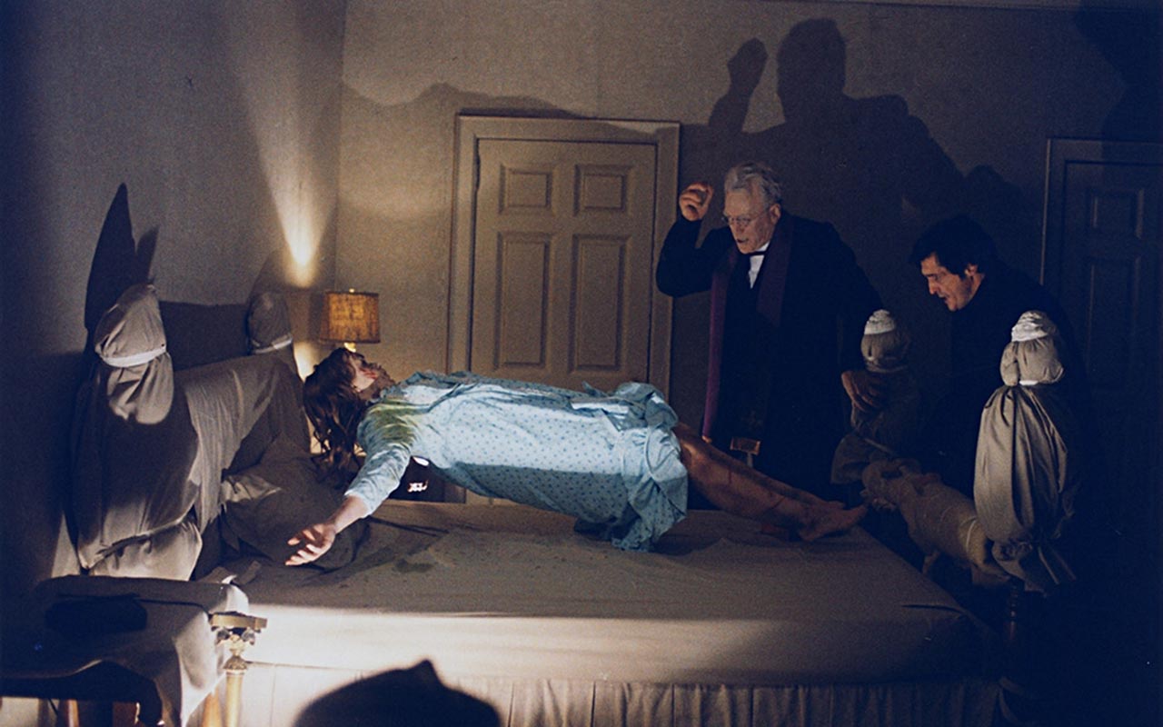
The cover of the Exorcist is perhaps one of the greatest lighting set ups of all time. A silhouette carrying a briefcase, standing underneath a lone streetlight as bright light pours from a window in a house.
This film’s use of lighting to portray horror is exquisite. The color pallet inside the house slowly becomes a cold blue and the light goes from soft, or subdued, to harsh, as the film gets more intense.
Light is also used in a religious sense, as light combats darkness in this film. If you look closely in the dark room you can see faces and structures. When the priests come into the narrative, there is light (even if it is that harsh blue), which represents the fight against evil.
10. Mulholland Drive (Lynch, 2001)
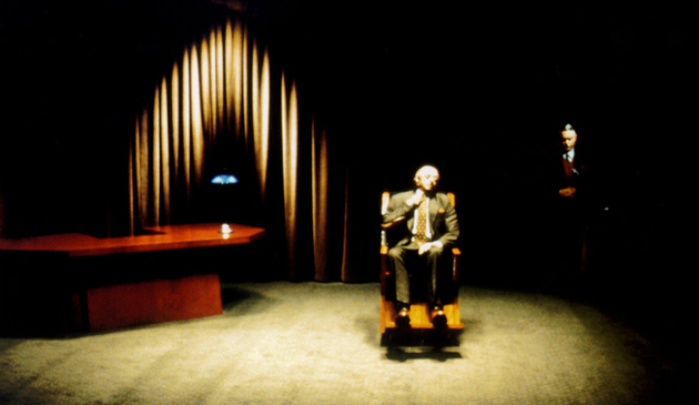
David Lynch is a director who focuses a lot on lighting. “Mulholland Drive” is perhaps his best example of its usage to convey themes, meanings, and emotions.
In the beginning of the film, it’s rather bright. Even when disturbing things happen, like outside of the diner, the lighting situation doesn’t reflect the nature of the narrative. But, as the protagonists of the film plunge deeper down the rabbit hole, the lighting becomes darker, more brooding, and harsher.
Take, for example, the shot of the man sitting in a wheelchair. The light on him is bright, but the surroundings are left to shadow. We are very obviously supposed to look at the man in the wheelchair while also understanding that this is not a happy place, so to speak.
Another example is the usage of the box. When the box is opened, the surroundings are gently lit to fit the lighting situation of the room, but the inside of the box is pitch black. The camera then suddenly lurches into the blackness. Not only does this call into question the contents of the box, but it also shifts the entire film in a way that would not have been as interesting if the inside of the box was shown.
Author Bio: Keith LaFountaine is a senior at Lyndon State College, planning to graduate in May. He is majoring in Cinema Production, and is currently working on his senior thesis film: “Departure.” Keith hopes to eventually direct narrative films.