6. A Clockwork Orange (1971)
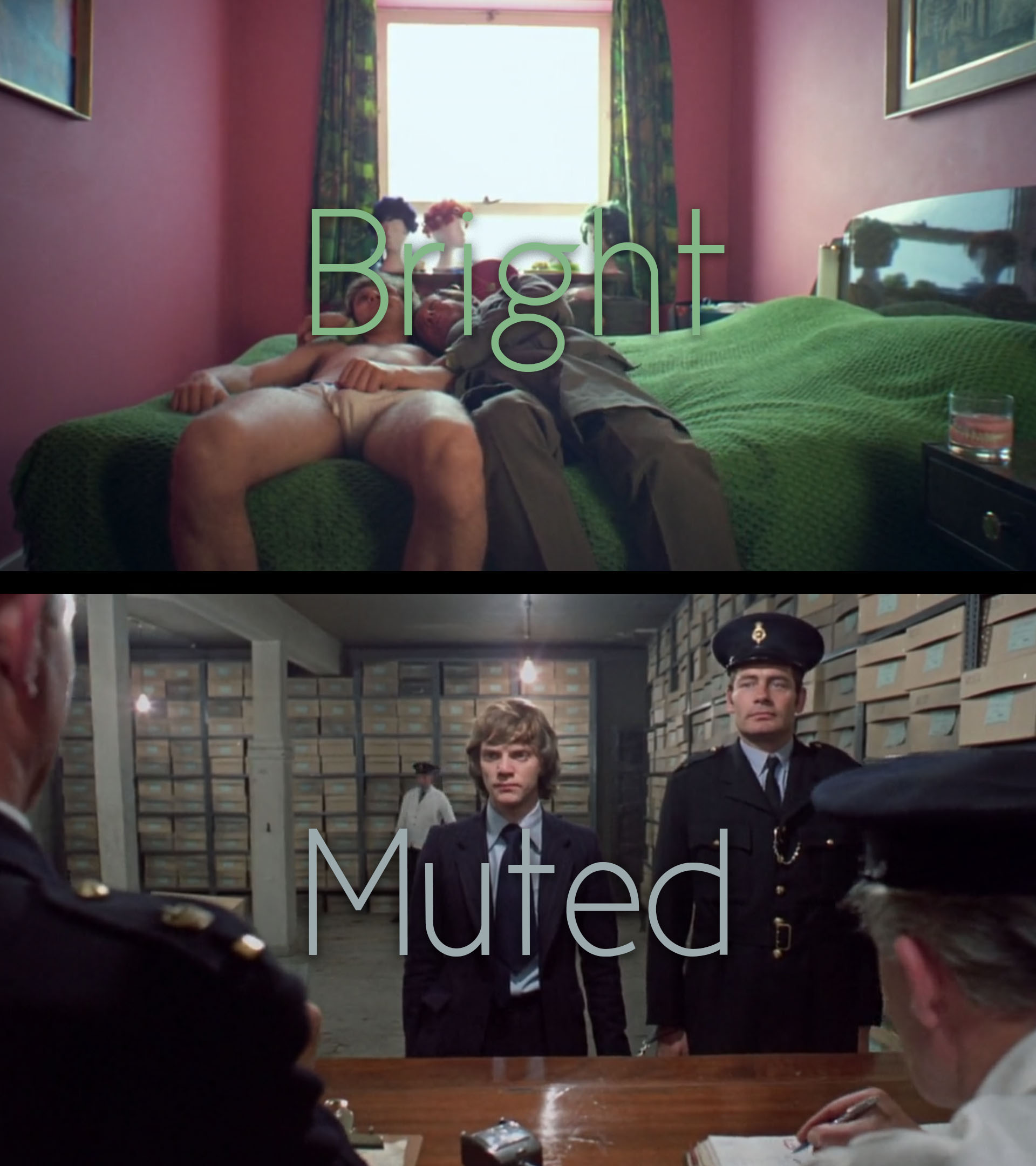
Stanley Kubrick’s controversial novel adaptation, A Clockwork Orange, is often cited for its graphic violence; it’s regularly cited for its chilling themes, sometimes for its interesting use of ultra-wide angle lenses, but very rarely for it’s astonishing use of colour. When analysing – from a purely aesthetic perspective – Alex’s journey, from his nights of ‘ultra-violence’ to being disgusted by any form of inhumanity, one’s attention is immediately captured by the change from surrealistic imagery to a more mundane view of the world.
This difference is primarily created by changing from ultra-wide lenses to more human focal lengths – around 35mm lenses – but also takes advantage of the colours within the frame. The change in colour occurs just after Alex is arrested for murdering a middle-aged woman; from the bright greens and pinks, to muted blues and greys, the change visually represents the sobering punishment for Alex’s horrific crimes – which, before the change, the film seems to find laughable.
One question often posed, about the narrative of the film, is: does Alex really get ‘cured’? This question mainly arises due to the juxtaposition between the terrifyingly naïve voice-over – which goes unchanging throughout the film – and the suddenly sedate visuals. This question goes unanswered, despite the fact that Kubrick so obviously poses it.
7. The Sacrifice (1986)
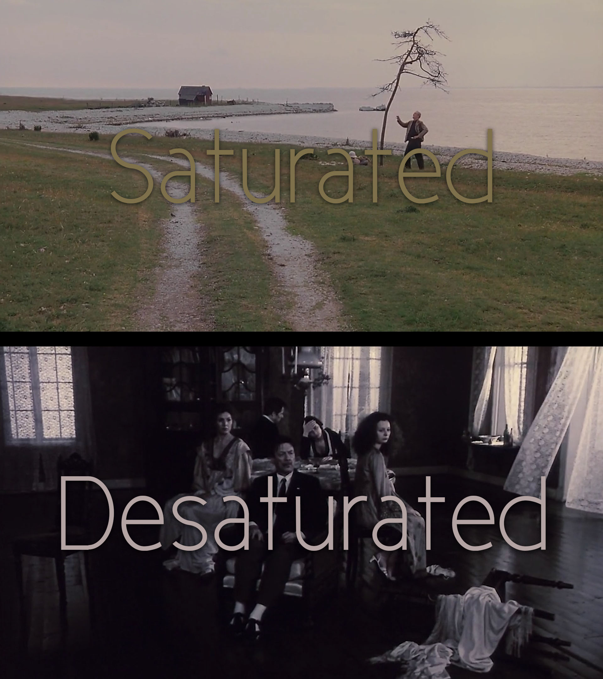
Andrei Tarkovsky is a filmmaker known for his use of poetic images to covey his message to the world. His use of colour is no exception; while many filmmakers, post black and white film, stick to taking full advantage of true-to-life colour rendition, Tarkovsky often uses a mixture of film stocks to portray the emotions of his characters – as ever, favouring visceral communication over realism.
Though the change in colour in The Sacrifice is less blatant than in some of his other work – like The Mirror – the change in narrative is so extreme it proves to be an insightful example of this technique.
The Sacrifice takes place in, and around, a remote house – shot on the Swedish island of Nӓrsholmen. The protagonist is a middle-aged stage actor (Alexander), who’s retired to take up lecturing on aesthetics. The change in colour arises between the first scenes of Alexander talking to his temporarily mute son, on the topic of philosophy, and the scene in which he finds out war has broken out.
The change is from a somewhat saturated colour pallet, to an almost monochromic one; this change in colour reflects the sheer lifelessness of war, as the colour – one of the most relatable elements of film – is practically sucked from the screen. The colour is only reintroduced after Alexander meets with a woman he believes to be a witch – restoring the essence of the picture, as if by magic.
8. Blue is the Warmest Colour (2013)
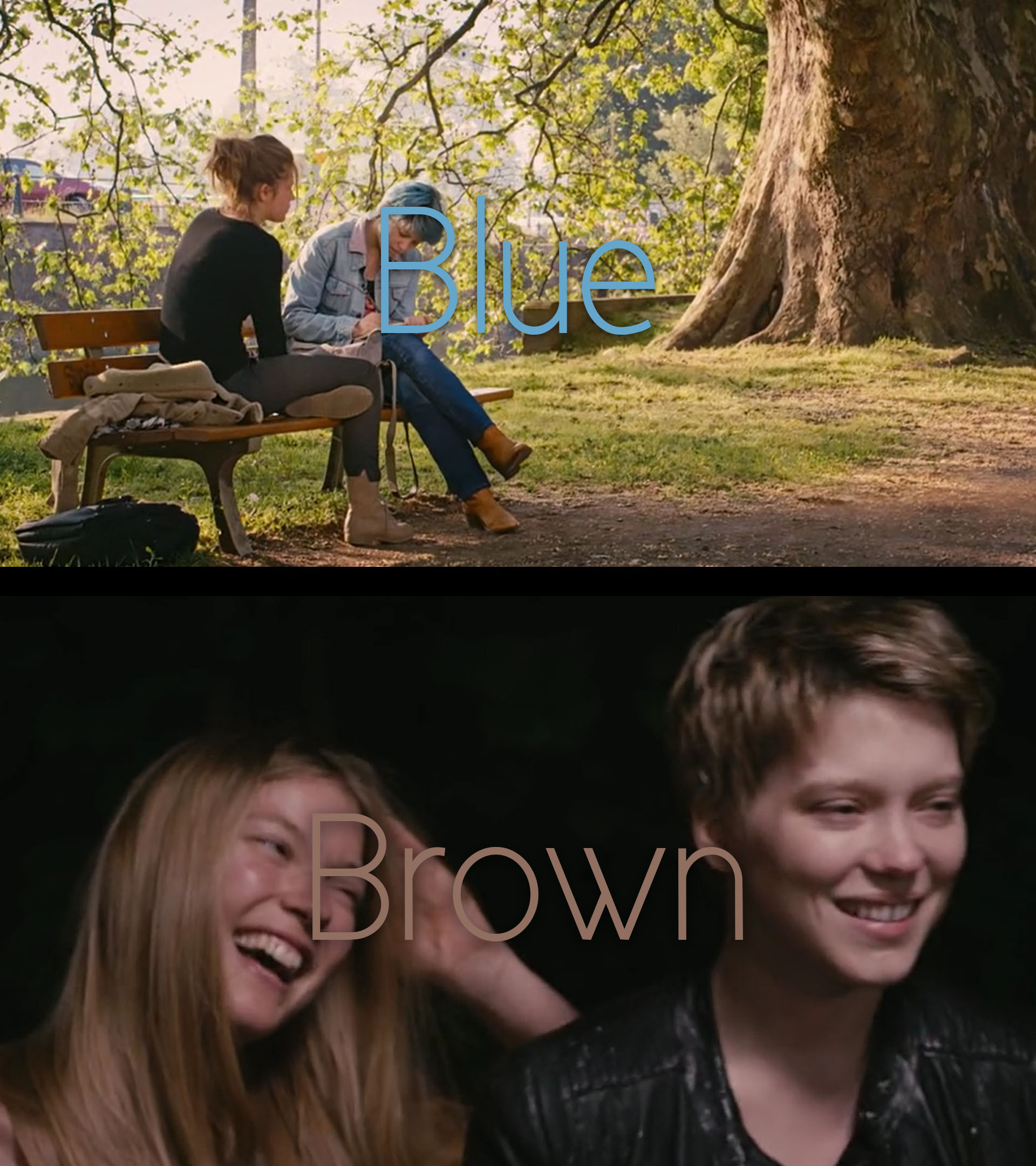
In Blue is the Warmest Colour, Tunisian-French filmmaker Abdellatif Kechiche breaths – and sweats – new life into one of Hollywood’s most familiar colour pallets; he flips the usual blue/orange associations on their head, to create a coldly intimate atmosphere around the relationship between two young women. Kechiche merges the commonly accepted connotations for colours with his own set of emotional ties.
Throughout the first half of the film, the colour blue becomes associated with sex, excitement and love – as opposed to coldness, sadness, and distance. This association is established through the use of blue during the graphic sex scenes, along with Emma’s blue hair – which Adèle finds irresistibly attractive.
Blue’s counterpart in this film, orange, is eventually stripped of its usual warmth and becomes associated with Adèle’s more emotionally downtrodden scenes, for example: her lonely walk home, under orange street lamps. This counter-intuitive choice of colour allows the audience to experience several emotional amalgamations which common colour pallets can’t do – simply due to their one-dimensional emotional connotations.
This is one reason such a lengthy runtime is necessary: to give the audience time to become accustomed to such strange colour associations. One particularly inventive change in colour is the change in the colour of Emma’s hair: from the most intense part of their relationship, when it’s blue, to the least intense moments, in which it’s a natural blond/brown.
The extremes of this being the intense moments before their first sexual experience together, and a party – after which they defiantly don’t have sex, despite Adèle’s attempts to engage with Emma.
9. Her (2013)
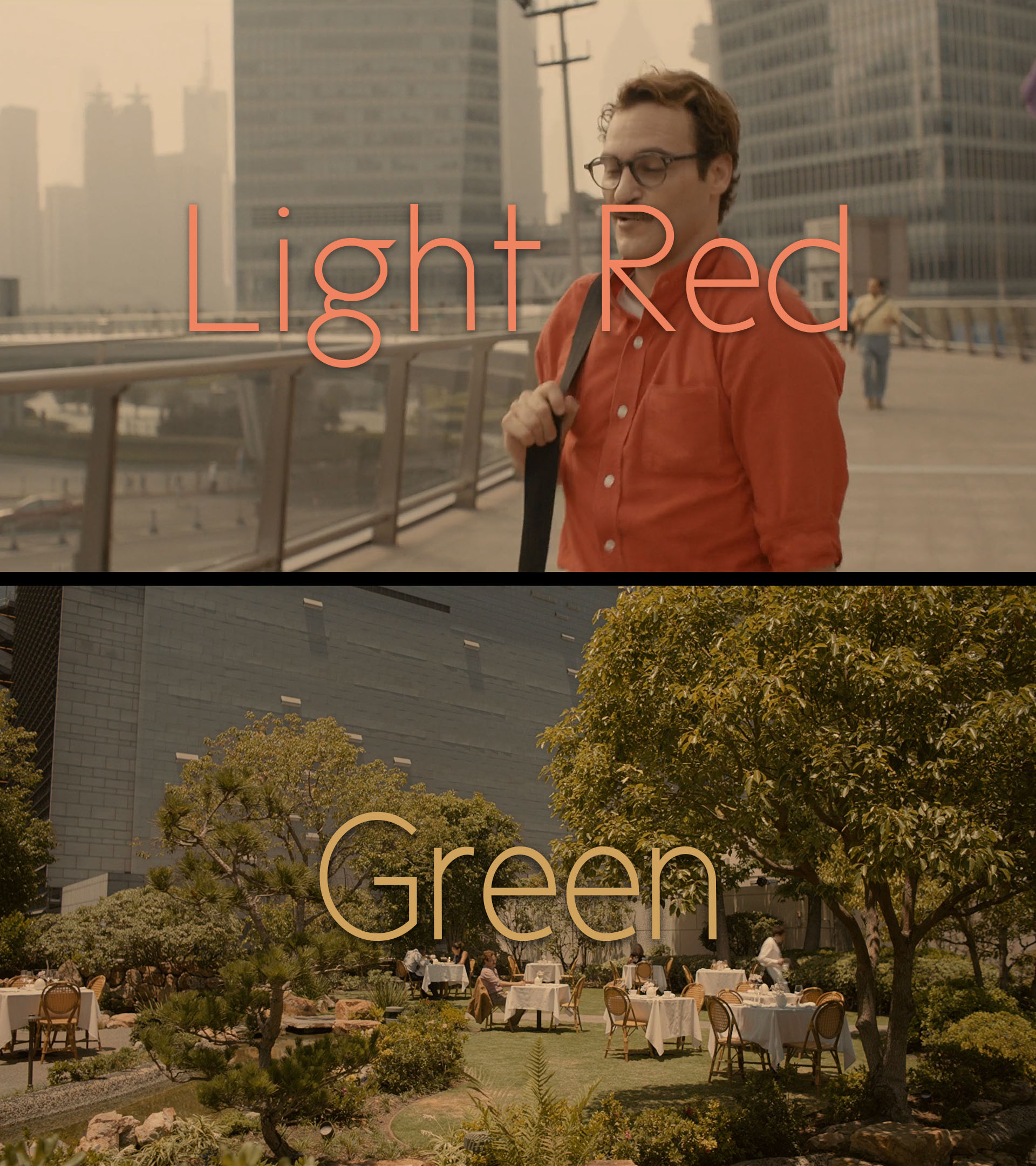
Her, written and directed by Spike Jonze, tells the whimsical story of a man (Theodore) who falls in love with his artificially intelligent operating system (Samantha). A film so centred around the emotions of a character without a body has to be rather inventive with its methods for showing emotion; to create a character as relatable as one with a full human body, using only a voice, is a very challenging feat. Her uses a dynamic colour pallet to capture the emotions of Samantha.
The most candid use of this colour pallet is after a conversation between Theodore and Samantha, in which they discuss him seeing his ex-wife to sign their divorce papers. In this conversation Samantha explains her jealousy of his ex-wife; throughout this scene Theodore walks down a pedestrian street wearing a light-red shirt, this is almost the only colour in the scene, the rest of the image is made up of light-grey buildings.
In the next scene Theodore meets with his ex-wife in the beautiful garden of a restaurant, they are surrounded by deep greens – some of the most saturated colours in the film. Using such a well-known connotation – green with envy, or jealously – the film realises what could have been an arbitrary remark, from an emotionless character.
10. Inside Llewyn Davis (2013)
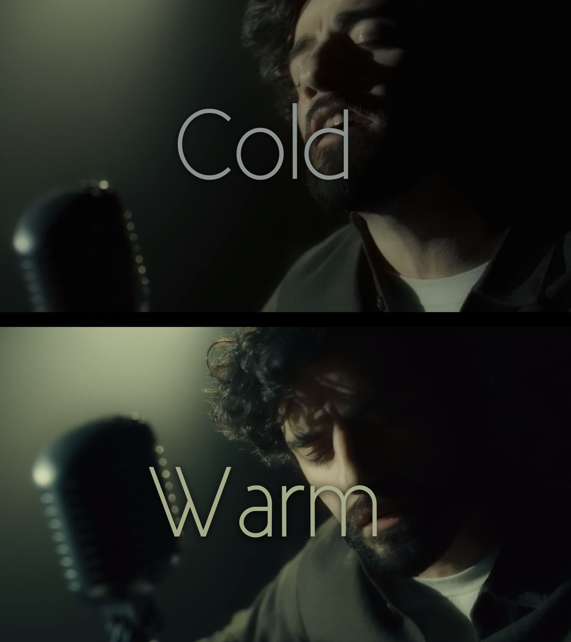
Inside Llewyn Davis is a film written and directed by the Coen brothers, and shot by cinematography Bruno Delbonnel, about the folk movement in Greenwich Village, circa 1960. The film follows aspiring musician Llewyn Davis, as he sleeps on sofas, gets beaten up, almost makes a record deal, and gets his friend pregnant – a bleakly funny story of not quite making it. In typical Coen brothers fashion, the ending of the film suggests some kind of cyclical paradox.
The subdued outlook – the outlook of Llewyn – is reflected in the use of desaturate, and cool, colours for most of the film, particularly in scenes in which Llewyn is dealing with the monetary side of his career. Upon first viewing, one may easily find this film depressing, or, at the very least, somewhat despondent; however, when re-watching the film, an optimistic element can be found within the visuals.
The last scene of the film is almost an exact replication of the first: Llewyn is playing in the Gaslight café, and proceeds to get beaten up after finishing his set. Though the scenes are almost identical, a subtle change in colour temperature, form cold to warm – suggesting his life is looking more prosperous, or brighter – might be the piece of hope, otherwise missing from this story.
In this article I have mentioned directors over cinematographers, simply due to the film as a whole being a director’s creation, so crediting them is a catch-all for the creative efforts of the whole crew – I have not forgotten the important role the cinematographer plays in the image of a film.
Author Bio: Ben is, first and foremost, a performer. A passion for circus performance, and the realisation of that passion, formed the happiest memories of his childhood. Consequently, audiences have always had a place in his mind; understanding audience reactions fascinated him from a young age – figuring out how to squeeze that last drop of admiration from a crowd, knowing when to pause, when to take a call, or how to deliver a punchline. This passion for performance, along with an interest in technology, and a fascination with psychology, lead him to studying Film and Television at Plymouth College of Art.