6. Anna Karenina (dir. Joe Wright, 2012)
D.P.: Seamus McGarvey
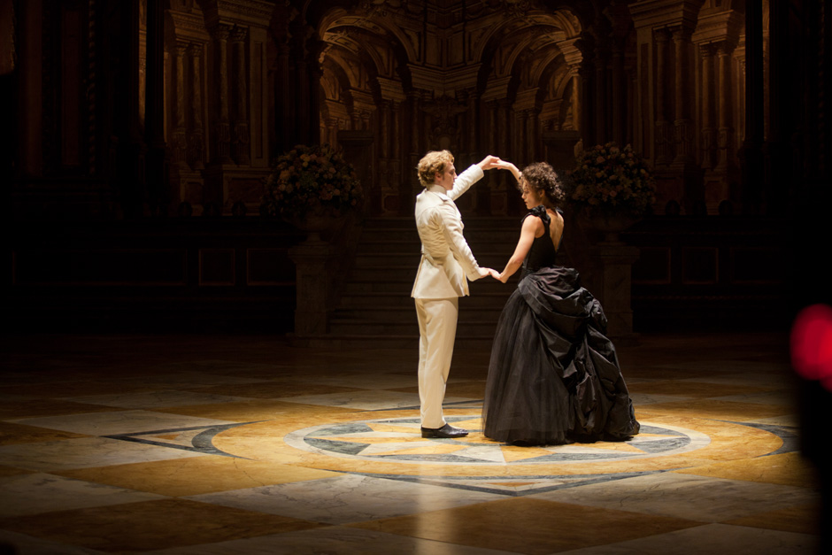
Phillipe Rousselot was the supposed cinematography for this Joe Wright film, but abandoned the project three weeks before the shooting due to health issues and was replaced by Seamus McGarvey, a former collaborator from films such as Atonement and The Soloist.
McGarvey then decided that it was best to shoot on celluloid with anamorphic lenses, because of the story and the period it’s set in. With a 36mm format on a Panavision Panaflex Millenium XL2 camera, this could only be difficult to accomplish successfully for the film was almost entirely shot in an actual theater.
This allowed McGarvey to explore the lighting, specifically from above. The scenes where there’s low light made the shadows more vivid and powerful, and the high-speed film stock ended up giving it a gorgeous grain structure.
As a director, Wright tends to use unusual camera movements, and that can be seen in “Anna Karenina” as it moves fast in the longer shots, giving the story a fluidity of scenery and actors. We see the set from a 360º angle and differents locations appear from scene to scene without leaving the room.
The Irish cinematography clearly enjoyed the idea that the lighting could have a bigger role and made it a part of the characters – there’s only one that is lit more naturally and that is the only one who exits the “theater.” The search for an adequate photographic style also includes the 2.40 aspect ratio as an interesting compositional tool which underlines, among other things, Anna Karenina’s relationship with her husband, allowing us to see and feel the distance between the two characters.
The camera takes us beyond the stage revealing the audience, backstage, the wings. While it might not be the best one of the many “Anna Karenina” adaptations, it is still a very interesting watch – and most of that due to its peculiar visuals.
7. The Assassin (dir. Hou Hsiao-Hsien, 2015)
D.P.: Mark Lee Ping Bin
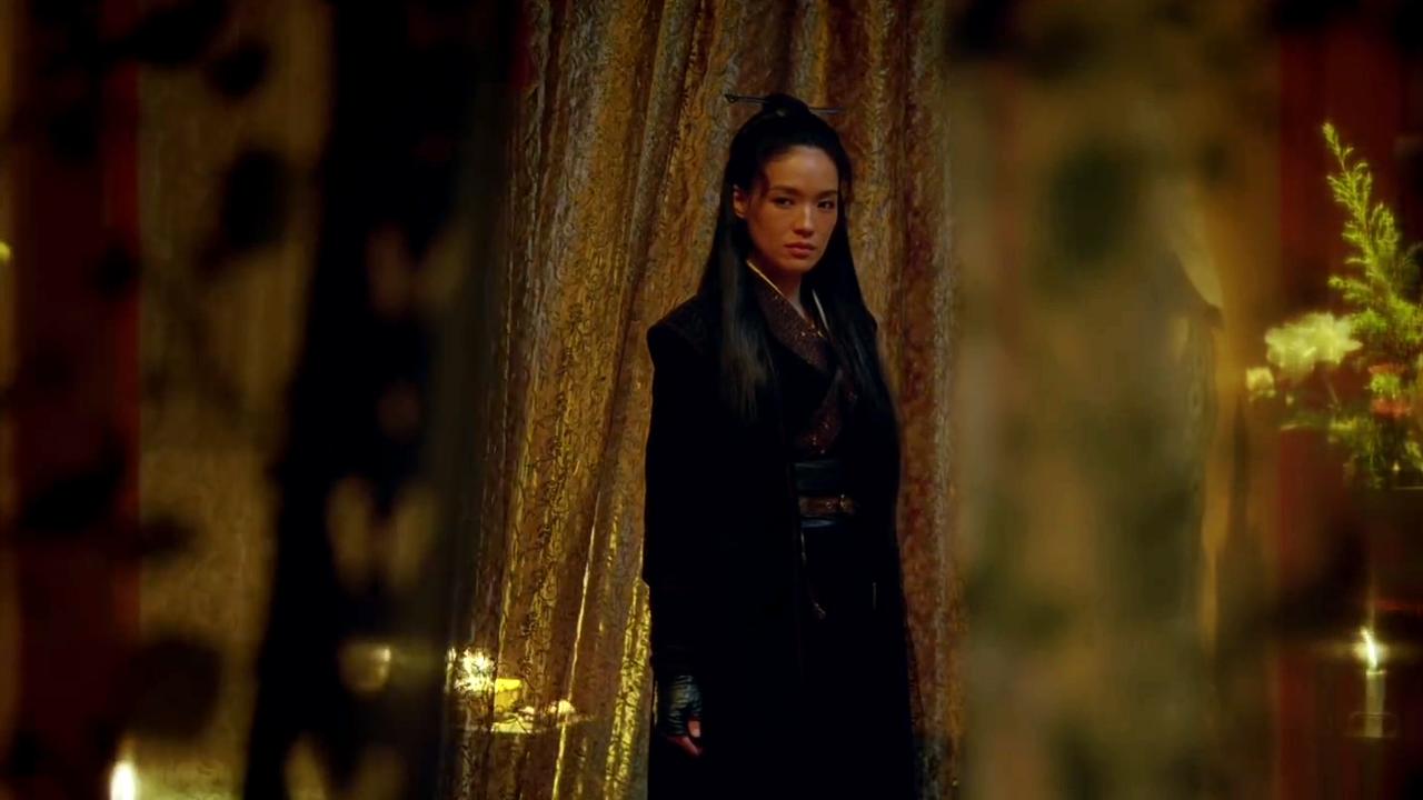
The film starts off with a prolog, shot in celluloid black and white and framed in compact compositions, preparing the viewer for a most incredible visual experience. It outlines the narrative perfectly, being a historical drama adapted from a ninth-century Tang dynasty tale.
What may come off as a straightforward kung fu epic develops into an abstract genre piece with a large interest in nature. As in his latest films, the director is more attentive to gestures and motion, expressions and space, building an incredible mise-en-scène. The cinematography, by Hou’s longtime D.P. Mark Lee Ping Bin, is an absolute achievement, an exquisite example of 35mm in its full potential to elevate the artistry.
Hou’s orchestrating of its pictorial beauty is part of why this martial arts masterpiece is among the most visually striking films in recent memory. Most of what we see in the film is also what was shot, with only a few filters being added.
What made it stand out, really, was how much thought was put into every artistic and visual detail, in set construction (they were built outside so they would use natural light) and only setting up lights occasionally to compensate for something – as was the case of some night scenes indoor where they would use low candle light and no CGI.
Shot in traditional 4:3 ratio in Hubei province in Mainland China, this is the story of an assassin who doesn’t enjoy killing, which some would say actually lacks action and where no martial arts hero can fly. It’s great work by all collaborators, albeit anyone can agree that the cinematography alone is the main reason why this is such a unique motion picture.
8. Samsara (dir. Ron Fricke, 2011)
D.P.: Ron Fricke
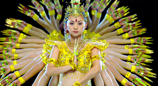
Ron Fricke is an American film director and cinematographer who specializes in time-lapse photography and large format cinematography. Before “Samsara,” he shot “Baraka,” Chronos,” and the Qatsi trilogy. In “Samsara,” there isn’t a specific storyline, or characters, or even dialogue.
Even though the creators (Fricke and Mark Magidson, producer) call it an art film, it’s still quite not that because it is much bigger than what one idea for a film might include, for its quintessential search for the essence of life in a near-documentary way. Essentially, these creators make films that document our presence in the world, aiming to find the most distinct landscapes and dive into different cultures.
Shot on luscious 70mm film, they traveled for 3 to 5 years and once they felt they had enough imagery, they went in the editing room and started cutting. This would sound extenuating if it wasn’t for the amount of preparation they did before they shot.
Due to shooting celluloid, the cameras were heavier and they had to take a longer time to set up, with Ron’s very selective style joining the picture. And even before that, they would carefully decide on their next locations, doing extensive research and visiting before shooting, planning everything first hand.
When they had several hours of film, they gathered little subject blocks in order to find a flow that would hopefully create the narrative. In the end, their decision-making came down to choosing appropriate imagery and delivering bold emotional impact. It’s an extraordinary example of cinematography as a storytelling medium, with outstanding time-lapse photography and coming very close to a special form of meditation.
9. The Place Beyond The Pines (dir. Derek Cianfrance, 2012)
D.P.: Sean Bobbitt
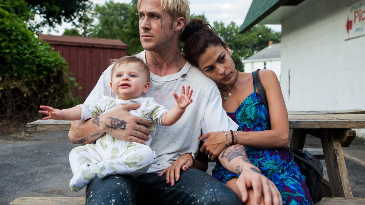
There’s an interesting story that Derek Cianfrance told regarding the D.P. for this film, and it reveals a big part of what makes its visuals stand out so much. The director said in an interview that Andrij Parakh (a previous collaborator of Cianfrance in “Blue Valentine”) called him 8 weeks before shooting to tell him that he wouldn’t work on the movie because he dreamt that he died while making it and decided not to do it.
When Sean Bobbitt joined the project, he scoffed at Parakh’s superstition, as he’d been a war photographer for eight years. They decided to begin the film with a bang, an opening shot that would instantly catch the audience off guard and leave it wanting more.
So he went to the center of the cage in which motorcycles would ride around him, and he would capture that first epic shot right in the middle of the action. This resulted in a trip to the hospital after a very decent first try and returned later to try it again – getting an even better result, despite Cianfrance’s wanting him to get the shot from outside the cage.
For the rest of the film, they alternated between LT/ST/235 cameras, and Cooke s4 and Angenieux Optimo Lenses shooting on a 2.35:1 aspect ratio to come up with a lot of trickery and to best capture the compelling performances it featured.
It was a very ambitious film and this is see-through. Ideas are rich but stuffed, and never turn into something coherent. What’s left is stunning cinematography, set-pieces and locations that stand out in a story that doesn’t amount to much in the end.
10. The Revenant (dir. Alejandro G. Iñárritu, 2015)
D.P.: Emmanuel Lubezki
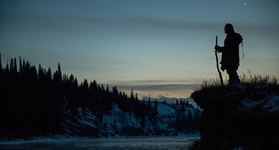
The Mexican-born D.P. Emmanuel “Chivo” Lubezki has been nominated eight times for the “Best Cinematography” Oscar, and this year’s was his third win in a row – for no other than this film. As the award for “Best Director” went to Iñárritu, one can automatically assume that this was a powerful duo.
Last year, there were the continuous takes in “Birdman,” and the year before that (for the D.P.) there was his need to actually invent equipment only to find the perfect look for the film “Gravity.” Although the director has recently proven how well he can do his job, it’s in his collaboration with “Chivo” that we see the best part of it.
“The Revenant” shooting suffered immensely from freezing conditions, which has been pointed out by Lubezki as some sort of necessity to better translate the experience. They also used strictly natural light because they wanted the audience to see exactly what they saw, and hopefully, find it as real as it was. (All the extra light they used was in a campfire scene)
Ideally, the picture was meant to be shot on film, but the format wouldn’t capture the scenes exactly as they were hoping, mostly because they had very little time of daylight and often shot at dawn and dusk. Instead, Lubezki carried the Arri Alexa 65mm digital camera with 12 to 21mm lenses.
This, of course, helped get rid of the grain and noise, which the D.P. considered his divorce from film. The director and D.P. alone probably couldn’t have captured such intense moments without one another’s help, which explains how well the bear attack, jumping cliffs and going down rapids of a river was as fascinating and immersive the film got.
As this film’s proven, there’s nothing Lubezki won’t try. As an adaptation from a novel with the same title, “The Revenant” attempted to bring originality to the script, which made the cinematography stand out a lot more.