6. The White Ribbon – Christian Berger (82nd Academy Awards, 2010)
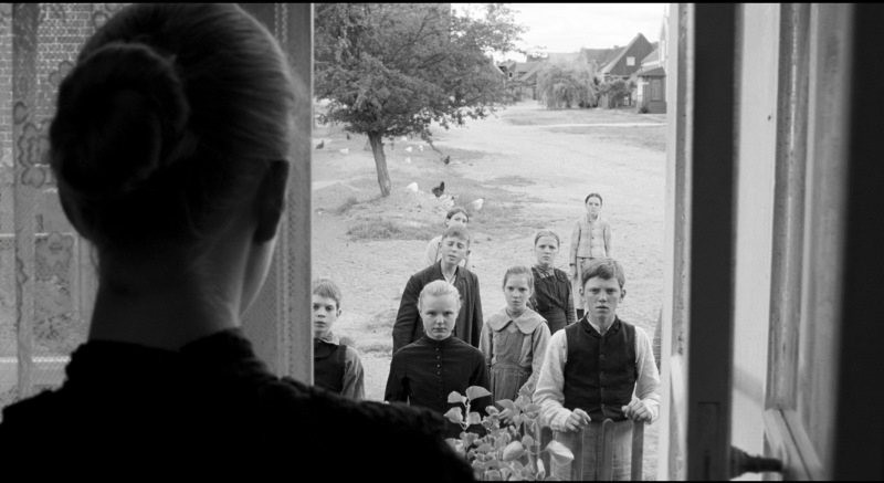
Austrian filmmaker Michael Haneke’s “The White Ribbon,” set on the eve of World War I, portrays a series of events in a rural village in northern Germany. Shot in black and white, it was the fifth feature film shot by Christian Berger for the same director.
Berger explained that, as a condition of a participating television station, it had to be shot in color. That wasn’t bad, per say, as the cinematographer agrees that today, “the best way to have black and white is to shoot in color because the materials are more progressive; black-and-white film stocks are not the best.”
For once, it combines analog with the negative, and it’s easier to unite digital with effective post-production. It also provides for the creation of a gentler gray scale and a much better resolution. However, unlike the mood that other similarly colored films on this list searched for, “The White Ribbon” looks modern to fit in with the present and dismiss nostalgia.
The lighting was yet another peculiarity to attend to, for being a period film, it would appear this aspect comes mostly from oil lanterns or torches. For this reason, Berger had to be extremely careful with the proper placing of light, so there was no interference with the shadows – something aesthetically prominent in Haneke’s work.
Although a rare achievement for a foreign cinematographer, Berger earned a nomination for this picture at the ASC Awards. At the 82nd Oscars, he lost to Mauro Fiore-shot film “Avatar” – whose win was, to say the least, interesting. Fiore was only behind the camera for less than a third of the film’s running time.
7. Black Swan – Matthew Libatique (83rd Academy Awards, 2011)
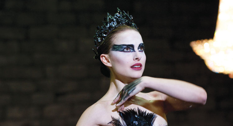
There’s no doubt that one of the highlights of Darren Aronofsky’s fifth feature film is the cinematography. Libatique’s handheld ARRI Super 16mm camera is a big part of that, along with a Canon 7D, 1D Mark IV and a 5D Mark II for specific sequences such as dance rehearsals and subway scenes for portability, maneuverability and crew size reasons.
This use of a DSLR is not particularly news-worthy nowadays, but Libatique took it as an opportunity+ and shot it documentary-style, doing all the focus pulls by hand and trying to get as much depth of field as possible from a Canon 24mm lens at 1,600 ASA. Libatique didn’t just make the absolute best of what he could, he made the cinematography vital for the viewer’s full understanding of the film.
As a twist on Tchaikovsky’s classic ballet “Swan Lake,” and following main character Nina’s (Natalie Portman) gradual darker side, all kinds of changes were being made cinematographically throughout it. There’s light (white and pink), then there’s gray and, at last, darkness (black).
This is combined with the shots themselves, as they slowly evolve from neutral to high angled, to a lot of canted angled shots in the end. There’s low key lighting, creepy imagery, close-ups, rapid cutting and a general increase of paranoia.
Darkness takes over and blends in with Nina, further generating a new set of metaphors and theories. The use of elements inherent to classic film noir, the use of more grain in specific shots where the main character’s mind is hazy, horror references and plenty of other microelements make this film’s cinematography immaculate.
All of this wasn’t enough to win an Oscar, and Libatique lost to Wally Pfister’s work in “Inception,” making it yet another case of a box-office hit that seemed so wonderful it even clouded the voters’ judgment.
8. The Tree of Life – Emmanuel Lubezki (84th Academy Awards 2012)
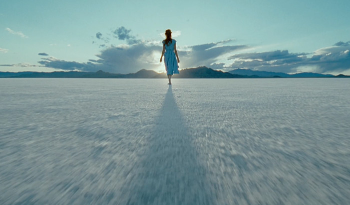
No list related to cinematography can miss Emmanuel “Chivo” Lubezki’s outstanding work. This said, and having won the latest “Best Cinematography” Oscars twice in a row (and quite probably heading for a third), if there’s one year when he didn’t win and should have, it was 2012.
Filmmaker Terrence Malick’s journey of a Midwestern family from their oldest child’s 1940s childhood through his adult life was his second collaboration with Chivo, and many claim it was their best. They decided to use 35mm film with an aspect ratio of 1.85:1, and a sheer amount of spontaneity combined with the most uniquely scripted moments.
“Tree of Life” tore down filmmaking conventions, ignoring the expected use of cameras filming actors while they speak and, instead, focusing on details around them and only pan back to them by the time the dialogue is over.
It’s important to add that Malick didn’t want to tell a story as much as he wanted to provoke feelings. With this in mind, photography was used first and foremost to portray emotions, in order to trigger the audience’s own experiential memories. It irritated a lot of people that couldn’t get past its ambiguity and decline of obvious answers.
Chivo has mentioned that the language they used was farther from film and theater and closer to music, and to capturing a moment. The entire film is an experience of finding all its layers, be it the characters or a full range of emotions. Being a picture whose scope rivals Kubrick’s “2001” means it is as poetic as it is ambitious, but it also means the cinematography is excellent.
Shot with hard lenses in short-focal-length, using all available natural light with no filters, avoiding white and primary colors in its frames, keeping true blacks, composing in depth and refusing to zoom are only a few aspects of the exceptional style of this film.
In the 2012 ceremony, this was the most artful of all contenders, but it lost to 3D-shot “Hugo”, which made cinematographer Robert Richardson’s third Oscar.
9. Skyfall – Roger Deakins (85th Academy Awards, 2013)
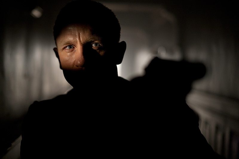
The second film on this list that was shot by Roger Deakins is a James Bond feature, and a master class in cinematography. Skyfall’s breathtaking locations – Macau, Shanghai, and Glen Coe – are combined with a fascinating use of light, ranging from white to blue, to yellow.
Deakins himself has said that most of his career has been about choosing the right location, and that’s very well represented here. The number of cameras used was kept to a minimum, and a great part of the film was done single camera with an Arri Alexa Plus and the Alexa Studio, but this was also the first film in the franchise to be shot digitally.
This was beneficial mostly for the lighting design, which is of major importance in this film. Director Sam Mendes enjoys having the cameras focused on the characters (especially while they speak), and this was particularly relevant in the bigger action sequences.
The major one, the film’s climax, was referred by Deakins as “an extended sequence of light change.” The film’s cinematography, all in all, can be split into three distinct sequences, one for each location, and it’s certainly one of the most remarkable efforts in action films to date.
One could discuss every film on Deakins’ current record for Most Nominations without an Award (13) and understand that he had quite a competition on most of his chances, but by now it’s just seen as classic Academy Awards stubbornness.
Avoiding the topic of the split votes between his two nominated films in the 2008 ceremony, his dismissed work in “Prisoners” and “Unbroken” in favor of Chivo Lubezki’s “Gravity” and “Birdman”, there’s one that shouldn’t go unnoticed here, and that’s his loss to “Life of Pi” in 2013.
10. Mr. Turner – Dick Pope (87th Academy Awards, 2015)
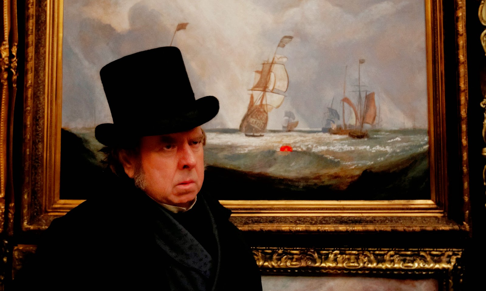
British cinematographer Dick Pope is known mostly for his prominent work with director Mike Leigh. On his 10th collaboration with the filmmaker, he had the chance to really show off, due to the subject of this biopic. As progressive as Mr. Turner was considered as an artist, he captured light on canvas exceptionally well, and this was taken into consideration in the making of the film.
Leigh has commented on this matter, stating the film is about light – and that’s where Pope’s vision came through. One aspect that has been mentioned by several critics is that some of Pope’s frames could’ve just as well be hanged next to Turner’s paintings.
Leigh and Pope considered shooting film but agreed that digitally would be more appropriate. The same way that Mr. Turner always moved forward, looking ahead, they thought it would suit his own views better by choosing a more modern technique. There is, however, a contradiction to this. Pope wanted it to look as painterly as he could, so he tried to remove the digital look completely.
For this effect, he captured the era with really old lenses (Cooke Speed Panchros) on the Arri Alexa. The vistas were naturally lit, and it was very important that the whole picture looked dusty, with nothing ever too shining – because period films often look too glossy.
As for a deeper comparison with Turner’s landscape paintings, Pope wanted it to be obvious what the artist would paint and why, using a colorization that drew from Turner’s palette. There wasn’t any graining, which is outstanding for the vast usr of candlelight: huge chandeliers, a candelabra and hundreds of candles around Pope.
Painting in light wasn’t enough for the Academy Awards, seemingly, which gave the award to Chivo Lubezki’s “Birdman”. They are both superlative, and it takes only a viewing of “Birdman” to know that its cinematography was essential, but they were very different too – which makes it more difficult to objectively define the best one.
Author Bio: Alexandra Gandra is a Portuguese writer and filmmaker. She currently finished a master’s degree in Digital Audiovisual at the University of Aveiro. She spends too much time in cafés people-watching and putting sentences together, some of which can be found at medium.com/@gandra. She’s also writing a book she hopes to finish some day.