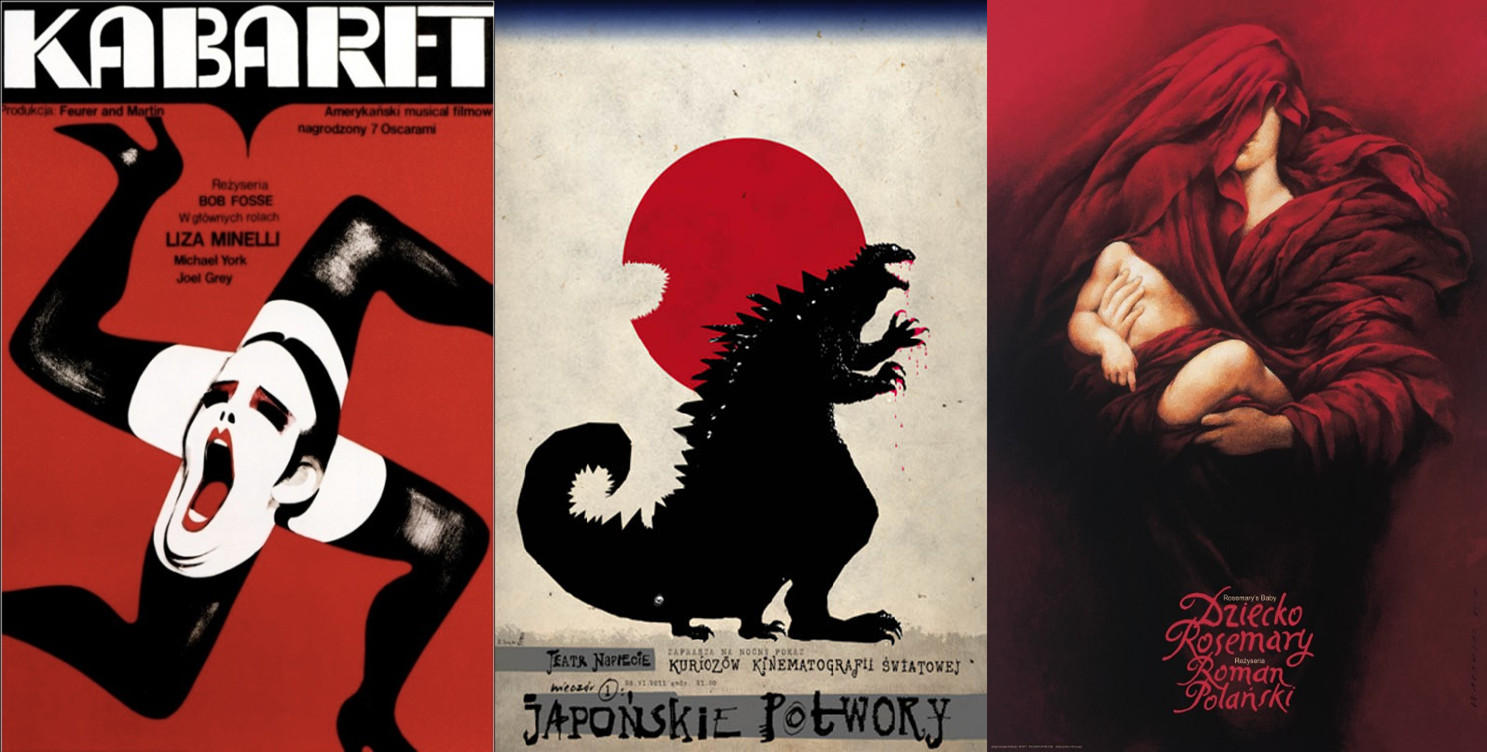
The poster is an integral part in the overlap between film as business and film as culture. In the Pre-internet days, the function of the poster was a significant chunk of a film’s advertisement. It was primarily the first impression, a chance for advertising to generate public interest and draw in an audience before the film was in cinemas, occasionally before the movie was finished.
With the advent of 24/7 journalism, by the time we’re first seeing the concept poster, we are already to grips with who is directing, writing, starring and so on, meaning that the poster’s primary function has changed.
In recent years we have seen a shift to more conceptual styles of poster design with an emphasis playing with the spatial parameters of the classic shape; for example Buried (2010) or Ant-Man (2015). Just as it is no longer a device to demonstrate information and provide enough sustenance to hook an intrigued spectator, now it also represents a showcase for art style and costume design, a vital aspect of expanded franchises such as the Marvel or Star Wars films.
As with the other facets of marketing (and filmmaking itself), poster design moves through trends and styles as the industry and audience tastes evolve. Cast your mind back to the poster for Spiderman (2002) and the surge of blue and orange that flooded the lobby of the local cineplex in the following few years and you will see how far we’ve come from the painted, expressive iconography of classic noir one-sheets or minimalist post-mod posters from the 1970s New Hollywood.
Regardless of evolving focus or stylistic design, posters remain a vital part of film culture. Specific designs become so ingrained with the identity of the film itself that it becomes the formal visual memory that springs to mind when prompted. Others become assimilated into the broader popular culture, a fashion statement to be located within dorm rooms across the world.
And then there is the work from Polish School of Poster Art. Founded in 1952 at the Warsaw Academy of Fine Arts, here artists were freed from commercial pressures to explore metaphorical and conceptual ideas.
Covering not just cinema but theatre, opera and all other form of entertainment, they took influence from artistic movements across the continent such as pop-art or folk symbolism. They used a combination of techniques in order to create one-sheets that act both as individual interpretation of the work in question and a commentary on the audience who are to receive it.
With their original conception, they played a vital role in decorating the war-torn streets and bringing a sense of post-conflict urban rejuvenation through vibrant and a particularly national twist to the city’s walls. Today the tradition continues with a select group of designers occupying a unique space within cult memorabilia collections and gallery showcases.
The largest private collection was amassed by Martin Rosenberg who hosts regular exhibitions across museums and festivals. You can view his pieces and the history of his thirty-year-long collection at his website.
All the posters featuring in this list are available to buy here.
Note: Attempt has been made to name all designers when the information was readily available.
1. Alien (1979)
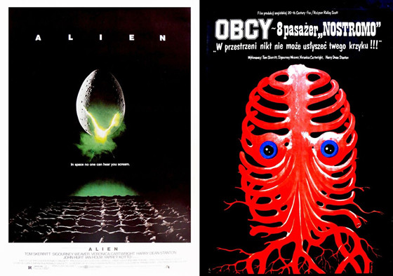
Designers Steve Frankfurt and Philip Gips usually share the credit for one of the most iconic posters of all time. The sparse lettering, the mysterious floating egg with it’s brilliant green-yellow crack and dread-inducing subtitle.
Equally striking, Jakub Erol’s design shows a bizarre skeletal-like nervous system with two piercing, terrified eyes. Both designs go for a more conceptual tone, playing up the organic infection element of the xenomorph.
2. Apocalypse Now (1979)
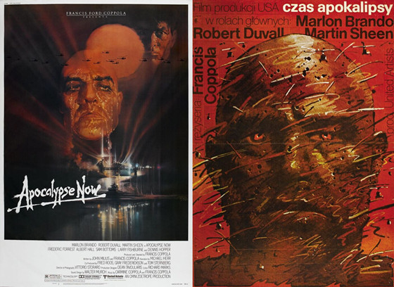
Bob Peak’s poster design is another piece of late seventies classic iconography with it’s varying hues of Hellish red and disturbed, dripping faces of Sheen and Brando emanating from the darkness.
Pushing Kurtz’s fragmented psychosis, this poster by Waldemar Swierzy is reminiscent of the more disturbing work of Egon Schiele, as a haze of bullets tear the face of Kurtz apart.
3. Badlands (1973)
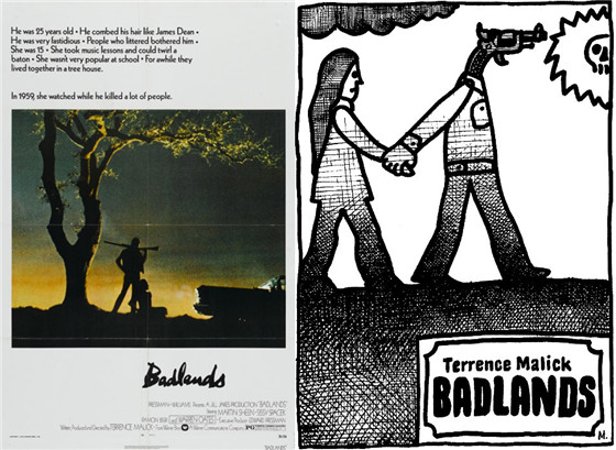
The original poster deliberately evokes the lovers-on-the-run B-movies of the 1950s that inspired Mallick. Cast in silhouette, Martin Sheen adopting a James Dean style pose, while a trashy Sissy Spacek clings to his legs.
Jan Mlodozeniec’s effort is quite different, black and white, pen-shading and a childlike illustration that seems ripped right from Spacek’s lonely, detached Holly’s diary.
4. The Birds (1960)
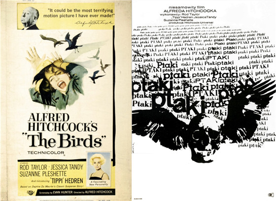
The US poster is typical of it’s era; playing up the involvement of Hitchcock who tops the composition with an enticing quote ‘It could be the most terrifying motion picture I have ever made!’ Whilst the Hitchcock blonde, Tippi Hedren in this case, fills up the the middle section with her screams and the ominous shadow cutting across her face.
Roman Cieslewicz’s poster on the on the other hand is unnerving and surreal. A winged skull adorned by the polish word for ‘bird’ emphasising the scale of the threat.
5. Breakfast at Tiffany’s (1961)
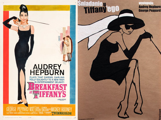
A famous one sheet by Robert McGinnis; Hepburn is the single object of attention; the ultimate 1960s fashion icon sporting a black slip dress, diamond necklace and the longest cigarette holder ever.
Michal Ksiazek’s mondo style sketch adds a vintage feel to a film that has remained a mainstay in the popular culture of Hollywood fashion.
6. Citizen Kane (1941)
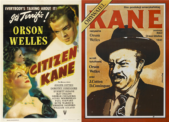
The original poster is a classic, albeit dated, example of 40s marketing. The composition and illustration style suggests romance and melodrama.
In a sly twist, Grzegorz Marszalek imitates the legendary Time Magazine cover to convey the stature of Kane’s character. A great detail in the faux articles to convey the film’s credits.
7. Cabaret (1972)
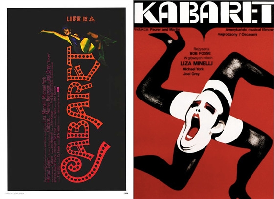
The American theatrical poster for Cabaret plays up the film’s ties to the 1966 broadway show with the title design calling to mind classic stage decor.
By contrast, the poster designed by Wiktor Gorka is a brilliantly surreal send-up to the film’s historical setting and themes.
8. A Clockwork Orange (1971)
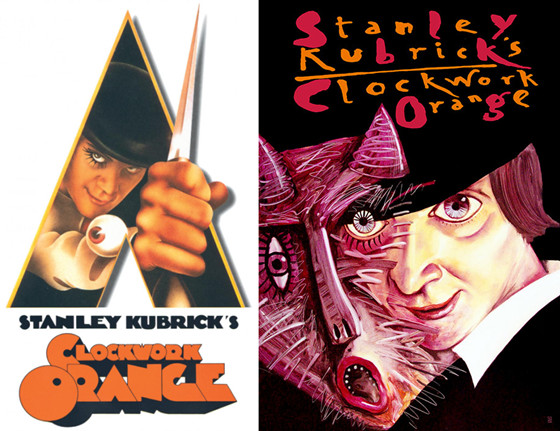
Another one-sheet from the 1970s that has remained firmly at the forefront of the visual iconography of the counterculture. Bill Gold’s design is immediately attention grabbing with the sharp edges and bold colour scheme, not to mention Alex DeLarge’s eyeball cufflink.
Leszek Zebrowski offers up a manifestation of Alex DeLarge’s monstrous id, representing it as contorted monster leaping from his wide-eyed smile.
9. The Exorcist (1973)
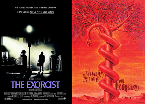
Bill Gold’s original one sheet is one of the most iconic and atmospheric images in horror movie history. The unearthly ray of light emanating from the bedroom of Linda Blair casts Max von Sydow in silhouette. It’s pretty much perfect.
Leszek Zebrowski gives us a Dali-esque image of a tree growing around a snake, all encompassed by a hellish red, barren landscape.
10. Fanny and Alexander (1982)
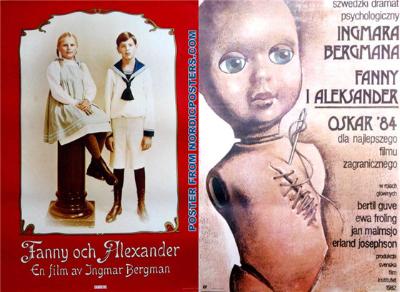
Ingmar Bergman’s epic masterpiece about a young pair of siblings growing up in a wealthy turn of the century household. The original poster is simple but effective with a framed picture of the two children against a red background.
The design by Wieslaw Walkuski takes on a metaphorical approach as the wounds of experience are sewn up the torso of a baby doll.