11. The Godfather Part 2 (1974)
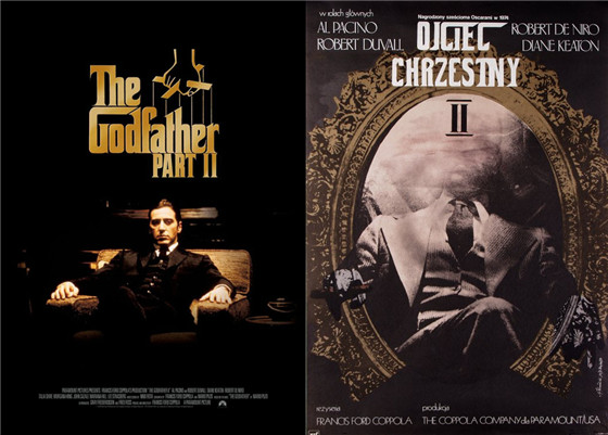
Andrzej Klimowski’s version of The Godfather Part 2 is pretty similar in terms of colour palette and composition to the US theatrical poster.
As Michael Corleone ascends to his father’s place within the family, he takes prominence in throne-like chair. However Klimowski gives us only a faded head, alluding to the parallel links between the generational subplot within the film.
12. Godzilla (1954)
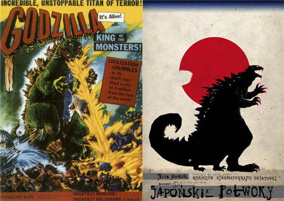
Cheating a little, as this poster is advertised as ‘Japanese Monster Movies’ but he’s the only one there. The American theatrical poster emphasises the scale of the action with Godzilla bringing fire down upon villages and a raging tidal wave to boot.
Ryszard Kaja has a bloodied King of the Monsters taking a bite out of the Circle of the Sun suggesting the more metaphorical elements of the film.
13. The Planet of the Apes (1968)
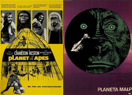
Alluding to the action adventure side of the film, the theatrical poster for the 1968 The Planet of the Apes directed by Franklin J Schaffer has black and white character bios against a bright yellow background at the top of the frame leading down to a group of caged humans in the foreground of the picture.
Unlike the cluttered US poster, the Polish poster is sparse and abstract. The ape-like face makes up the presumed planet while the iconic, destroyed Statue of Liberty hangs about in the bottom.
14. Rosemary’s Baby (1968)
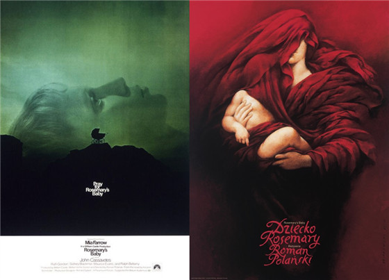
One of the most iconic horror movie images, Stephen Frankfurt’s poster for Roman Polanski’s classic psychological chiller is both haunting in it’s composition and elegant in it’s simplicity.
Wieslaw Walkuski’s design is similarly disturbing with Mia Farrow draped in a red cloth that covers her face and that of the baby in her arms.
15. The Sacrifice (1986)
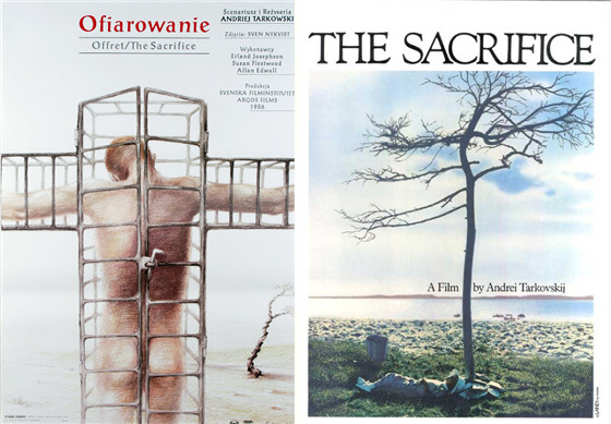
The original poster provides a simple and fitting still from the film; a young boy sits at the bottom of a barren tree as the desolate horizon expands out away from them. It encapsulates the mood and central metaphor for Andrei Tarkovsky’s final work.
The tortured, misty sketch by Roman Kowalik is a striking alternative, interpreting the film’s theme. A naked figure stands crucified in a steel cage, the tree sits in the corner similarly bound.
16. Some Like it Hot (1959)
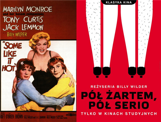
The American theatrical poster bigs up the star names behind Billy Wilder’s classic screwball comedy with particular attention being given to Marilyn Monroe and ‘her bosom companions’ Jack Lemmon and Tony Curtis.
Joanna Gorska and Jerzy Skakun provide us with a slick minimalist work that forgoes the actors in favour of the more suggestive image.
17. Star Wars (1977)
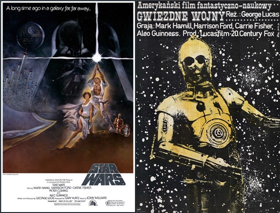
Little needs to be said about Tom Jung’s classic design for the original Star Wars. It is a generational image that conveys not just the design but the scope of the franchise.
Jake Erol’s design is strangely haunting by comparison, as C3PO alone stands against a starry backdrop.
18. Sunset Boulevard (1950)
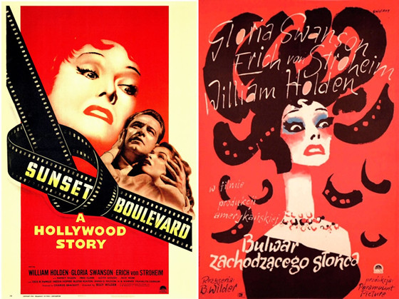
One of the most famous and sought after posters from the original Polish poster school by Waldemar Swierzy.
Similar to the US original it shows a manic, Medusa-like Gloria Swanson swamped in hair and reds suggesting the psychosis at the heart of the Hollywood fantasy in Billy Wilder’s satire.
19. Taxi Driver (1976)
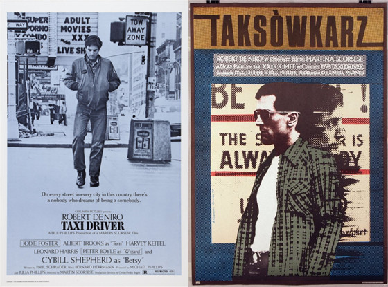
Robert De Niro walks down a grimy monochrome New York street with an ambiguous subtitle alluding to the dark satire that lurks within Martin Scorsese’s masterpiece.
Andrzej Klimowski gives off a pop-art tabloid vibe as De Niro stands against a sign reflected behind him is his doppelganger, a manifestation of the violence that he harbours inside.
20. The Terminator (1984)
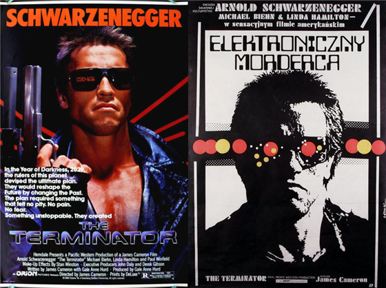
Schwarzenegger’s prominence is clear on the US poster, touting a futuristic gun and dressed in the least conspicuous leather overcoat in history.
Jakob Erol’s spin on what has become a classic piece of 1980s paraphernalia is a highly stylised cyberpunk portrait of the Schwarzenegger’s Terminator. The stark black and white look is punctuated by the brilliant, menacing red and yellow light stream that feeds into his goggles.
Author Bio: Mervyn is a Post-graduate Film Student at Queen’s University. He has been writing about film for around three years now across a number of sites including The Yorkshire Times Online and The Focus Pull. When he is not watching, writing or thinking film he is a part-time reader and drinker of whiskey. You can follow him on Twitter or Letterboxd.