6. The Sound of Music (1965)
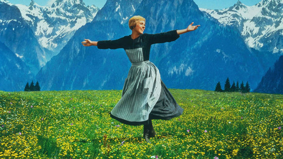
Like Spartacus, The Sound of Music (1965) has an unusual aspect ratio of 2.20:1, though this musical classic is particularly notable since it was shot with the 70mm Todd-AO system.
Todd-AO was created in the 1950’s as a rival to Cinerama. Like Cinemascope, it aimed at using only one projector instead of three; it used a 65mm negative which was printed on 70mm print stock, as Ultra Panavision also did (an example is the aforementioned It’s a Mad, Mad, Mad, Mad World); its lenses were spherical, not anamorphic.
The first movies made with Todd-AO had a “30 frames per second” frame rate, but by the time The Sound of Music was shot the frame rate had to be the standard 24fps, so the movie was actually shot in 65mm negative and printed on 35mm film, as most of the 16 feature films made with Todd-AO turned out to be.
In addition to the ratio of 2.20:1, The Sound of Music can also boast a six-track recording system; Todd-AO’s assets in image and sound helped enhance the movie’s qualities, making it one of the most recognizable musicals ever, both in look and in sound.
7. Barry Lyndon (1975)
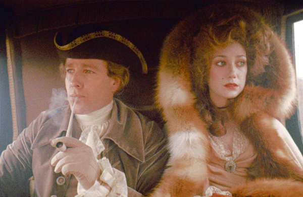
Stanley Kubrick was one of the greatest innovators in cinema history, and he gladly experimented with every aspect of filmmaking. As far as aspect ratios go, we have already seen how he employed Technirama for Spartacus, resulting in a widescreen of 2.20. In the following two decades, he shot a series of films which were mainly in a 1.66:1 ratio (the main exception being 2001: A Space Odyssey with his 2.20 ratio); among these films there’s Barry Lyndon, an historical drama released in 1975.
Barry Lyndon’s director of photography was Kubrick’s frequent collaborator John Alcott who actually started as his lighting cameraman but was promoted on the set of 2001: A Space Odyssey. The two first collaborated as a director/dp duo on A Clockwork Orange and then again on Barry Lyndon. The visuals and especially the lighting work by Alcott for this film garnered him an Academy Award and the endless admiration of cinephiles.
The movie was shot on 1.66:1, but the recent release of Barry Lyndon’s Blu-Ray edition sparked quite a controversy about the film’s actual ratio. Some testimonies said Kubrick’s actual intention was for the film to be in 1.77:1, and the Blu-Ray edition presented it in the TV standard of 16:9.
The discussions was given an halt after the discovery of a letter by Kubrick himself to the projectionists, which notified them that the film “was photographed in 1-1:66 aspect ratio”; the letter had an additional warning: “Please be sure you project it at this ratio, and in no event at less than 1-1:75”.
8. Tango (1998)
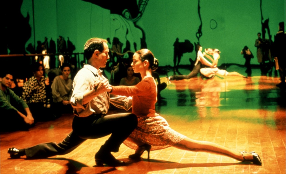
In 1998 Spanish director Carlos Saura, active since the 1950’s, released Tango (original title: Tango, no me degas nunca), a musical film about the personal and professional struggles of Mario Suárez, a theatre director in Buenos Aires. Suárez’s work on a tango musical brings the young woman Elena in his life, but Elena’s boyfriend, the shady Angelo, threatens to jeopardize the musical and much more.
The film was presented at Cannes Film Festival and was nominated for Best Foreign Film at the 1998 Academy Awards; its score was held by veteran Lalo Schifrin, and the photography by the legendary Vittorio Storaro.
Storaro, along with his son Fabrizio, has dedicated his recent years of work to the development of Univisium, a 2:1 film format that could ideally be used by movies and TV alike. Tango is one of the works he has employed this aspect ratio, although some theatrical releases have been converted to a more usual 2.35:1.
In Storaro’s plan, the 2:1 format could unify all releases of cinema and TV. As of 2016, ten films have been filmed using Univisium and the ratio of 2:1 has been also utilized for the TV series House of Cards and Transparent.
9. The Grand Budapest Hotel (2014)
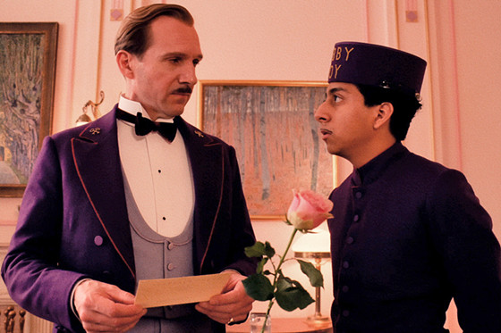
Wes Anderson’s most recent work takes place mostly in 1932, but has actually three framing devices: the movie begins with a young woman reading a 1985 book, in which a writer talks of a hotel stay he had in 1968, during which he listened to a story narrated by the hotel’s owner: this story is the main narration of the movie.
Wes Anderson’s peculiar style and sense of aesthetics have gained him a large cult following, as well as cultural recognition; in this 2014 film he dealt with the themes of adventure, nostalgia and the passing of time.
Appropriately, he decided to employ a specific aspect ratio for every timeline in the movie, starting with the main one, set in 1932. For this section of the movie he used the Academy Ratio (1.37:1), the standard for movies after the 1.33 ratio (4:3) had to change to make space for the sound strip on the film roll. For the scenes of the movie which are set in 1968, in the declined Grand Budapest Hotel, the ratio is of 2.35:1 (the classic Cinemascope ratio), while the modern scenes feature a 1.85:1 ratio.
By making this bold filmmaking choice, Wes Anderson emphasized effectively the difference between the timelines, and infused the appropriate atmosphere to the various sections of the movie, especially the 1930’s one, which is potentially the farthest from the modern spectator’s sensibility.
10. Mommy (2014)
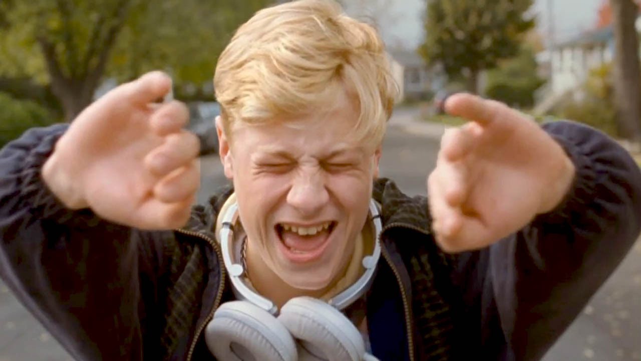
Xavier Dolan was only 25 and had already directed four movies when Mommy came out in 2014. Dolan, a Canadian former child actor, began his directing career with the deeply autobiographical I Killed my Mother (J’ai tué ma mère), which got praise for the indisputable raw talent of the director, but also struggled commercially for distributing reasons, as did Dolan’s next three films. Mommy was his real breakthrough, being presented at Cannes Film Festival and winning the Jury Prize.
As his previous works, Mommy tackles the themes of obsession and Oedipal complex, in this case by telling the story of the extremely troubled Steve and his single mom Diane.
The film was shot with a very unusual 1:1 aspect ratio (a perfect square), which was chosen by Dolan in order to convey the intimacy his drama needed. Inspired by LP covers, he said that this aspect ratio would “have the audience look the characters right in the eye”; another advantage was that in two crucial scenes where the story becomes more hopeful he had the chance to underline this story turn in a visual way, by enlarging the screen to 1.85:1.
After its theatrical release, the movie was made available on streaming services; when in January 2016 Dolan learned that Netflix UK was actually streaming his movie in widescreen he promptly wrote a letter (and tweeted it) complaining about how the original 1:1 ratio hadn’t been preserved.
Netflix UK soon responded and fixed the problem; this controversy, not unlike the one sparked by the correct aspect ratio of Kubrick’s Barry Lyndon, shows how crucial the technical role of aspect ratio is to directors and fans alike, and how its choice is a fundamental step in giving a movie its identity.
Author Bio: Riccardo Basso is an Italian cinephile specializing in Humanities and Philosophy. He has only recently started writing about his favorite interest, cinema, but wishes to continue doing it (just don’t tell his cinephile friends he has seen every 007 movie at least three times).