5. The Knick
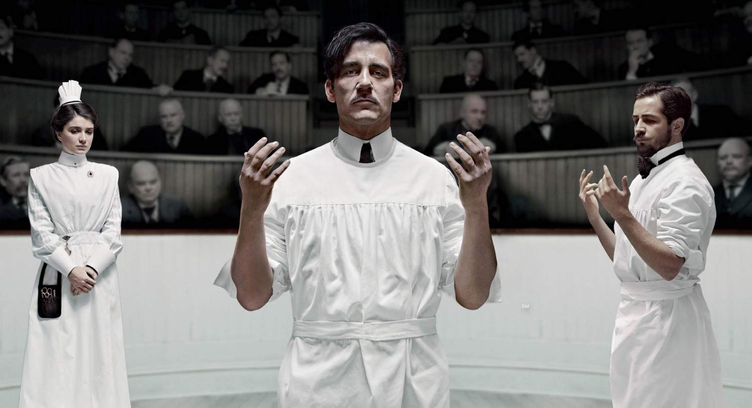
This very recent series that has been thus far exclusively directed by Steven Soderbergh is already putting to shame its peers in both the historical and medical drama genres after a mere two seasons. The remarkable respect of every infinitesimal facet of a scene relating to historical or medical accuracy is unlike anything that has been exhibited in feature films of late.
Dr. Stanley Burns, the medical consultant for the show, was quoted saying that after the actors’ committed training, he “would trust them to suture [him]”. Likewise, in cases where modern medicine is inconsistent with practices of the time period of the setting, little to no mistakes are made in identifying them. Such responsibility is the sort of integrity that all filmmakers should offer their audiences.
As far as the content of the frame is concerned, Soderbergh takes example from his highly efficient predecessors in the TV trade through the clever placement of a camera so that a simple pan can replace several cuts that waste the editor’s time, tracking oners that provide charismatic chaos or eloquent suspense, or closeups that actually demonstrate a doctor’s work as opposed to dishonesty for the sake of censorship. This contributes film form that is mature as well as alluring.
Many spectators, critics, and producers agree that with all the tours de force to be broadcast in the last dozen years the world has been witness to the new Golden Age of television. The fact that The Knick is a new installment in this era is relaxing evidence that things are looking on the up and up for the industry.
4. House of Cards
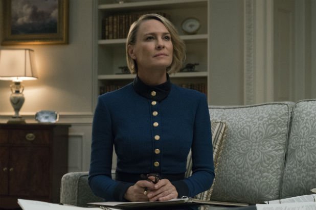
David Fincher’s political drama starring Kevin Spacey and Robin Wright revolves around what is likely to be remembered as the greatest power couple to ever be uploaded to the Internet. Frank and Claire Underwood are a chilling representation of the governmental process in the United States that former President Bill Clinton (the alleged partial inspiration for Frank’s character) says is “99% real”.
It is difficult to make the argument that the cinematography of the Netflix series is responsible for its superb accuracy. However, what the direction of it is responsible for is what prevents it from being a documentary, by way of stunning aesthetic assertions throughout its many chapters.
Excluding the infamous lull that was the midsection of the second season, House of Cards has never failed to be exceedingly gorgeous in all respects of the word, twisted though its protagonists may be.
Many film critics have identified and applauded the tribute that the show pays to classical art including opera through the soundtrack, Shakespeare through Frank’s soliloquies, thematic fashion through Claire’s costuming, and even non-verbally addressing the importance that home decor has on public image through Frank’s obsession with the placement art, flowers, etc.
However, the forgery of the politicians persona is conveyed in more than just the references and homages to classical art, but also in the blocking of actors and lights in any given scene.
Many scholars of the cinema have correctly established that the quality of any particular contribution to the film form ultimately boils down to a auteur’s approach to the basic background of the common conversation.
There are many factors to consider even in such an elementary setup. Who wants what? Do they get what they want? Why or why not? Who is controlling the flow of the conversation? Once a director follows through with such a diagnostic, the job of actually filming becomes much simpler.
The directors behind House of Cards show their awareness of this fact by blocking Frank in the center of the frame with everyone else on the sides to illustrate his constant supremacy as opposed to a couple of slightly attractive over-the-shoulder shots, by kicking off the fourth season with the camera (and likewise the world at large) looking down at Lucas Goodwin to remind us of how far under the rug he has been pushed by governmental oppression. Such artistic awareness is always deserving of the label of “cinematic”.
3. Death Note
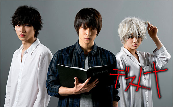
The plight of a live-action show like Breaking Bad is that there is only so much resemblance that it can have to a graphic novel without seeming hyperbolic or downright ridiculous.
Fortunately, those who work in animation do not have that dilemma. Death Note creators Tsugumi Ohba and Takeshi Obata had the added blessing of operating within the genre of anime, a Japanese style of animation that is unique and fun with the premise that the conventional is strange. As long as what in the frame is relevant to the story, characters, or theme, it works. Such an approach is the hallmark of visionary genius.
Death Note is particularly fantastic because it was written to be a fine mix of the Hitchcockian dramatic-irony in Western film noir and phenomena of ancient Japanese religion with all the proverbial lessons of both.
It follows a college student by the name of Light Yagami as he struggles with the evil that god-like power can spawn within fallen, mortal creates when he finds a notebook labeled “Death Note” that kills people whose name is written on its paper (written inside are, of course, a set of logical rules to prevent paradoxes).
The suspense of the show is derived from the nature of the scenario as well as the advanced degree of its fabrication. Without being overtly black-and-white in how themes are projected, the animators arrange drop-dead gorgeous imagery to illustrate the contrasting tone of characters and plot points in a way that live action can rarely manage without looking absolutely silly.
This is manifested through colorization, lighting, and the drawing of facial expression that (again) has the ability to be as wild as necessary simply because it can be. A cinematic freedom that only comes with animation.
2. Breaking Bad
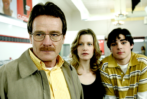
It is an almost universally accepted that Vince Gilligan and Peter Gould’s crime drama/black comedy Breaking Bad is one of the better series to ever grace the airwaves. Naturally, one does not garner 134 awards and 215 nominations for various ceremonies (imbd.com) by merely meeting a deadline.
The style and tone of the show owes a lot the brilliant resemblance it bears to graphic novels, a medium which, as many film aficionados tend to agree, is the most cinematic form of 2-dimensional storytelling.
Breaking Bad often used stark colorization and enterprising camera angles to convey a dexterous visual narrative. In fact, there are several dozen infographics that one can find online that lay out how Gilligan prescribed certain candid colors to illustrate a theme or tone, a tactic that comic book colorists use frequently.
Everyone has been in one of those awkward scenarios in which they or someone else is telling a personal story that they find to be particularly funny but when the alleged “funny” part rolls around, the speaker is the only person laughing.
This of course forces them to utter those infamous words, “Well, I guess you just had to be there to get it.” Unfortunately, the most recurrent subject of these intellectually sterile moments is the modern comedy director.
Most self-proclaimed comedic movies are directed by people who either lack the skill necessary to shoot a visual joke but still try or by cowards who are absent of the vigor to experiment. The consequence is often a film whose funnier moments are defined by dialogue (why is radio dead again?) or simply are not funny at all. Gilligan’s work was fundamentally different.
How does one make a show as dark as Breaking Bad humorous? The answer is simple, use the full spectrum of the medium’s laws.
When Aaron Paul as Jesse Pinkman has to drag a dead body up a staircase, have him act gimpy and awkward trying to get it across a level surface so when he gets to the stairs, all cinematographer has to do is place the camera on the floor angled toward the top of the steps to give the illusion of a hellish trek.
The audience has now been let in on the joke so when the body falls, they will laugh because they were there and they get it.
1. Alfred Hitchcock Presents
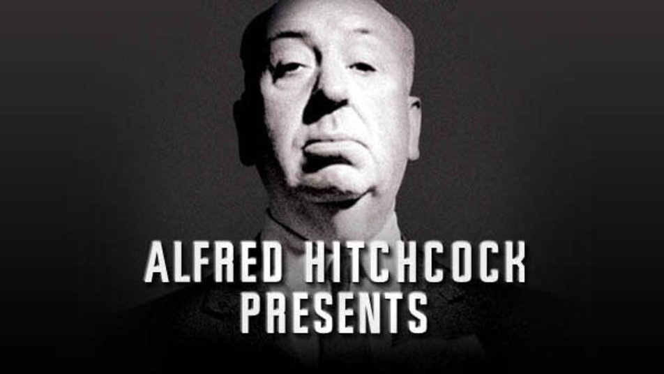
What better first installment in a list of television programs that exhibit masterful filmmaking than that which was directed by one of the most influential filmmakers to ever live? Hitchcock’s style revolutionised the craft by teaching the world that shot composition and framing technique can give any film a gift so incomparably robust that its quality as a whole is infinitely increased, that is the gift of a pulse.
Such was true of his classic TV series called, oddly enough, Alfred Hitchcock Presents. Each scene of these short films was treated with meticulous attention to details of every sort, from light placement to camera angle to the adroit blocking of actors and furniture. The resulting masterpieces were all the more dynamic due to their fair treatment as films, short though they may be.
All of the following segments are forever indebted to this first one for the exploration of possibilities of which a TV series is capable. Hitchcock was the older brother that television needed and deserved.
Author Bio: Conner is a student with a passion for films and the brilliance behind their creation. He also enjoys other arts including music (specifically classical and jazz because he’s a band geek). When he’s not watching a film or practicing his trumpet, he can be caught writing for fun, solving logic puzzles, or playing games like chess, ping pong, Magic: The Gathering, Dungeons & Dragons, or basketball in his spare time.