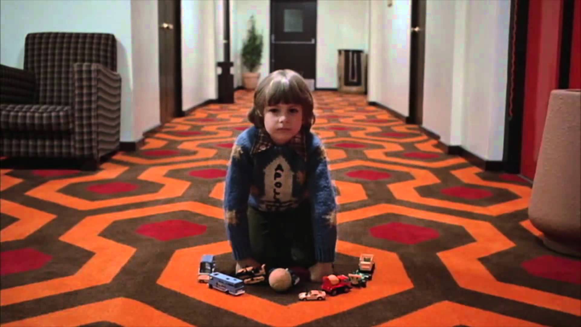
“There is no exquisite beauty… without some strangeness in the proportion.”
Evil in any form is generally perceived as ugly in nature, but the Master of the Macabre, Edgar Allan Poe, recognised that horror is far more complex than that. Today, many of the genre’s best filmmakers share Poe’s sentiment, finding beauty within the darkness of evil.
Horror is primarily designed to scare, but cinema is a visual form, one that encourages directors and cinematographers to experiment with the aesthetic of fear. Scary movies may not traditionally be thought of as beautiful or aesthetically pleasing, but some of the most stunning films ever made were born out of that initial desire to incite fear in a darkened room.
At its most effective, the beauty that can be found in horror is a thousand times more disconcerting than the most hideous of scary movies, forcing us to question why we find such depravities aesthetically pleasing.
20. A Tale Of Two Sisters (2003)
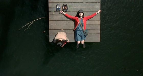
Japanese horror may have come to the forefront of Asian cinema in the late 1990’s, but Korea refined the process soon after, releasing a number of popular scary movies including Phone and Hansel and Gretel. Out of this new wave, Kim Jee-Woon’s A Tale Of Two Sisters is the most visually stunning, drawing inspiration from a wealth of dark fairytales to create a truly horrifying modern fable.
From the outset, the house where the action takes place acts as a strong visual marker, representing each characters isolation in the form of a breathtaking physical expanse. However, what truly sets A Tale Of Two Sisters apart from other Korean horrors is Jee-Woon’s bold use of colour, symbolising the mental state of each family member at specific times throughout the film.
Jee-Woon achieved this striking effect by placing different colour cloths over the lighting props, imbuing the film with a shade of purple for the stepmothers room or green for the sisters. As one would expect with a horror film of this nature, red also features prominently, suffusing the physical space with a constant sense of dread that entrances as much as it chills.
19. The Haunting (1963)
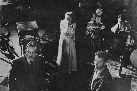
In the wake of films like Saw and The Human Centipede, it’s hard to imagine horror relying on anything but visceral gore and jarring music to produce scares, but trust us; there really was a time when horror primarily utilised the power of suggestion to create something truly frightening.
The original version of The Haunting is a prime example of this, expertly using shadows and open spaces to suggest the existence of apparitions where none can be found. Encouraging audiences to fill in the gaps forced viewers to imagine an evil far worse than anything the filmmakers could have put on screen themselves.
However, none of this would have been as effective in the wrong location, so it’s fortunate that the team behind the Haunting stumbled across the beautifully chilling house that became the focal point of the entire film. Robert Wise’s tight direction brings the house to life, imbuing every looming window and spiralling staircase with a hypnotic beauty that still stands out today as one of the best haunted house movies ever committed to film.
18. Eraserhead (1977)
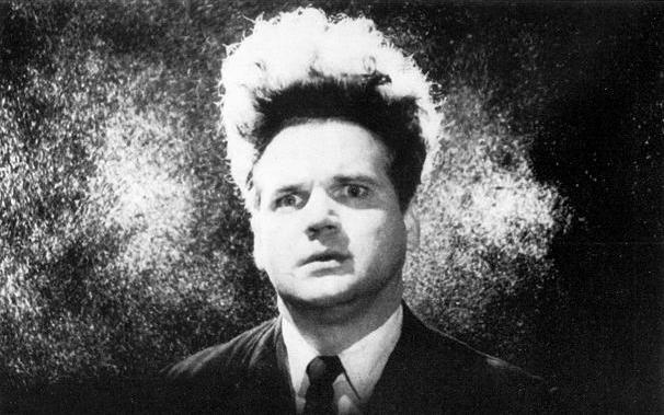
Some of the worst horror movies ever made telegraph their intent, showing and explaining far too much in a bid to shock and scare. Talented filmmakers work hard to avoid this, refusing to give away a films secrets in order to exploit humanity’s deep rooted fear of the unknown. American director David Lynch takes this approach to the extreme, filling his movies with surreal imagery that shatter mainstream conceptions of narrative structure.
Lynch’s debut Eraserhead is one of the most beautiful of all, exploring the birth of a repulsive mutant with the kind of bizarre dream logic that defies categorisation. Eraserhead is literally a nightmare brought to life, but even the films darkest moments possess a fragile beauty, one that is heightened by the monochromatic film used throughout.
More than any other film on this list, Eraserhead is a perfect representation of what Poe meant when he suggested that there is no real beauty “without some strangeness in the proportion”…
17. Cat People (1942)
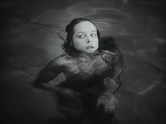
Continuing our run of beautiful black and white horrors, Cat People is unique in the way it blends film noir tendencies with moments of genuine horror, creating a cult classic that’s only increased in notoriety as the years have passed.
Shadowy backdrops may be nothing new to the genre, but the striking contrast of light and dark in Cat People was revolutionary at the time, imbuing every moment with an ominous atmosphere that gradually closed in on the central character, scene by scene.
The idea of people turning into feline creatures could have been cheesy and even atrocious if handled poorly, but Jacques Tourneur’s delicate compositions and use of a soft filter lend Cat People an eerie quality that entrances audiences willing to immerse themselves in a horror/noir classic.
16. Thirst (2009)
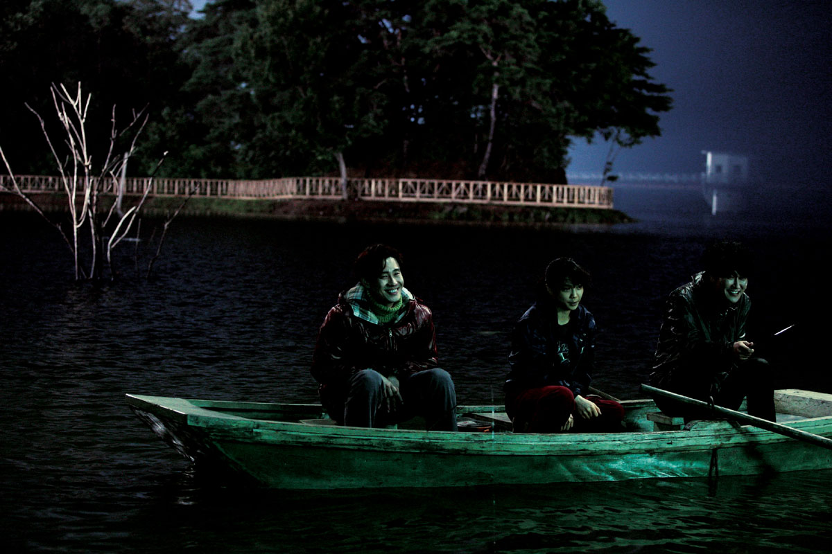
With his epic revenge narratives, Park Chan-Wook may have become the most prominent voice in Korean cinema, but its the exquisite visuals of his films that stick with audiences long after vengeance has been found and the credits roll.
As one of the oldest staples of the horror genre, vampires are difficult to portray on film without inevitable comparisons to Twilight et al, but Chan-Wook took huge strides to revitalise the creatures of the night with Thirst, a lucid fever dream that invokes religious symbolism and crisp cinematography in innovative new ways.
Chan-Wook has always been first and foremost a visual filmmaker, but Thirst contains some of his most memorable imagery yet, including the vampires glaring white room and repeated use of symmetry, bringing order to the chaos of this supernatural world.
15. Don’t Look Now (1973)
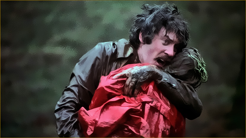
As one of the definitive films of the 1970’s, Don’t Look Now transcended the limits of the genre, securing a permanent place in cinematic history for its emotionally wrought performances and captivating visual style.
Even the most amateur filmmakers could make a beautiful horror film in The Floating City, but director Nicolas Roeg never takes the easy route, deliberately portraying the seedier elements of Venice to heighten the fragile emotional state of the films grieving parents. The remarkable architecture is just as beautiful as ever, but Roeg strives to show every facet of Venice, paying equal attention to the dilapidated areas of the city that are gradually crumbling away.
Don’t Look Now is also unforgettable for its vivid use of red, which acts simultaneously as a potent symbol and a key plot device during the parents search for their daughter in Venice. The prevalence of red in a horror film is hardly something new, but Roeg set the standard that all other filmmakers should follow, evoking primal fears that are aesthetically pleasing, yet psychologically chilling.