Set design, like any other creative department in filmmaking, can make or break a movie. It is curious, however, that unless the sets in a film are breathtaking and gorgeous, they will seldom even be mentioned.
That’s the unfortunate facet of being an art director/set designer. If your work isn’t stellar, then you’ll most likely come and go without a notice. However, what is it that makes a set great? That makes it iconic and memorable? Is it the sheer scope, the ambition, the painstaking attention to detail? Is it the illusions it creates, the way it dialogues with the characters, the color schemes and textile patterns?
It could be all of those, and more. To have a better understanding of this real of creative endeavor, let’s have a closer look at some of the finest set designs in cinematic history, both old and new.
15. The Grand Budapest Hotel
Designer: Adam Stockhausen
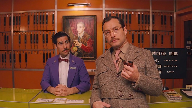
Wes Anderson’s set designs have always had a somewhat whimsical feel to them, like a strangely bizarre yet organic aura. The insistent symmetry and one point perspectives, of course, help emphasize his film’s unique atmosphere, especially when coupled with the fact that the sets are designed shot by shot, frame by frame.
Think of the intricate dolly shot in Life Aquatic With Steve Zissou, with the camera running through the ship almost as if it were a real life doll house. Anderson’s film sets, actually, look like organic doll houses brought to life. If that makes any sense.
The Grand Budapest Hotel takes this quality one step further. The light pink/magenta hue of the titular hotel, the symmetric rooms and bakeries and prisons, the way everything feels old yet well-maintained. As Hotel is set in the fictional country of Zabrowka, production designer Adam Stockhausen had to visually help create a whole world. Which means, no real life local were ever used, and everything was created on set – mostly with cardboard and tape. Even the trains and train stations.
Stockhausen argues that Anderson’s strong preference towards hand modelling (and strong aversion to using digital technology in post) adds to the idiosyncratic yet believable charm of his films. And who can deny it?
14. Pan’s Labyrinth
Designers: Pilar Revuelta and Eugenio Caballero
Guillermo Del Toro hasn’t had the most consistent of careers, quality-wise. Although he is yet to release a major bomb – either commercially or artistically -, his films have often been divisive, to put it mildly. All those things taken into account, it’s interesting to note that production and set design in Del Toro’s films are always commanded and strongly praised. Which is no surprise considering Del Toro’s background as a special effects makeup artist.
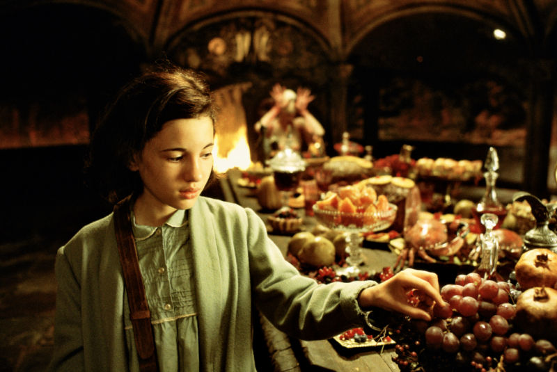
By and large, The Pan’s Labyrinth is Del Toro’s magnum opus. His darkest, most mature and ambitious work, Labyrinth is a master class in production design. Transforming the story’s recurrent theme of duality into a visual medium would seem like an arduous task to pull off, but Revuelta and Caballero used every card up their sleeves for it to work.
From the construction of an entire farm mill to the careful selection of color palette to represent the three different worlds the film is set in, Labyrinth’s sets are fantastical, beautiful and threatening. There is an ominous quality to the ambience in the film, which grows as the story advances and the villain’s fascism becomes increasingly shocking.
However, Revuelta and Caballero’s most impressive feat is creating incredible fantasy sets that feel real, organic, and downright spine-tingling. Who would ever want to venture into the Pale Man’s lair?
13. Moulin Rouge
Designer: Catherine Martin
Baz Luhrman’s hyperbolic style of filmmaking is, quite likely, a dream come true to many a set designer out there. After all, his uniquely recognizable aesthetics translate perfectly into lavish and extremely stylized sets and ambiences. Just look at his approach towards Fitzgerald’s seminal The Great Gatsby – turned into an energetic and bombastic film with designs so larger-than-life that keeping track of everything that’s going on onscreen is quite a daunting task.
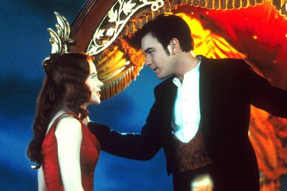
Moulin Rouge may be his most flamboyant and audacious film yet. Made in the style of big studio films from the 40’s and 50’s, Moulin Rouge ups the theatricality effect to 11, as Luhrmann wanted the film to feel “artificial (…) a place where breaking out in dance and song would feel natural”. To obtain that particular effect, Martin did a lot of research on the time period the movie is set in, so that she could create a heightened reality of what it must have been like to live in 1920’s Paris.
As the movie was entirely shot in sound stages, Martin and a large group of sculptors, model makers and scenic artists worked hard on design and decoration, even building several three-story paper-maché elephant with an Arabic-themed brothel in its interior. Watching the movie, it’s hard not to be in a bit of awe at all the details and thought put into the sets.
12. Citizen Kane
Designer: Van Nelst Polglase
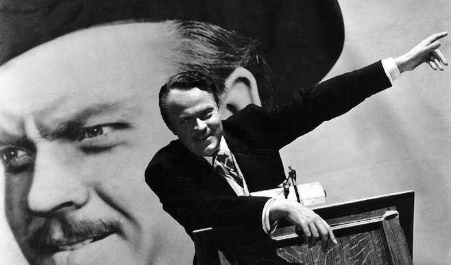
Citizen Kane was, and remains, one of the most influential and important films of all time. Introducing a vast array of innovative techniques – from cinematography to composition to montage – the film is rightly viewed as one of the greatest ever made. And the set design is no different, as its progression is fundamental in understanding the story of Charles Forster Kane.
Kane was born in poverty and died in extreme wealth. His goal in life was to do good for the common man, however his ambition deviated him from his own humanity and alienated him from all love and warmth he had during his lifetime. As Kane’s wealth grows, so do the opulence of the sets. The wood of his childhood days become cement and chiseled stone.
As he drifts further away from his wife, their breakfast table becomes longer and there are more objects between them. His political enemy’s election rally is set at a dark asymmetrical alleyway packed full of ordinary men; Kane’s election is a massive symmetrical almost 1984-like location, where identically well-dressed men sit and listen to his speech.
The sets not only help telling Kane’s story as they tell a story all by themselves. A story of contrast and progressions, of an ever-colder ambience that accompanies the protagonist’s concomitant growth and decay. To that effect, Polglase’s production design is superb, and accentuate every single detail of the movie’s narrative.
11. Crouching Tiger, Hidden Dragon
Designer: Tim Yip
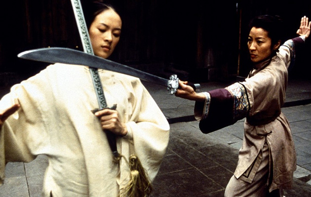
Arguably Ang Lee’s ultimate masterpiece, Crouching Tiger, Hidden Dragon is gorgeously built. From cinematography to costumes to fight choreography, the movie feels almost like a classical ballet or Chinese opera, with its sense to warranted poetry and theatricality. And much of that is due to Tim Yip’s extraordinary set designs.
Yip was born in Hong Kong and worked extensively in theatre and stage design before trying his hand with film. In the Chinese film culture, there is no clear distinction between set and costume design, both departments are seen as one.
In Yip’s work, that lack of distinction is apparent, as the costumes merge and coexist with the locations they are in, belonging to the time and space the film is set in. Crouching Tiger is a perfect example of that mindset, as the Qing and Tang dynasty costumes blend in with the large, carefully constructed sets – which always leave space and contribute to the tempo of the elaborate action sequences.
Lauded with the Academy Award for Best Art Direction, Crouching Tiger, Hidden Dragon is a crowning achievement in set design. With is beautiful scenery and incredible locations, it is an exhilarating drama and martial arts flick, which wouldn’t have the same impact without Yip’s “new orientalism”.
10. The Aviator
Designer: Dante Ferreti
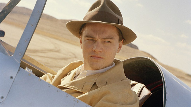
It may seem paradoxical – or at least ironic – that the most difficult periods for designers to represent in film are the most well-known ones. It all comes to popular baggage: the more people know said period, the more extenuating a task to make it look believable and inhabitable. Dante Ferreti knows that all too well, having worked with Martin Scorsese in six films set in four different periods.
The Aviator, however, was a bigger challenge. With only 12 weeks to research and build the world of one of the greatest megalomaniacs in American history, Ferreti had to work around the clock. Gathering furniture, antiques, paintings and memorabilia in LA, and then moving them to the sound stages in Montréal where most of the film’s interior scenes were shot, Ferreti was responsible for the creation of a by-gone world. And he didn’t disappoint.
From his on-point recreation of the Cocoanut Grove nightclub to his Art Déco-inspired executive offices (all painted with saturated colors to better resemble the Technicolor look Scorsese was aiming for), Ferreti continuously impresses in the film.
The production designer and his crew even went to the lengths of building a replica of Hollywood’s Grauman’s Chinese Theatre inside one of the Canadian sound stages. But don’t worry, it wasn’t full-size. It was a foot larger than the original.
9. Gone With The Wind
Designer: William Cameron Menzies
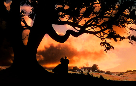
One of the most famous films of all time, it’s shocking to find out that almost all of Gone With The Wind, with its beautiful sceneries and massive locations, was shot in the backlot of Selznick Studios in Culver City. That fact, however, doesn’t take away any of the movie’s magic; instead, it adds even more to the amazing glitz and glamour of Victor Fleming’s film.
Set in the South of the United States at the time of the Civil War, Gone With The Wind is an ambitious and decade-spanning story. Production designer William Menzies was at the helm of constructing some of the film’s iconic sets, most notably the O’Hara family plantation and the war-ravaged state capital.
However, many of the film’s stunning backdrops were never built at all. Instead, Menzies resorted to a technique that has unfortunately long been lost: matte painting. As two key examples, the vibrant sunset sequences and the façade of Twelve Oaks Plantation were all hand painted and then later combined with live action shots during editing.
Menzies’ contribution to the film doesn’t reside only on the overall design. He also directed the Atlanta fire scene, when Rhett and Scarlett escape the flaming plantation at the knick of time. For the scene to happen, MGM actually burned old movie sets – including the Great Wall setting of 1933’s King Kong – for around two straight hours. Talk about commitment to artistry.