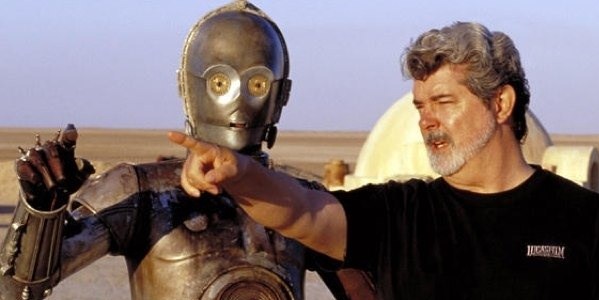
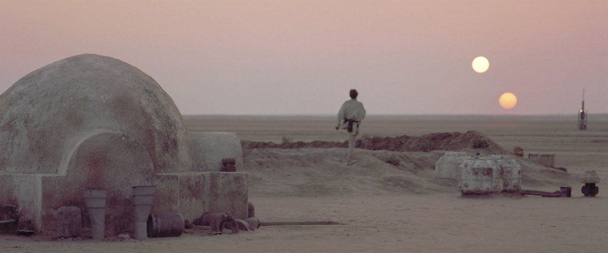
Star Wars’ artistic and technical innovations made a profound impact on Hollywood. After its release audiences moved away from gritty, violent thrillers like French Connection and The Godfather and moved towards fun summer blockbusters like Superman and Ghostbusters. Yet, despite breaking box office records, its artistic achievements are repeatedly scoffed at. The New Yorker’s film critic, Pauline Kael, famously criticised the film, writing “There’s no breather in the picture, no lyricism; the only attempt at beauty is in the double sunset.” The writer of Taxi Driver and Raging Bull, Paul Schrader, wrote “Star Wars was the film that ate the heart and soul of Hollywood. It created the big-budget comic-book mentality.”
The lack of critical praise for the Star Wars prequels has further tarnished Star Wars’ reputation. It’s important to remember that Star Wars (now known as Star Wars: A New Hope) was nominated for ten Oscars, and won six. This isn’t because it was a fun summer blockbuster that was set in space, it’s because it was (and still is) a technical and artistic triumph. It changed Hollywood because it refreshed tired styles of filmmaking. You can learn a lot about filmmaking from Star Wars, and this list acts as a guide to its cinematic achievements.
1. Editing
The first edit of Star Wars was infamously a disaster. Scenes dragged and bored the viewer with lengthy dialogue that was filled with technobabble. This was partly because Star Wars has a lot of backstory (they eventually had to make three prequels to explain it all). Lucas fired his original editor, and replaced him with a team of editors that breezed through the exposition-heavy dialogue. Instead of lingering on complexities, everything in Star Wars moves forward with energy and gusto. There’s no hanging around, and characters leap (sometimes literally) from scene to scene.
The editing in Star Wars also highlights George Lucas’ visual style. In editing, you often match similar objects when you’re ending one scene and beginning another (think of the jump cut from a bone to a spaceship in 2001: A Space Odyssey). George Lucas prefers to juxtapose imagery and ideas (e.g., white versus black, good versus evil). The first ever Star Wars wipe transition (where one shot moves over another shot, replacing the image as it goes) changes the setting from the dark backdrop of space to the light desertscape of Tatooine.
2. Costume design
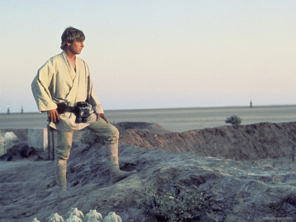
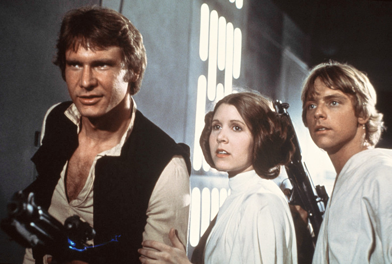
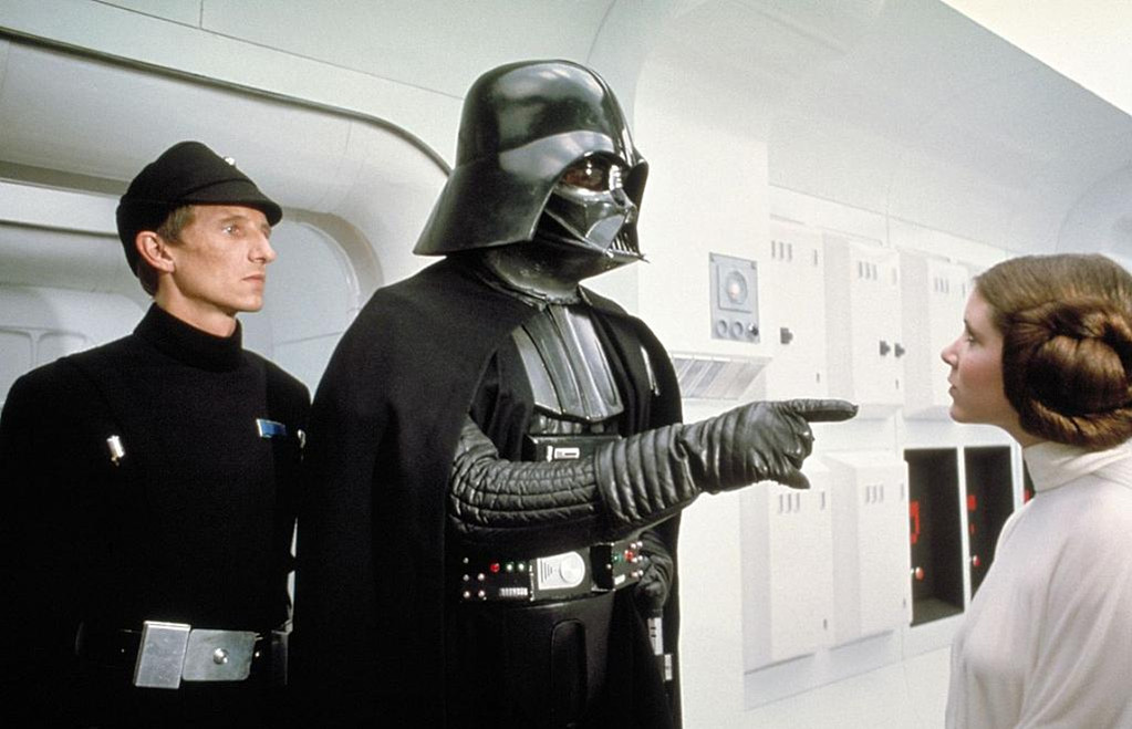
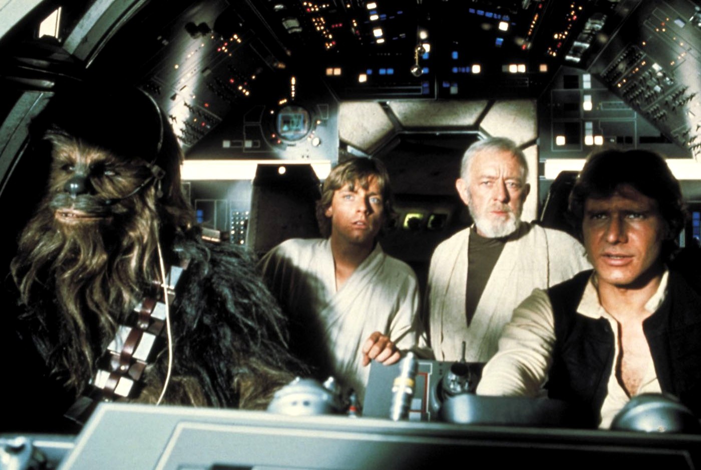
George Lucas’ penchant for juxtaposition carries through to Star Wars’ costume design. Costumes can subtly imply themes when worn by lead characters. The good characters, Luke and Leia, both wear white while the bad character, Darth Vader, wears black. Han Solo, the morally dubious antihero, wears a mixture of the two. Aesthetically, Luke and Leia have a connection; they’re both pure in their motives and perhaps, something deeper is implied (romantically, or otherwise).
3. Aspect ratio
When presented in cinemas, Star Wars has a 2.35:1 widescreen ratio. This ratio was traditionally used for epic films, and as a result the film was photographed so that it would feel spacious and grand, like a western. The vast landscape of Tunisia (Tatooine) is portrayed as sprawling and almost never ending, much like space. The film also has a very sharp, clear image – largely because cinematographer Gilbert Taylor believed that outer-space wouldn’t be “out of focus”. As a result, much of Star Wars carries an aesthetic sense of grandeur and timelessness. When it was released in 1977, it already looked like a classic.
4. Lighting
In many ways, the simple sets used in 1977 look better than the computer generated imagery (CGI) in 2005’s Star Wars: Revenge of the Sith. A large part of this is down to lighting. Real objects reflect light in a more realistic way than CGI. In an effort to light the huge (and dark) spaceship interiors, Gilbert Taylor, apparently, violently dismantled the dark Death Star sets in order to put powerful lights within the scenery. As well as successfully lighting up the oppressive set, it also allowed George Lucas to shoot from all angles without having to go through the pain of re-lighting each scene.
5. Cinematography
Star Wars doesn’t use many close-ups or extreme close ups. It also doesn’t have many extreme long shots (where a character is barely visible). Instead, George Lucas relies on long shots (which show characters’ full bodies and their surroundings), medium long shots (which almost show full bodies but feet and lower legs tend to be cut off) medium shots (which show the upper body) and medium close-ups (which show the face and shoulders, but not to the extent where the background is obscured).
The result of this is that the characters are often shown interacting together onscreen in the same shot. It quickly creates bonds and ties in a story with a substantial number of important central characters. It has the added effect of not focusing too heavily on make up, costumes and set design; the alien world is unobtrusive and unremarkable to the characters that inhabit it. The obvious exception is during the Cantina sequence; Luke walks into a strange new world and we’re presented with a montage of aliens that are weird and repulsive to the young protagonist. He’s staring at them in awe, along with the audience.
