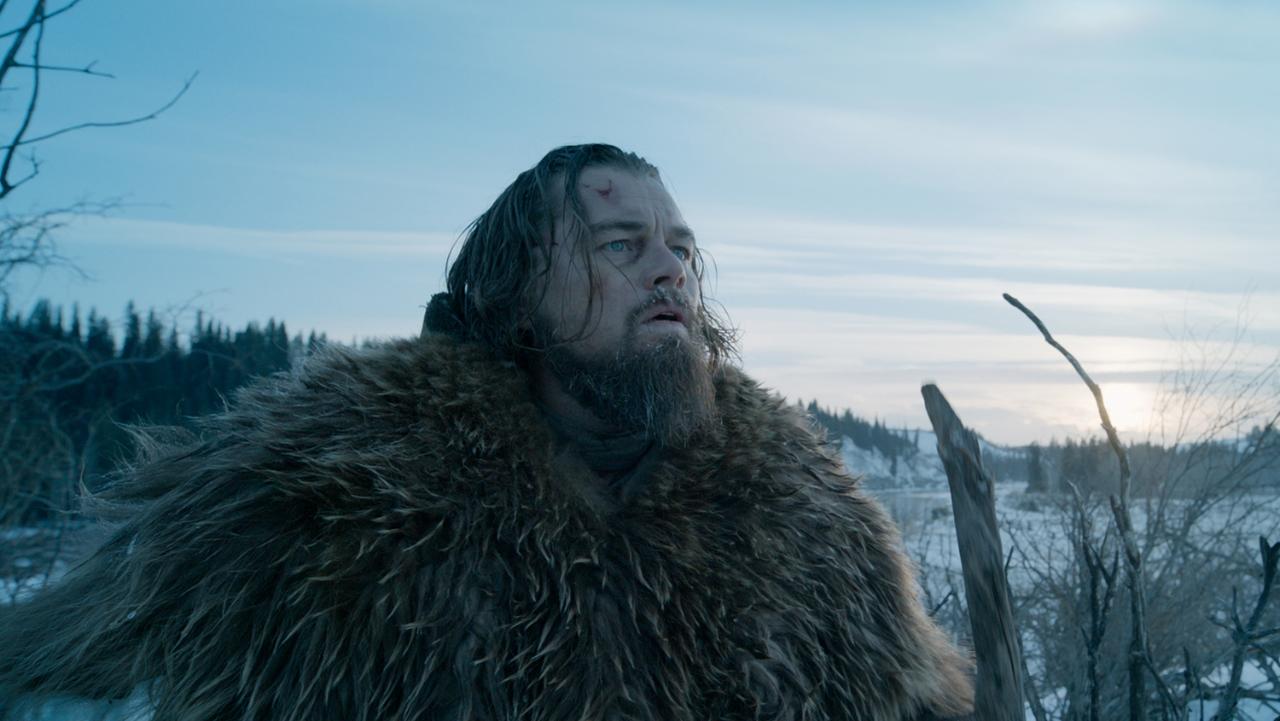
When words fail, visuals speak. That is the case of some of the films listed here, but not all. For some, the fact that its cinematography and overall scenery stand out doesn’t mean that they’re incomplete. It only shows how not too often in the film industry we get to see powerful visual storytelling.
Arguably, the cases here presented show that their final result simply wouldn’t be nearly as good if they didn’t have the amazing visuals that they do. A few names listed are established household names in filmmaking, and more specifically in cinematography. In those cases, one can only expect that their work often surpasses the quality of the rest of the film.
However, in general, the idea is to appreciate the infinite details they added, the intrinsic value they created, the techniques and miracle solutions they came up with in the making of these films.
The verifiable truth that this list includes four titles from 2015 supports the cause of how much cinema has been gravitating towards a stronger tendency to make films look better than ever. If only they had more potent narratives, in most cases, these films would immensely grow in quality. For now, let us appreciate what the visuals alone have achieved from 2010 to 2015.
Note: This list is in no particular order because there is no search for the best example out of all. Each film has different reasons for being listed here and they are all fine examples.
1. Sicario (dir. Denis Villeneuve, 2015)
D.P.: Roger Deakins
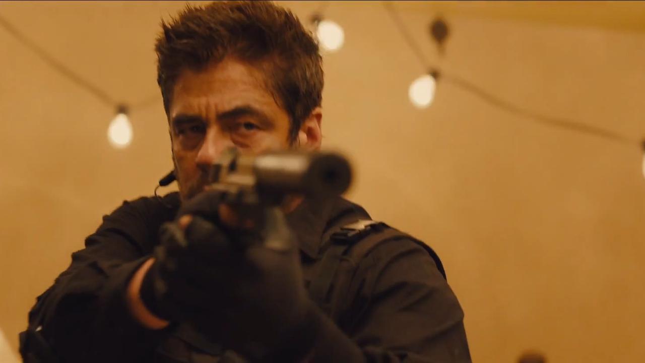
“Sicario” is cinematographer Roger Deakins’ second collaboration with director Denis Villeneuve after “Prisoners.” With an astounding 13 nominations for “Best Cinematography” at the Academy Awards, Deakins still hasn’t won.
For his most recent nomination, Deakins framed every shot with incredible precision, using the ARRI Alexa digital camera almost as an extra character. The audience becomes intimate with the action thanks to it, and the cinematographer’s work adds layers of throbbing intensity that otherwise wouldn’t be achieved.
The artistry displayed here includes creating silhouettes in the desert, embracing shadows and using as much possible natural light simply to raise tension. The Infrared shots managed to bring the audience even closer, seeing the action with the character’s eyes and experiencing the entire nightmare directly.
Something about the rest of the film explains why it’s been said to “lack a higher purpose” and “too cramped in the argument,” which is how the cinematography really stands out as its most imminent quality. Deakins is a household name for film fans everywhere, and it’s understandable that a film he works on might, most of all, underline his talent.
2. War Horse (dir. Steven Spielberg, 2011)
D.P.: Janusz Kaminski
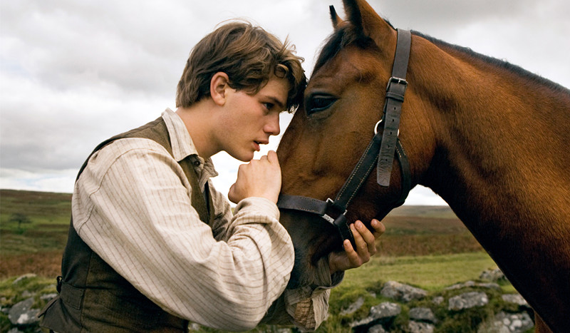
Directed by Steven Spielberg, “War Horse” is based on the Award-winning play (based on Michael Morpurgo’s book) about the friendship between a horse named Joey and a young man who tames and trains him called Albert (Jeremy Irvine) during WWI. Polish-born and Oscar-winning Kaminski has an impressive career, having shot all of Spielberg’s films since 1993. He prefers film to digital for the sole belief that it produces a better image, yet doesn’t dismiss that shooting in digital gives him more “ownership of the image.”
While a few moments are unequivocally a combination of director and cinematographer, this film is a rare variation of anything else they’ve made so far. Purposefully old-fashioned in style and shot mostly on exteriors, the feature allows the audience to fully appreciate the environment around the characters, using natural techniques.
With five minutes to shoot the sunset, Kaminski risked it, the same way he risked in locations all over England using a complete lighting kit and a camera package from ARRI Lighting Rental and ARRI Media. The dare went on to almost completely exclude CGI and shoot widescreen to play up the landscape of Devon, aiming to turn other similar shots as part of the story.
Of course, the most important part of the film, and the reason why its visuals stand out is its central character: the war horse. The horses had to be constantly lit, and the filmmakers had to place the light in correct positions to make their skin reflect the light to make glints in the horses’ eyes noticeable. Making the horses stand out from the rest of the environment was a goal, and they had to have this unique look.
One of the few opinions of this film’s cinematography remain that the first scenes have strange lighting, and this is because Kaminski wanted those scenes were meant to suggest innocence, so the lighting was more idealized, with deep blue skies and white clouds, and the actors were front-lit so to appear glorious against the landscape. This film, albeit a nice film, is live photography at its best, with the luck of having John Williams to orchestrate it.
3. Ida (dir. Pawel Pawlikowski, 2013)
D.P.: Ryszard Lenczewski and Lukasz Zal
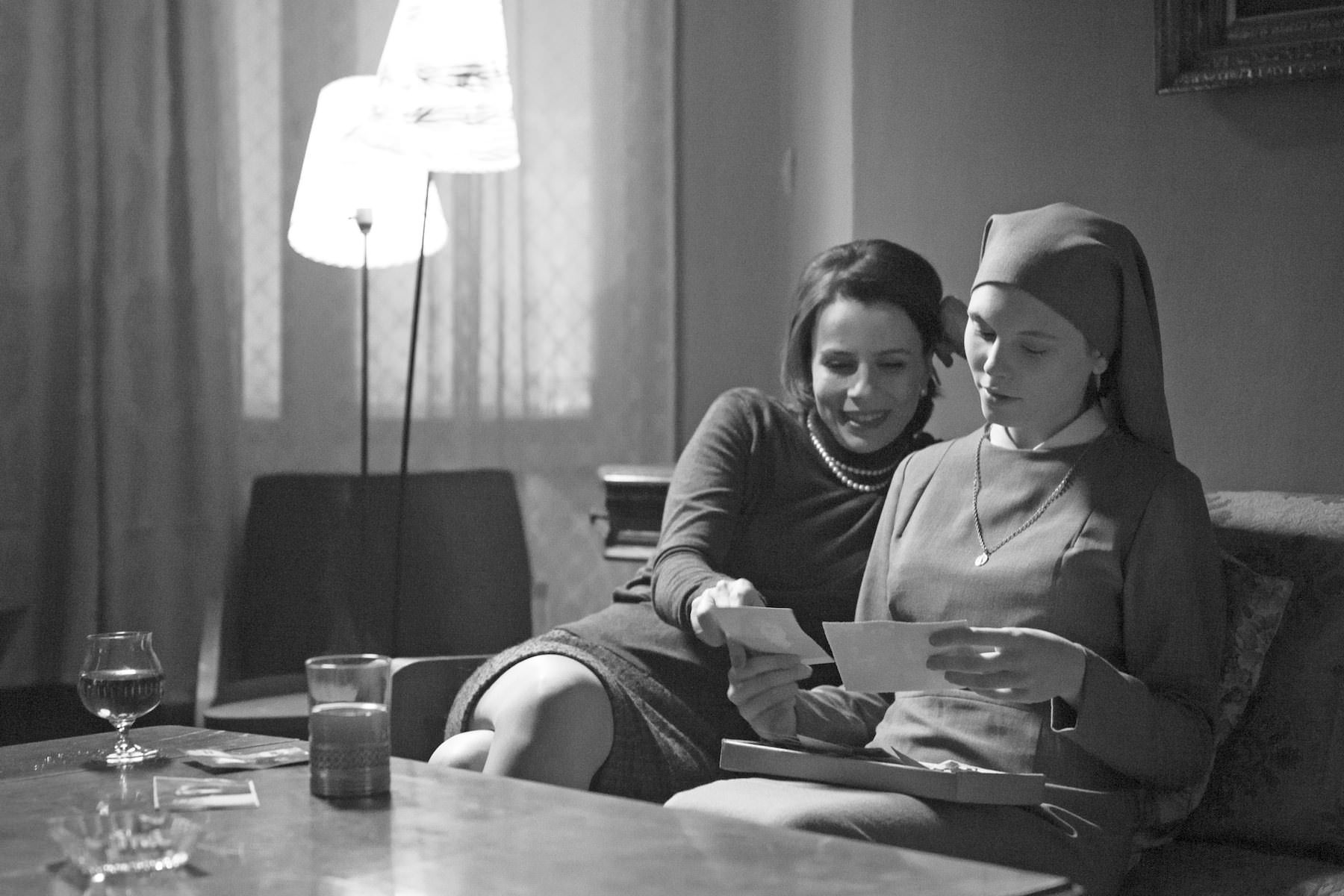
Unlike other films on this list, “Ida” stands out because its cinematography is its major storytelling medium. At first, veteran DP Ryszard Lenczewski took about 3,000 stills in the countryside to find a way to better express loneliness and nostalgia, therefore setting the tone for the film. However, Lenczewski became ill and was replaced by camera operator Lukasz Zal after 10 days of shooting, and Zal was promoted to DP.
There wasn’t enough time for rehearsals or changes, so they stuck the director’s intent to make a “photographic” film in which the camera hardly ever moves. For this to be achieved, 90% of the film was shot on a locked-off tripod in order to capture exquisite static frames.
The cinematography is part of the film’s statement, revealing something about the lead character with each new shot. Shooting in black and white in the very demanding 4:3 format allowed the filmmakers to capture the state of mind and the drama without spoken words.
It was fundamentally relevant to the director, Pawel Pawlikowski, to get rid of ornaments and make it as simple as austere, with soft lights and avoiding sunlight altogether.The elimination of color and camera movement helped keep the essence of the scene and added tension, making an expressive use of silence.
While the initial images show the main character in the lower half of the frame, conceding to empty space in the upper part to suggest that Ida’s powerless and isolated, towards the end the camera starts to move alongside her as she comes to grips with her identity.
Whoever watches this keeps expecting there’s one shot that isn’t perfect, but that never happens. The characters are small compared to the history, and this is strengthened visually.
4. Meadowland (dir. Reed Morano, 2015)
D.P.: Reed Morano
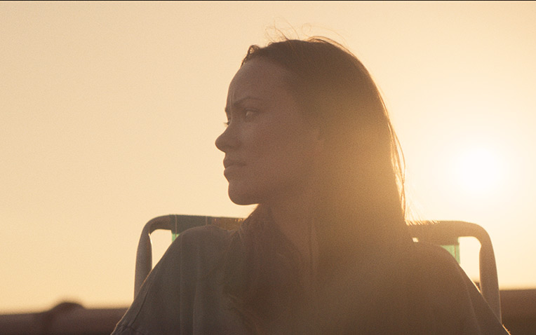
The fact that Reed Morano was also the director of this film, the entire feature can never be divided by her work as a cinematographer. Morano is one of the 14 females only to be a member of the American Society of Cinematographers (the number of males is over 300).
For her directorial debut with a female-led film, she tells the story of a couple (portrayed by Olivia Wilde and Luke Wilson) who loses their son. Being mostly an aftermath, it’s a quiet and thoughtful piece and later dark and disturbing, which gave the visuals a lot of responsibility.
While the director and D.P. herself has said that the film is “not focused on the visuals,” the cinematography worked so well with the story because the camera was actually a tool to tell stories. It was a fairly spontaneous job, allowing her to not overthink the cinematography and strictly stick to enhancing the story with it.
This led to the use of handheld, because there wasn’t a dolly or a Steadicam to use, and this approach led to the audience being as close to the characters as possible, as a documentarian would. Morano is in every scene, physically, participating in some way or another.
Originally, she hoped to shoot on film, but with very few days to complete the film, it wasn’t a viable option. She used the Alexa Plus to shoot wide open, not just for having a very small lighting package but for some powerful aesthetic reasons, too. These visuals stand out because they make the story and the lead us through it – the camera is the narrator.
5. The Secret Life Of Walter Mitty (dir. Ben Stiller, 2013)
D.P.: Stuart Dryburgh
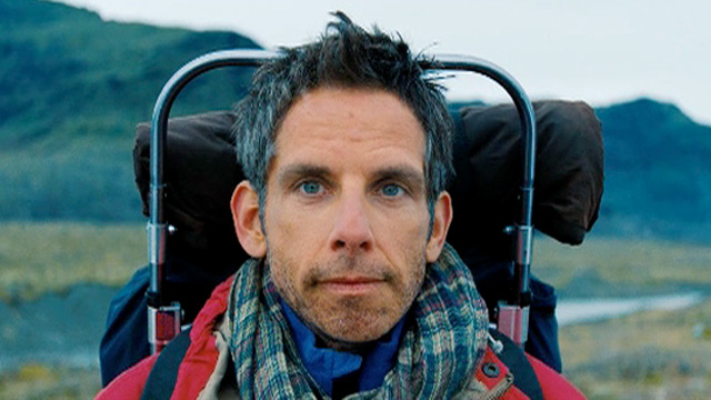
Ben Stiller directed and played the main character of this latest take on James Thurber’s 1939 short story, although Stiller has said that this is more of a remake of the 1947 version than the original story itself. This is further reinforced by its striking cinematography, which made it its own modern narrative come to life.
Natural lighting was a definite element, as much of the film is based outdoors – yet in many indoor scenes the lighting is largely between high and low key. Stiller and Dryburgh shot “Walter Mitty” entirely on celluloid, unlike most big-budget recent Hollywood productions.
Dryburgh worked closely with the art department, from the 60s workspace design to the cool color palette employed, generating a range of gray hues. All of Walter’s actual adventures contained more color saturation and bigger contrast, shooting on location in Iceland – a country appreciated by the DP for its natural rich greens, dark browns, and clear blue skies. The rest of Walter’s destinations were also shot there.
He chose Kodak film and shot the picture on Arricam SP and LT cameras, using Hawk V-Lite lenses to make the powerful but very minimalistic landscape shots. This helped create a stronger effect, along with the score. There’s no doubt that the film is interesting, its characters likable and the adaptation well-done, but the cinematography makes it far more enjoyable and inspiring.