The connections between film and other forms of visual art including drawing, painting, and sculpture are limitless. Line, shape, form, color, texture, value, and space are the building blocks of art. All artworks, including film, utilize these elements to convey their message, but some works articulate elements in an especially poignant manner.
The following list includes seven films that best embody individual elements and three films that combine two elements harmoniously:
1. The Third Man – Line
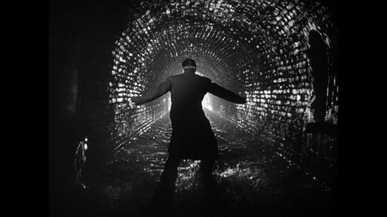
Carol Reed’s The Third Man (1949) tells the story of Holly Martins (Joseph Cotton), a pulp fiction writer who travels to Vienna. Upon his arrival, Martins begins to examine the the mysterious death of his old friend, Harry Lime (Orson Welles.) The Third Man opens with a zither’s strings zoomed into semi-abstraction. These strings establish the important role that line plays in the film.
Vienna is illustrated as a complex system of lines, much like the lines that compose The Third Man’s iconic Ferris wheel. Emphasis on perspective lines draws attention to Vienna as a crucial element in the unfolding plot.
Dating back to the Renaissance period, painters have used perspective lines to create the illusion of depth. The Third Man uses the lines of the landscape to retract to a clear vanishing point. The perspective lines of the film continuously emphasize distance, in a physical and emotional sense, between characters.
The logic centrality of Renaissance perspective is rejected in The Third Man’s canted angles. Canted angles create diagonals that emphasize Vienna’s unstable atmosphere. Minimal camera movement serves to push importance onto the bazaar angles. The city’s lines work as an obstructive force to Holly, an outsider.
As Holly navigates down a crumbled set of public stairs to escape an angry crowd, it is to be questioned which force is working more strongly against Holly, the people of Vienna or Vienna itself?
The film’s conglomeration of lines, often with no clear horizon line, are as confusing as an M.C. Escher painting. The utter lack of spatial orientation conveys the confusion that an outsider like Holly experiences.
2. Ballet Mécanique – Shape

Fernand Léger brought together the principles of Cubism and Purism in his work as a painter. Léger studied of form while taking direction from bourgeoning technology and machines. His film Ballet Mécanique (1924) is a dreamlike sequence of events.
The film juxtaposes the tools of daily life, including wire whisks and copper pots, against humans in a machine-like fashion. The precise lines that compose machinery’s clean shapes are contrasted against the organic human form. The structure of daily life is examined in a dance of the recognizable and distorted.
In the opening and closing sequences, a figure resembling Charlie Chaplin is presented. While holding some human features, the figure is composed of two-dimensional shapes and moves like an automated machine. Léger also employs a motif of rapidly alternating two-dimensional circles and triangles in Ballet Mécanique.
The illusion of movement is created through this rotation of shapes. The machine-like quality given to basic geometric shapes reinforces the Purist practice of emphasizing machines’ precise and high functioning lines and design. Léger and artists of his time explored the mechanical world, and its relation to humans, through their work. They were both captivated and disillusioned by technology.
Through animation, geometric shapes take on both human and machine qualities. Léger continuous breathes life into sterile and linear through movement. Shapes and the tools of daily life play the role of dancers as they rapidly move, creating a ballet.
3. Man with a Movie Camera – Form
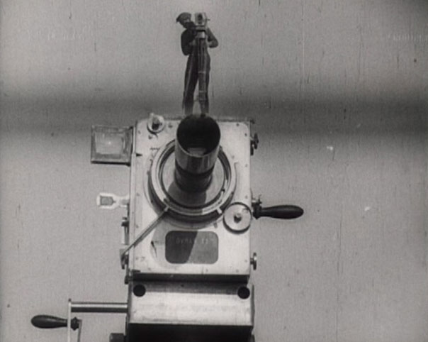
In Dziga Vertov’s Man with a Movie Camera (1929) a cameraman (Mikhail Kaufman) records the daily functions of a city and its citizens. The film is composed solely of imagery, void of intertitles, dialogue, and character development. The visually driven film celebrates contemporary city life and the forms that compose it.
Just as the Cubists showed multiple views of a form in one image, Man with a Movie Camera encompasses the entirety of a dynamic city in one composition. In the beginning of the film, the harmonious choreography of the city is illustrated through a series of shots of the city’s inhabitants asleep while dually showing the quiet city streets. An idea is illustrated with out the use of words or intertitles, merely forms.
Fast pace of the film allows for juxtaposition of images and ideas. The forms of the film match each other shot to shot. For example, the circular motion of threads moving on a sewing machine mirrors the circular form of a smokestack.
This juxtaposition shows that the city functions as a whole harmonious form across professions, from service to industry. Form-matching is a prominent device used in the film to illustrate the city’s synchronization to the audience without the use of words.
4. Three Colors Trilogy – Color
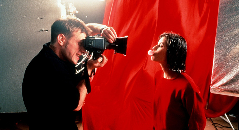
Ambiguous connections are strung together through love, loss, and breathtaking cinematography in the Three Colors Trilogy. Directed by Krysztof Kieślowski, the trio of films are named named after the colors of the French flag; blue, white, and red. These colors serve dually as motifs and symbols throughout the trilogy.
Cinematographically, the films’ shots are saturated with the colors of their titles. The beautiful heroines of each film (Juliette Binoche, Julie Delpy, and Irène Jacob) are often shown under the tinted light of the respective colors of the French flag.
These characters, along with White’s Zbigniew Zamachowski are driven by what the colors represent in relation to the French flag. During the French Revolution, the colors of the flag represented central tenets, liberty, equality, and fraternity. In Blue, after Julie (Binoche) loses her husband and daughter she must liberate herself to start anew.
In White, Karol (Zamachowski) seeks to gain power equal to the power that his ex-wife wields over him. In the final chapter, Red, Valentine (Jacobs) fosters a fraternal connection to an ex-judge (Jean-Louis Trintignant.)
The trilogy encompasses tragedy, comedy, and romance, while fighting against the boundaries of genre. The films are guided by their seemly disconnected characters and their motivations.
Just as blue, white, and red are individual colors that compose a meaningful whole, the French flag, the superficially disjointed stories of the trilogy are woven together to form a complete illustration of the human experience.
5. Picnic at Hanging Rock – Texture
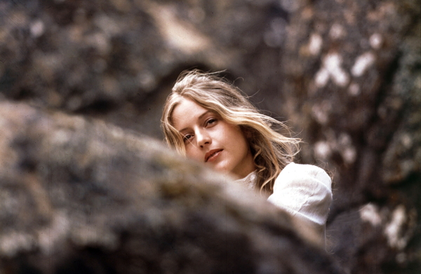
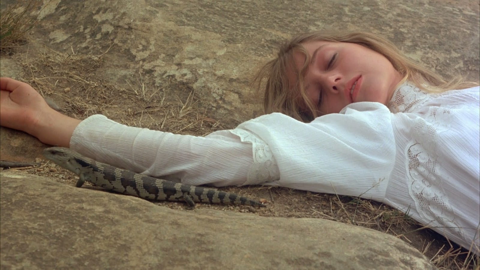
Picnic at Hanging Rock (1975) is Peter Weir’s adaptation of Joan Lindsay’s novel of the same name. The film centers on the disappearance of four girls at the mysterious Hanging Rock on Valentine’s Day.
For over forty years, the angelic quality of the schoolgirl’s lacey costumes has inspired the world fashion. The fixation on the characters’ gauzy dresses and the characters’ lack of clothing contributes the film’s sense of fetishism.
As the girls wander around the rock during their school trip, their delicate costumes are juxtaposed against haunting circumstances. The overall whiteness of the costumes and brownness of Hanging Rock establishes color consistency that works to emphasize texture
. The jaggedness of the rock contrasts the softness of the girls’ dresses as they weave through the rocky maze. Fear is found in what is not soft and approachable, the rock. Hanging Rock encompasses the fears of all those who lay a hand on it and feel its foreboding roughness.
The delicate texture of the dresses serves to reinforce the feminine nature of the pubescent girls and the semi-eroticism of the film. Texture evokes a sense of tactility. The mist, lace, and greenery that are key to the film’s cinematography all allude to familiar and seductive feelings.
The audience desires the physicality of the landscape and characters on their hands. However, everything in Picnic at Hanging Rock is an illusion, both in the sense of false tactility created and any kind of resolution imagined.