Criterion Collection is art in every department,sometimes a beautifully designed cover made me buy it.Reading those backstories of the creating process is like watching a making-of documentary,very inspirational for those professionals and very interesting for amateurs like me.It is not easier than picking top 10 films in the collection,and this list only represents my very own taste of art and design.
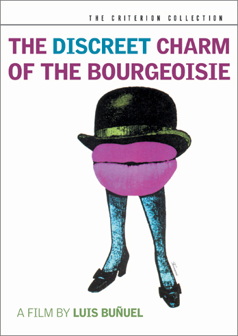
#10 The Discreet Charm of the Bourgeoisie
This is not a visually stunning cover but just matches the story and the style of the film perfectly.I like the “hot lips” in the middle,the big mouth does not get fed up in the film and probably never will.
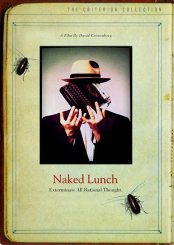
#9 Naked Lunch
When you watch a David Cronenberg film,you know there will be something pretty gross,and what animal on earth could be grosser than cockroaches? The reason I like this cover is because those little dirty creatures look so alive,you will not want to watch it after dinner I assure you.
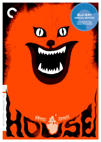
#8 House
Both CC and MOC released this film in 2010,but CC’s cover is much more terrifying,it beats MOC’s by a mile.There are many weird things happen in the House which may bring you the mood,but this blazing cat really works for me.
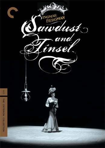
#7 Sawdust and Tinsel
Bergman’s film is always precisely framed,so is this cover.I like the hanging lamp,I like the font of the title and I like the crown over Bergman’s head.
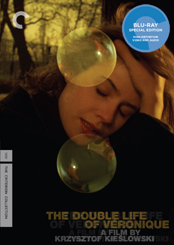
#6 The Double Life of Véronique
What I like about this cover is Irene Jacob’s beautiful face and her look,just like looking through the camera’s lens.The idea of the two bubbles is brilliant.
#5 The Bad Sleep Well
This is the most delightful cross I’ve seen on a paper.It is just like some good shots in a film,a frame of image can tell thousands words.I have heard of that the cross marks the wrong position on this cover,anyone else think so?
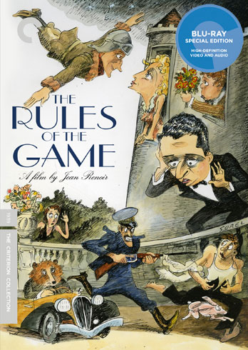
#4 The Rules of the Game
The old cover brings all the characters on the cover,which is a must.But the new one emphasizes the chaos in a very funny way.Some may argue that the bear is drawn more like a fox?
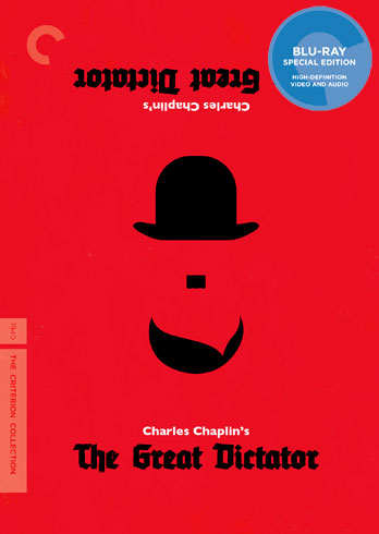
#3 The Great Dictator
There is a rumor that Hilter’s moustache is a Imitation of Chaplin,it may not be true,but the smart use of this resemblance and makes it into a mirror image is simply brilliant.
#2 Sullivan’s Travels
Veronica Lake’s hairstyle is the trademark of this classic comedy,and the designer made the best use of it.I don’t think you can ever forget this blonde after seeing this cover.
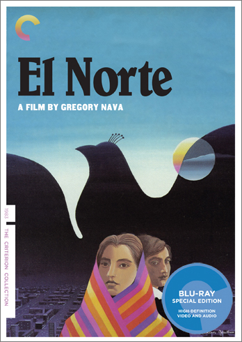
#1 El Norte
For me,this is not a dvd cover,it’s more like a painting of some great painter.It is the most comfortable cover I’ve seen in this whole collection.
I’d really like to know you guys’ taste,leave a comment,thanks.
