6. Colour Scheme
Mr Anderson is a man who knows his colours. Not something to be boastful of on it’s own but when used to channel such a wonderful artistic vision, a strong understanding of palette can make a film. There is a nice Tumblr page (as mentioned Wes Anderson inspired zeitgeist is everywhere) which lays out the colours at work in various stills taken from the Anderson filmography.
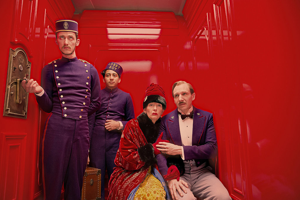
The Grand Budapest has arguably the strongest, most visually pungent (in a good way) colour palette. The interior of the Hotel itself is not dissimilar to that of The Shining’s, with appropriately grand shades of red and the more regal shades of eggshell. (It’s probably eggshell) A lot of the exterior shots of the Hotel and the outfits fall under a combination of pinks, purples, and the more pastel blues. The use of colour and the money behind the set design, produce a result probably worthy of it’s own art film (and at least a “making of”).
What makes Grand Budapest Hotel’s colouring most distinct from that of the back catalogue is that the purple is particularly attention grabbing. Where Tenenbaums or Rushmore is more naturalistically coloured, arguably the progression of colours used has taken the viewer further and further away from realism. Into Andersonism I suppose? If the colours can be said to represent each new universe created, and it’s going to depend on the person, then I think Budapest is the most enticing yet.
7. Soundtrack
The soundtrack for Grand Budapest is composed by, prolific composer and Anderson collaborator, Alexander Desplat. Having worked on Fantastic Mr Fox and Moonrise previously he delivers something with less of the Pop feel we get from Mr Fox and more of the choral, classical and calming melodies of Moonrise. Also recurring is the organ and the punctuating, all used in simple yet effective ways that set the scene and mood just so.
As ever the tone and mood of the film is not straightforward and I feel the soundtrack is distinctive but one that will grow on us over time. Where Anderson has elsewhere used well known pop/rock/Sigur Ros songs, whichever film it is from immediately jumps to mind. This is one of the ways in which these films stay with you long after seeing them. But the way an original score can grow on you is possibly equally good. Quentin Tarantino and the Academy have some publicly available opinions on this.
8. Stop and Slow-Motion
If there is one thing that is a staple of why Anderson can be quirky to the extent of alienation it is his uses of stop motion animation. If there’s one thing that could persuade most people to watch his films it’s the compilation on Vimeo of his slow motion shots so look that up, it’s a treat.
But the stop motion is another matter for some. To be fair it’s jarringly unusual upon first viewing and without proper explanation of the director beforehand. It’s not that people don’t get it or that is isn’t a recognised art form, but it is its use in conjunction with live action film that is unusual and possibly a bit of a problem.
But as Anderson again has said it’s all about whether you buy into it. It is of course objective. The climactic scene of Life Aquatic required the largest stop-motion creation ever made (or so I’ve read). Fantastic Mr Fox is at least as visually impressive and funny as any Pixar movie, but made only $46 million off a $40 million budget, with Bug’s Life tripling its money on a $121 million budget. One of financial backing and mainstream appeal and most likely a mixture of both can I think explain this. It goes to show Pixar’s mainstream appeal that Bug’s Life was their lowest grossing film in their repertoire.
Yet in the same way as the other classic staples the way it flourishes in Grand Budapest is through subtlety. Rather than the more jarring effect it has in Aquatic, it is used in a way that is more cohesive with the plot and once again more accessible.
When the little stop motion cable car/train is moving up and down we know that we are going to or leaving the hotel. It is the way Wes wants to welcome you. The skiing chase scene is truly brilliant in its own right as a short comedic animation and feels totally appropriate tonally in that moment of cinema. A slight improvement for the better on the stop motion all round.
9. Screen Ratios
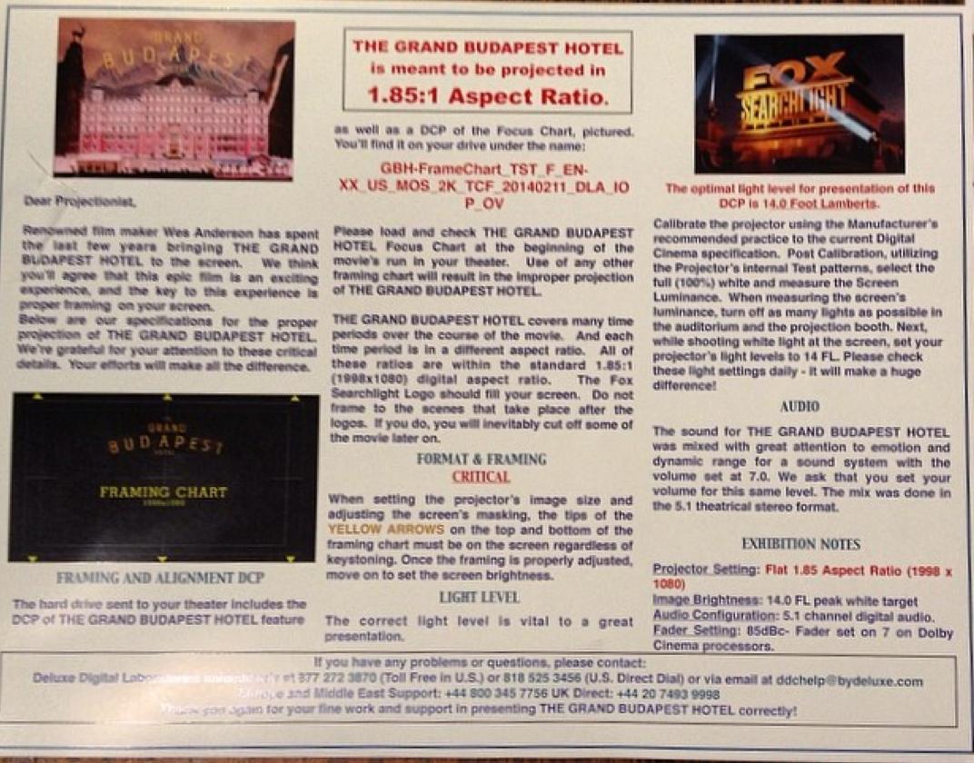
Another thing that made the promotional media for Grand Budapest so important is the new and film-geek-friendly use of aspect ratio. Anderson employs a novel use of the screen by switching between aspect ratios to signify different time periods. Geekier yet is that the different ratios correspond to relevant and poignant moments in cinema history.
This technique represents possibly Anderson’s most pronounced declaration of a love of cinema and its craft. It is amongst many other hints of the same kind to be found in various shapes and sizes throughout his work but this manages to pay homage and act as an innovative cinematic story telling tool simultaneously. One can see the logic that Martin Scorsese, director of Hugo (2011), a children’s animation that paints a golden and nostalgic picture of cinema history is a self-proclaimed Wes Anderson fan.
10. Camera Movements
As with most of the items on the list above Anderson’s use of camera movements has progressed noticeably. We have moved from the occasional use of the parallel horizontal and vertical pans of Bottle Rocket to the Royal Tenenbaums where it is used more inventively to explore and display the set. In Tenenbaums it’s the House, in Life Aquatic it’s the Belafonte, and in Moonrise Kingdom it’s BM and the ever-transforming Frances McDormand’s family home (McDormand reminding us how funny her Almost Famous-esque mother character is).
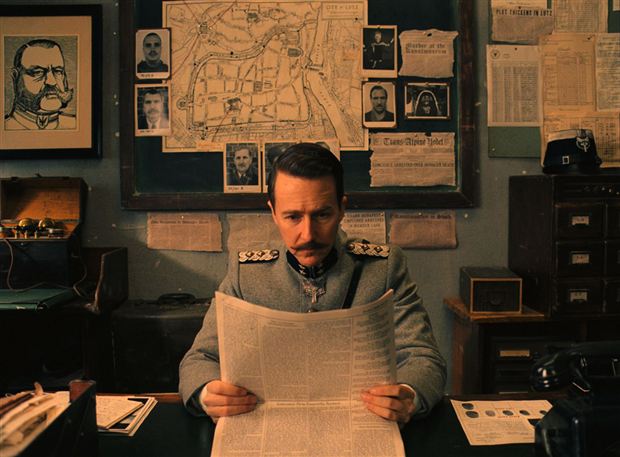
In The Grand Budapest Hotel the symmetry and shot is right in your face. But then this can be said for the violent, sexual, and casually taboo instances of the film. The camera has been well documented by journalists already as one of the ways he really has turned all his classic tropes up very high. Some higher than others but for me this might be the one he needs to mix up in his next film.
One article slightly superlatively says that Wes’ characters have forgotten how to walk diagonally. While slightly true, what would be really exciting is to see Wes ingratiate some of the new camera technology out there.
Outro
While the camera movement is heavy on style perhaps, the cutting between scenes is more musical than ever and accompanies the dialogue and soundtrack perfectly. Undoubtedly the final result of all the ingredients (and the others I may have neglected to mention) brought something joyous and clever to the screen, with that Andersonian touch of melancholy on the side. To quote Bill Murray and Wes Anderson’s first collaboration, Herman Blume, “She’s sweet, but she’s fucked-up.”
Author Bio: Matthew Wright, member of Team Zissou, and film fan. Richard Linklater, Quentin Tarantino and Wes Anderson are amongst his favourite directors. Studying Philosophy in his last year at Newcastle and looking to start film application, and blog shortly.


