14. Zack Snyder
Most noteworthy examples: 300, Watchmen & Sucker Punch
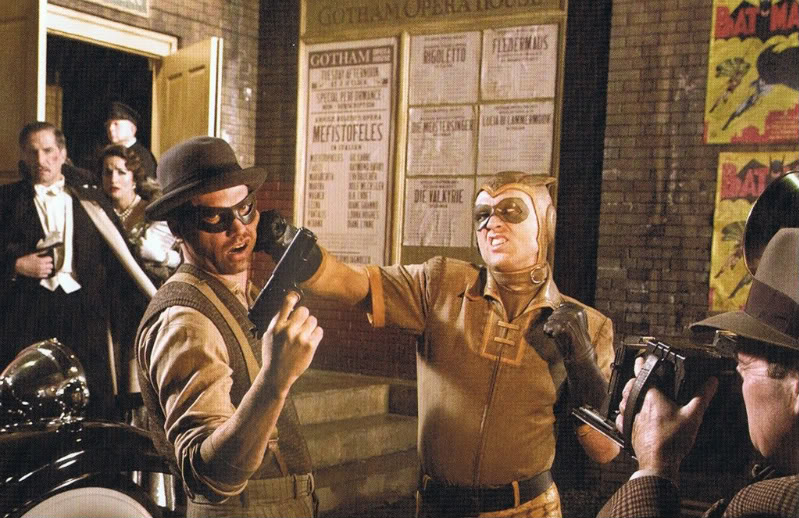
The quality of Zack Snyder’s films is often questionable but there is no doubt in anyone’s mind that the man knows how create some striking visuals. His remake of Dawn of the Dead looked nice but it was his next three movies which all made some truly impressive aesthetic choices. 300, Watchmen and Sucker Punch were all shot by Snyder’s go-to cinematographer Larry Fong, who perfectly translated the comic book aesthetic to the screen in all three cases.
These movies are first and foremost pure eye-candy, especially 300 and Sucker Punch, and presented viewers with a visual style they had never experienced before. Content is relegated to the sidelines as pure visual bravura takes centre stage. Watchmen however, whilst still suffering from some of these problems, was a very impressive, and on a visual level very successful, attempt to bring Alan Moore’s iconic graphic novel to the screen. It can be argued that it was an impossible job from the very outset but Snyder gave it his all and rarely has a comic book adaptation looked this impressive on the screen.
13. Darren Aronofsky
Most noteworthy examples: Pi, Requiem for a Dream & The Fountain
Darren Aronofsky seems to like nightmares and more importantly, he seems to know exactly how to translate them to the screen.
Whilst his debut Pi was an impressive looking low-budget feature shot entirely in grainy stark black and white 16mm, it was Requiem for a Dream, which really showcased Aronofsky’s visual sensibilities. A true visceral drug-fuelled fever dream, the movie re-teamed Aronofsky with his partner in crime, cinematographer Matthew Libatique, who would shoot all the director’s films with the exception of The Wrestler.
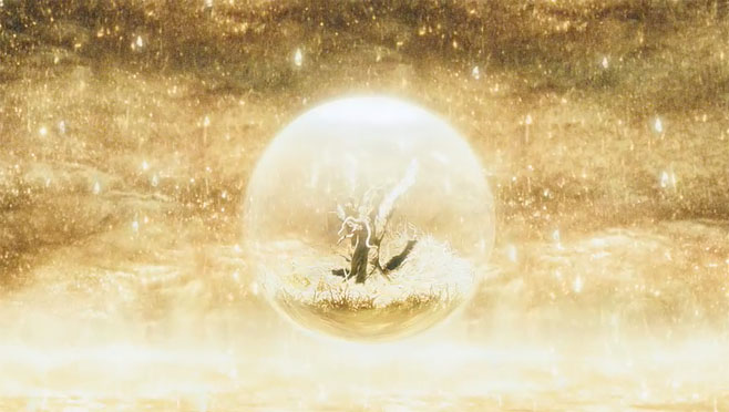
Their next film, The Fountain, was even more ambitious and is best described as a visual poem as it lacks a clear narrative and serves up an impressionistic take on existential themes. Using macro-photography and various visual motifs to explore its themes of mortality and love, The Fountain is an underrated and underseen piece of cinematic splendour. A true visual poem, The Fountain is a stunning looking film and should be seen by anybody with an interest in gorgeous visuals or visual storytelling.
12. Gaspar Noé
Most noteworthy examples: I Stand Alone, Irreversible & Enter The Void
In all honesty the most noteworthy examples given here were the only possible examples as Gaspar Noé has only directed three feature length films so far. Nonetheless they are all works of intense visual and stylistic imagery, although there is no denying that his films have become gradually more and more grandiose when it comes to sheer visual bravura.
I Stand Alone contained its fair share of cinematic trickery, including title cards, abrupt cuts and fast dollies, all framed in a deep and primarily red coloured palette but his international breakthrough film, Irreversible, took things up a notch by telling a story in reversed order in a series of long shots whilst using a frantic camera technique, which steadied itself over time with each consecutive long take, not to mention some truly disturbing special effects.
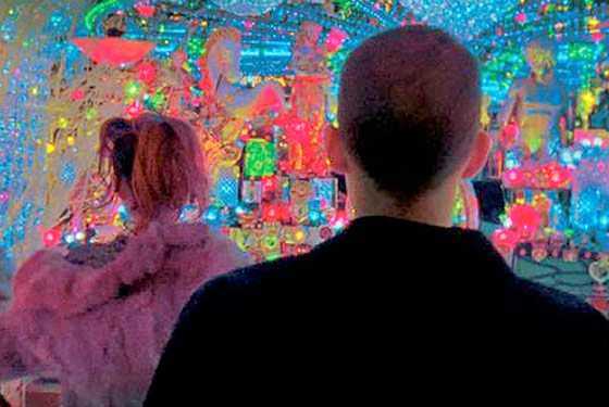
But it was his last film so far, Enter The Void, which was a true tour-de-force of hypnotic visual splendour. A movie which switches from pure POV photography to a camera perspective that hovers over a brightly neon-bathed night-time Tokyo, every shot in this film has been altered by CGI and the result is a film unlike any other before or after it. Noé’s themes and subject matter might not be everybody’s cup of tea, but when it comes to sheer technical and visual brilliance, it’s hard to top Enter The Void. A truly unique and mind-blowing piece of visual filmmaking.
11. Jean-Pierre Jeunet
Most noteworthy examples: Delicatessen, City of Lost Children & Amelie
Two of the movies suggested as most noteworthy examples here were actually made by the directing duo Jean-Pierre Jeunet and Marc Caro. They made a lot of shorts together but parted ways after two feature films and based on their output since, Jeunet was ultimately the more talented filmmaker (Jeunet was already a director of commercials when the two met, whereas Caro was a designer).
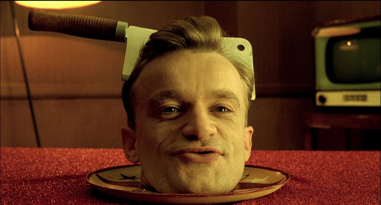
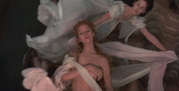
Delicatessen and City of Lost Children both burst onto the scene in the early to mid nineties and introduced the pair to the world as well as their cinematographer, Darius Khondji, who has been mentioned on this list before and who has racked up an impressive resume ever since. Both films had a highly distinctive look, the former being a gold tinted dream-like post-apocalyptic fable whilst the latter was a dark adult fantasy fairy tale, both set in highly imaginative and fantastical worlds with some very unique and distinct production design.
In comparison, Amelie, Jeunet’s greatest international hit, is relatively toned down to these earlier works but make no mistake, it is still a highly stylised fantasy in which Paris is represented as some idyllic colourful city with an almost fairy tale-like feel to it. So effective was the movie in making the neighbourhood of Montmartre look stunning, that it actually increased tourism to the in real-life not half as colourful Parisian suburb.
10. Tim Burton
Most noteworthy examples: Edward Scissorhands, Sleepy Hollow & Alice in Wonderland
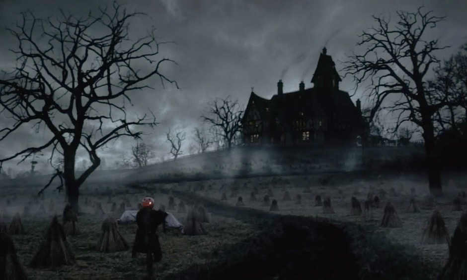
Tim Burton has managed to find mainstream success with a long string of often bizarre and always visually impressive movies. Whilst the overall quality of his films over the years has increasingly been more and more debatable, his visual excess has only grown.
Each of his films has been obvious eye-candy, often including Gothic sensibilities, starting with Pee-Wee’s Big Adventure, Beetlejuice and of course Batman but it was his first collaboration out of many with Johnny Depp, Edward Scissorhands, which really first showcased his campy aesthetic. A unique film, which perfectly exemplified Burton’s trademark Gothic visuals whilst at other times looking like a more mainstream version of a colourful John Waters’ film.
From there on in, Burton has provided us with a whole range of fantastical wonderlands of increasingly visual grandeur, especially in terms of production design and art direction. Both Sleepy Hollow and Alice in Wonderland are prime examples of this and one also has to note the various stop-motion endeavours Burton has directed or produced over the years. A director who clearly embodies “style over substance”, most of Burton’s films have done very well at the box-office and he can easily been viewed as the mainstream version of Terry Gilliam, who, just like Burton, started out in animation.
9. Terry Gilliam
Most noteworthy examples: Brazil, The Adventures of Baron Munchausen & Fear and Loathing in Las Vegas
Whilst Terry Gilliam started out in advertising in the United States, it was his animations for a children’s television program in the United Kingdom which first got him noticed. From there he started doing the animations for Monty Python’s Flying Circus and soon found himself directing the Python’s first feature film.
Immediately after he ventured into fantastical realms with Jabberwocky and Time Bandits but it wasn’t until his 1985 film Brazil where he pulled out all the stops and people really started to take notice. Highly imaginative and bordering on psychedelic, the film was a tour-de-force of visuals and ideas. Some people criticised it for being too all over the place but there is no doubt that this was a true visual and conceptual spectacle.
The same applied to Gilliam’s next film, The Adventures of Baron Munchausen, a film best described as a Ray Harryhausen spectacle on speed. The film is pure visual dream-like excess but went enormously over budget and did not preform well at the box-office, which caused Gilliam to restrain himself a bit more from here on in.
This however did not mean that the man became any less visually inclined as exemplified by Fear and Loathing in Las Vegas. The story based on Hunter S. Thompson’s book was arguably the best cinematic depiction of drug hallucinations ever put to the screen. There might have been no fantastical worlds but the hypnotic psychedelic trip presented here is nothing less than astonishing on a purely visual level. Whilst Gilliam has had a harder time finding financial success than Tim Burton, these two men can in some ways be seen as the two sides of the same coin in modern fantastical cinema.
8. Baz Luhrmann
Most noteworthy examples: Romeo + Juliet, Moulin Rouge & The Great Gatsby
From his very first feature film, Strictly Ballroom, it was clearly apparent that Baz Luhrmann liked his visuals colourful and campy. But not many people would have predicted that from this small Australian production, which did garner praise at Cannes, he would immediately find worldwide success with his next film, Romeo + Juliet, a Shakespeare adaptation nonetheless. Outrageous costume and production design, kinetic editing and a striking colour palette all contributed to a highly original and flamboyant visual style for this post-modern re-interpretation of the classic tale.
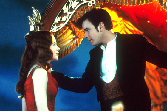
He continued his success with all the same ingredients and some added fantastic set designs for the even more campy or even kitschy Moulin Rouge, another true visual spectacle and assault on all senses. After making the generally panned Australia next, Luhrmann returned to all the elements which made his previous films successful with another re-interpretation of a classic tale, The Great Gatsby, adding 3D in the process, just in case the visual assault wasn’t outrageous enough.
