14. The Wild Bunch (Sam Peckinpah, 1969)
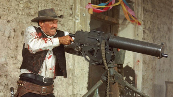
The landmark Revisionist Western held the record for number of cuts until the release of “Natural Born Killers” (Oliver Stone, 1994) and the MTV generation’s influence on editing. Peckinpah wanted to work with new blood for his film, and he found what he wanted in a youngster named Lou Lombardo.
Lombardo came from different cop shows, so he had some experience with shootings. One of his previous experiments included using slow motion intercut with normal speed footage. He showed the result to Peckinpah, and Peckinpah told him to use it extensively on “The Wild Bunch.” This technique later became a trademark of Peckinpah’s films, but the original idea came from his young editor.
The result was amazing. Peckinpah, inspired by the Vietnam War, believed that fiction could have a cathartic effect on the audience, and to expose them directly to the reality of violence would provoke a disgusting feeling. This did not have the intended effect.
The audiences were delighted by the stylized violence, and the debate surrounding the impact of excessive and stylized violence rages on today (see the controversy regarding Quentin Tarantino’s “Django Unchained,” for example). But even if Peckinpah’s thesis was false, the film inspired many young filmmakers, including John Woo and Tarantino.
With another suggestion of Lombardo’s, every shooting scene was filmed from several different angles, cameras, and speeds. Later, in the editing room that Peckinpah and Lombardo shared in Mexico, they could choose almost any point of view they wanted.
From full shots to close-ups, and from normal speed to super slow motion, this variety of points of view on the same action was completely new at the time, and it gave the feeling of being there, in the middle of the violent frenzy. Sadly for Peckinpah’s thesis, the result was more entertaining than it was disgusting, and his work influenced a new wave of violent cinema.
15. The Godfather (Francis Ford Coppola, 1972)
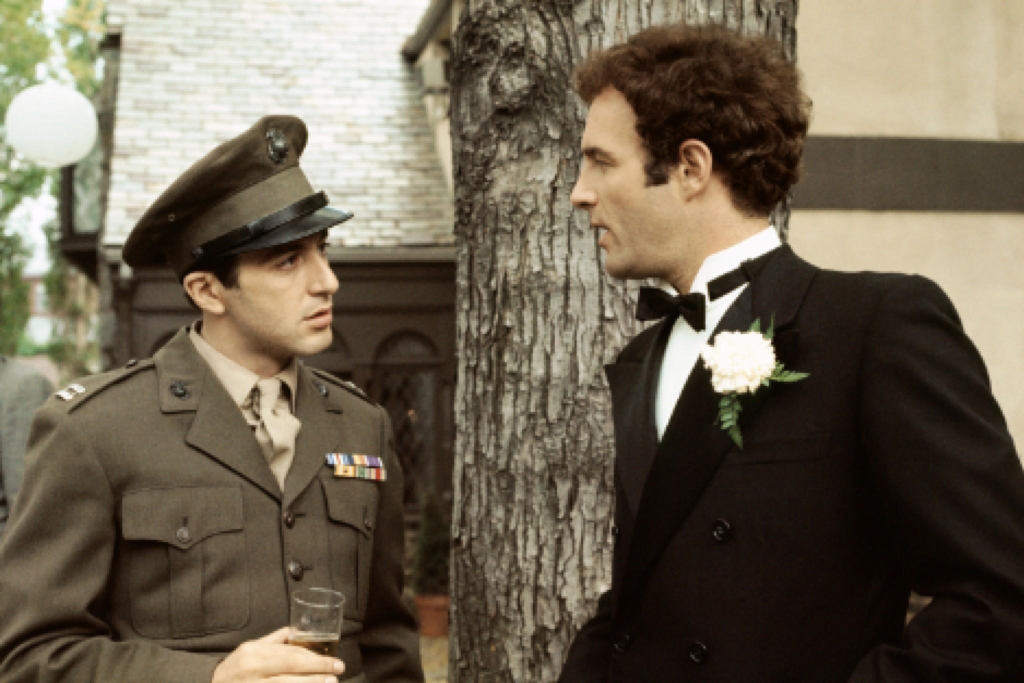
“The Great Train Robbery” was the first primitive example of parallel editing, but when “The Godfather” came out, the technique reached its main splendor in the classic scene in which Michael Corleone (Al Pacino) baptizes his baby while his thugs are executing every Don in New York.
The employment of the technique was not new, and, on a purely formal aspect, doesn’t look very revolutionary. But what “The Godfather” did with this scene was to advance the intellectual aspect, building new concepts and meanings through editing.
Parallel editing is used mostly as a way to build tension, making the audience focus on two different actions at the same time. But in this scene what Coppola is showing us is not just a way to build tension, but to clash two different events that expose Michael Corlone’s character: on the one hand, he is a devoted family man; on the other, he is a ruthless mob boss. He is both of these things simultaneously, and the editing emphasizes this.
The last shot of the film is known as the closing image of Michael Corleone’s new life, but this is implied before by the editing. Michael denounces evil even as he directs a killing spree, and the symbolism of the holy water contrasted with the bloody massacres is deep and beautiful.
16. F for Fake (Orson Welles, 1973)
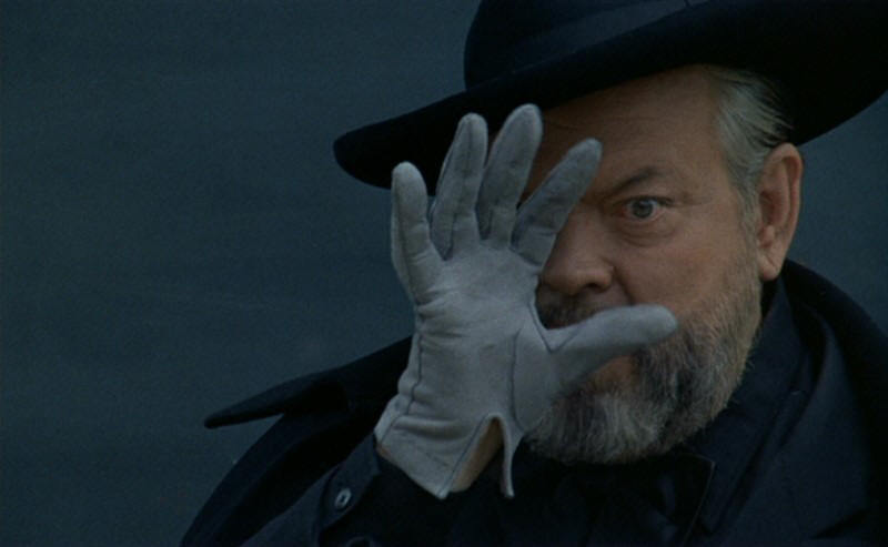
“F for Fake” could be considered among the most visionary and influential films from an editing aspect, but somehow, history has not given the film its due. It is one of Welles’ most famous films, but it also might be the greatest example of modern editing.
Welles predicted “attention-deficit editing” years before it was made commonplace by MTV and in TV commercials, by which time the speed of life had increased the speed of editing. The eye became able to understand more information in less time, and so the cuts started to get bigger, and jumping from one theme to another was necessary to keep audience’s attention.
Long before this became the rule, in “F for Fake” Welles jumps between 6 different narrative lines. He connects one and another through different concepts and ideas, making an intellectual exercise that is nevertheless entertaining for the audience.
Welles freezes images in the middle of a dialogue, shows us the editing room, and interrupts different speeches to make the film look like a fluid element. “F for Fake” jumps freely and it doesn’t reveal its structure easily. In a film about trickery, showing us the editing makes a delightful comment about film itself.
17. Raging Bull (Martin Scorsese, 1980)
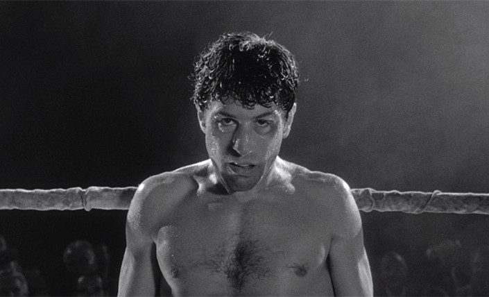
There is an anecdote concerning Raging Bull’s editor Thelma Schoonmaker visiting a cinema about to shown “Raging Bull”. She found the projectionist working on the negative. When she asked him what he was doing, he answered, “Somebody put some color footage on this black and white film I have to show now!”
This little anecdote tells how uncommon it was to mix black and white and color in the way Schoonmaker did it. In the middle of one of the Jake LaMotta’s (Robert De Niro) fight scenes, Schoonmaker put the only color footage in the middle of the punches. This kind of psychological decision is seen all over the film.
“Raging Bull” was edited according to Jake LaMotta’s interior world, and Scorsese and Schoonmaker mixed tons of techniques to achieve this idea. Cutting from a fast energetic montage–with jump cuts and half-second detailed shots of punches–to slow-motion sounds like a crazy idea. But the psychological construction of the character makes everything flow in a way that makes total sense for the audience. “Raging Bull” is probably the most effective and exquisite use of slow-motion in cinema history.
18. Sans Soleil (Chris Marker 1983)
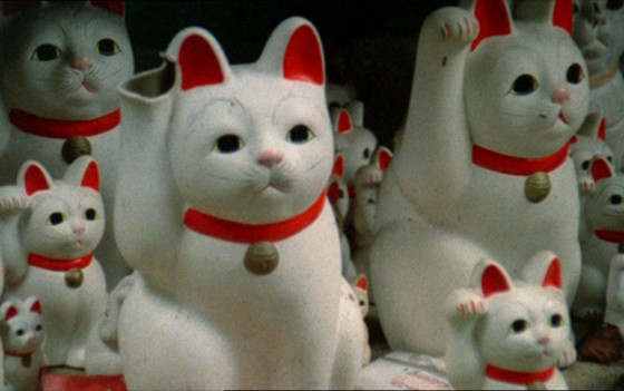
Film- is not one of the most explored genres in film history, but it deserves hugely its two spots on this list. While “F for Fake” flows as a way to link different narratives like an academic work, in “Sans Soleil” we get a more poetic and random feeling.
It seems like Marker can jump from any big issue to the next without the need of a proper introduction. But the mind-flow works and it is engaging despite its unclear narrative. Marker didn’t develop a completely innovative technique, but Marker organized an editing tecnhique that makes the viewer feel like he or she is inside his mind, and as in everyday thinking, you can go from one theme to another without any major logic.
19. Seven (David Fincher, 1995)
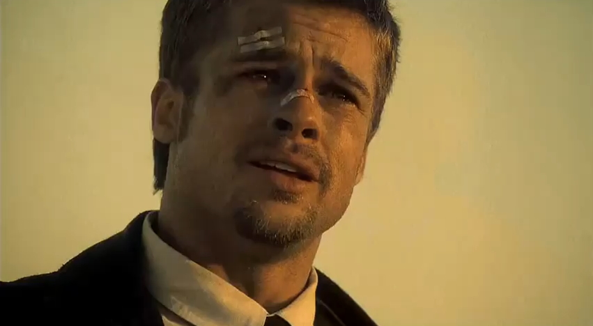
Every Fincher film is a quality display of editing. Even in his less enjoyable efforts, you can tell post-production is sacred on his films. His second feature was the film that showed his trademark editing, and his previous background. The influence of television advertisements and music videos is clear in the pace and rhythm of his cuts.
Fincher learned these codes before his first feature, making advertisements and clips for Madonna. This work taught him to make images fit a certain rhythm, and this was translated later in “Seven.” The most classic and celebrated segment of the film is the often ignored credits sequence. Impressed by Mark Romanek’s “Closer” video for Nine Inch Nails, he decided to apply this aesthetic at the beginning of the film.
This introduction of John Doe, the killer, is cryptic: we see a dark impression cutting newspapers. The sequence was scored by a Coil remix of the same Nine Inch Nails single. In fact, Fincher was so impressed that he wanted Romanek to direct that segment. At the end he directed it himself with the help of designer Kyle Cooper, and it had an influential effect on the 90’s.
Never before had a credits sequence seemed so important to the narrative, and it certainly wasn’t so common to introduce a video clip-like segment in a non-musical film. Later there was a wave of films with this heavy television influence.
From “Trinspotting” (Danny Boyle, 1996) to “Fight Club” (David Fincher, 1999), this choppy editing became a 90’s trademark. Heavily criticized by some critics and filmmakers, the influence of MTV’s hyper-active culture on cinema is undeniable today.
20. The Tulse Luper Suitcases (film series) (Peter Greenaway, 2003-2004)
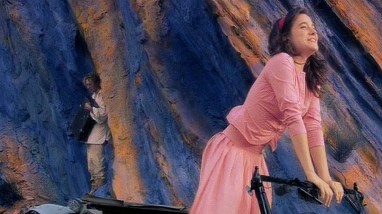
Jump cut, overprint, fast motion, picture in picture, color, black and white, sepia, overlapping dialogue, freeze frame, subtitles, on-screen text, repeated actions, and zooms. All of these techniques are found in any of the three parts of Greenaway’s most ambitious project and the films play as a summary of all the techniques explored on this list.
“The Tulse Luper Suitcases” was supposed to be a massive transmedia project consisting of three features, 92 DVDs, a 16 episode TV-series, a bunch of books and CDs, and an online game and website. Greenaway didn’t complete his project at all (the TV series were never done, nor were most of the books, CDs, and DVDs), and could be seen as one of his major failures. But the films were ambitious as well, and they are one of the most interesting pieces of digital cinema.
In Greenaway’s trilogy the film is seen as a piece under construction all the time, and it is showing us a new way to tell a story after the death of film. Greenaway proposed a “post-celluloid” experience and a completely new film narrative. Ambitious and arrogant, it is hard to deny that “The Tulse Luper Suitcases” is a very fresh viewing experience.
Totally excessive in its formal aspect, the film tells a straight plot. And if you get used to these technical display of excesses, you can follow the narrative. Probably this is one of the most interesting aspects of the film, because with his descriptions, it was easy to expect a completely avant-garde film. Will transmedia and the Internet be the next big influences on editing?
Author Bio: Héctor Oyarzún is a film student in the Valparaíso University of Chile. Since he was a kid, his most important occupation is watching films. He also likes punk music and playing guitar.