5. The Submarine – The Life Aquatic with Steve Zissou

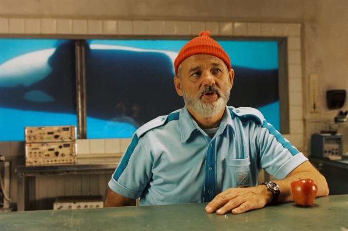
The Submarine in The Life Aquatic with Steve Zissou – apart from being an incredibly beautiful and carefully designed piece of set design – plays an important role with Anderson’s continually arising theme of childhood innocence.
Anderson’s love of minutiae plays into a childlike fascination with toys and imagined spaces. The Submarine is one of these spaces; it is compartmentalised and cartoon like and somehow doesn’t feel part of the real world. In this way it very much feels like a space of childish imagination.
This is important considering Zissou’s remark that his 11 and a half was his favourite age. There is a nostalgia behind his character; a perpetual yearning to be younger, freer, to return to simpler times.
This reading of Zissou’s character is provided by the spectacular design of the submarine which acts as a signifier of Zissou’s childish desires, once again showing Anderson’s ability to use set design to comment on his characters and reveal new things about them.
4. The House – The Royal Tenenbaums

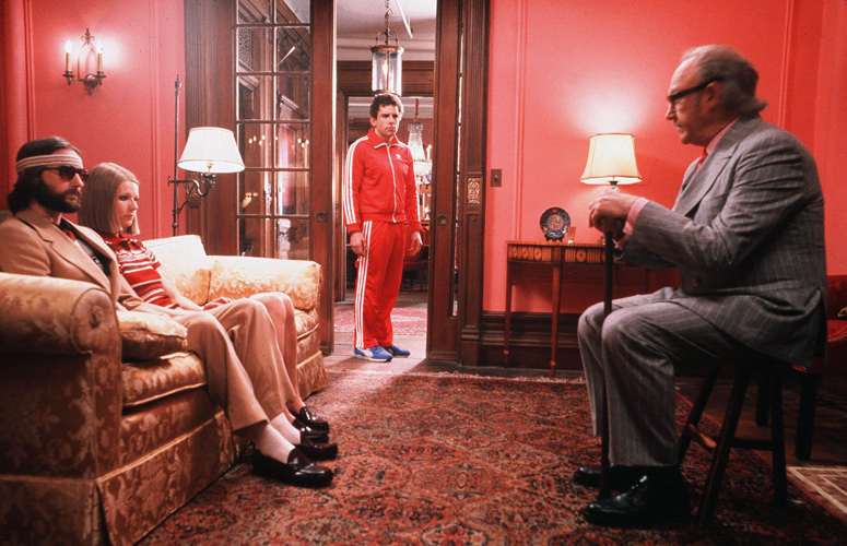
It has been noted by many critics that Wes Anderson is influenced by the work of J.D. Salinger. No where else is this more evident than in The Royal Tenenbaums, which is very much a reimagining of the Glass family residence in Salinger’s famous Franny and Zooey. It is a compartmentalised space which reflects each individual of the Tenenbaum family.
For example, the library and ballroom spaces bespeak the children’s interests in the arts and humanities. These are educated and extremely middle class children who are being pushed by their parents to expand their horizons and become successful. Because of this, Anderson places them within a grandiose family home which is meant to enhance their intellectual and creative pursuits but ends up stifling them and turning then into very confused adults.
This is very much in the vein of Salinger because it bespeaks the wealth accrued from intelligent children and how this is translated into material possessions and the house around them.
3. The Motel – Bottle Rocket

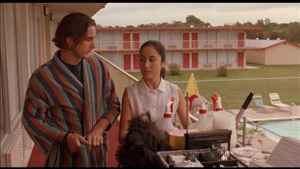
The Motel in Bottle Rocket is one of the most conventional pieces of set design in a Wes Anderson film. This has a lot to do with the fact that Bottle Rocket is Anderson’s first feature film, and he was subsequently still honing his style at the time. However, many of the stylistic traits which make up his approach to set design can be found here; the linear, geometric patterns which make up the windows and doors of the motel satisfy Anderson’s need for order.
The placement of the swimming pool – which is one key scene becomes Anthony’s vantage point from which he spies Inez – is parallel in relation to the motel rooms.
The linear, ordered way in which the motel is designed seems to be constantly bringing Anthony and Inez together which is most evident in the aforementioned swimming pool scene. It is a subtle piece of set design, but is incredibly important in terms of Anderson’s oeuvre for the way it signaled how his style would develop.
2. The Tree – Fantastic Mr. Fox

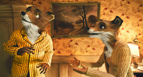
One of the great things about stop-motion and clay-mation films are the textures and details you get. Anderson’s Fantastic Mr. Fox is a great example of this, particularly with regards to the tree which Mr. Fox buys at the beginning of the film. The tree is an idyllic space, set atop a hill bathed in gold sunlight in what seems like a perpetual summer.
The interior – as is the case with Mr. Fox’s burrow which he leaves because it makes him feel ‘too poor’ – is modeled on the domestic space of a human being; this is one of the things which gives it such charm. Take Ash’s bedroom, for example, which is decked out in the style of a ten year old boy’s bedroom.
Yet the presence of the natural habitat in which they are situated intrudes with the large knotty oak roots which line the ceiling. Mr. Fox’s tree is a wonderful piece of set design from Anderson, for it draws together all of the elements which typically make his sets so interesting to look at, and places them within the context of both a stop-motion film where anything at all is possible, and one of the most beloved stories from one of the world’s favourite children’s authors.
1. The Tent – The Royal Tenenbaums

The tent in The Royal Tenenbaums draws together two central aspects of Anderson’s cinema together: his tendency to portray the minutiae of the world his characters inhabit and his thematic interest in childhood innocence.
The idea of a space in which the child can retreat is a common motif in film and literature. This is used to great effect in The Royal Tenenbaums, particularly when Margot returns to the tent.
It is a childish space, but also a space in which adult passions bubble implicitly beneath the surface. This is engendered by Anderson’s careful set-design and planning, which places the intimate scene between Margot and Richie in the enclosed space of the tent.
It is a magnificent pieces of set-design because of how low-key it is; the power is held in the size of the space and the richness of the colour of the yellow light which seeps through the material. It is a lesson to filmmaker’s in how set-design can influence the quality of a greatly in small, subtle ways.
Author Bio: Christopher Sanders is a cinephile from London. In his spare time he loves watching and making movies, listening to the Beatles, and proselytising to anyone who will listen that Paul Thomas Anderson is the best director in the world.