6. Stalker (1979, dir. Andrei Tarkovsky) – Water Frequently Present
One of the greatest of all Russian cinema, Tarkovsky’s final Soviet feature takes three men (as well as the audience) into the Zone, where it is said there is a room that will grant one’s deepest wish. What follows is an enigmatic, meditative, and thought-provoking journey that has sparked much discussion on topics of philosophy, existentialism, politics, religion, and then some.
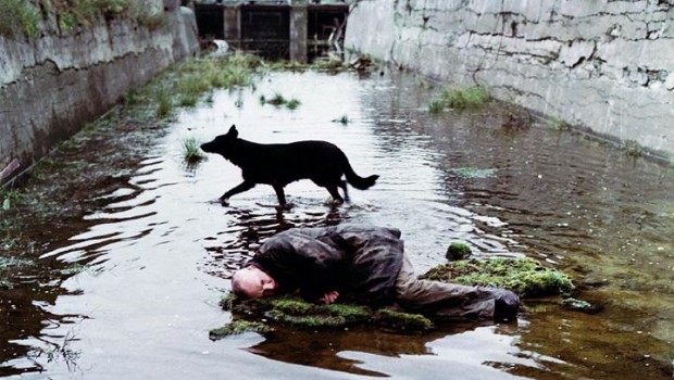
Stalker has been called many things, unanimously described as “absorbing” and “atmospheric”, which is an unquestionable description. Though this is achieved mostly through sound design (notice how much reverb there is on SFX), an additional aspect to this quality is within the film’s settings.
In almost, if not every shot, there is water – whether it be a pond, a puddle, or a glass of water, the element is always present. If it is not present in its liquid form, there is evidence of water’s presence. Upon arrival to the Zone, littered with trees and other such foliage, the dirt and tree branches appear to have been drenched.
7. Taxi Driver (1976, dir. Martin Scorsese) – Omnipresence of NYC
Driven by a chilling performance from Robert De Niro, Taxi Driver is a fearless descent into psychological instability and urban decay. In spite of a 40+ year lifespan, its punch has failed to lose any of its power and continues to stand the test of time – it is now renowned worldwide as one of the greatest films of all time.
Travis Bickle (De Niro) is a cab driver in NYC, heavily scarred both physically and mentally – possibly from the Vietnam War, but who knows for sure? Trapped in a seemingly inescapable state of social isolation (made worse after a date gone horribly wrong), Travis becomes a ticking time bomb of a man, filled with anger and ready to take action, buying guns, modifying his weaponry, and training physically. His fuse only grows shorter because of the city he hates so much.
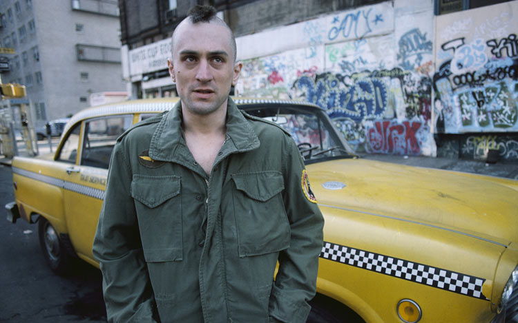
The city’s presence, always pestering Travis, is brilliantly conveyed visually – in most of the film, NYC encompasses a good chunk of the frame, whether Travis is standing on a street corner enveloped by the city, it can be seen out of a window, or even a grimy, crack-laden wall stands behind him, the city and all of its sleaze and ugliness is always there. With this perpetual presence on his back, it is only a matter of time before Travis snaps, and this is something the audience can both feel and see.
8. The Texas Chainsaw Massacre (1974, dir. Tobe Hooper) – Grainy Footage
The 1970s gave audiences worldwide some of the greatest horror films of all time – The Exorcist, Alien, Halloween…the list goes on and on. Among this great sea of cinematic terror is Tobe Hooper’s The Texas Chainsaw Massacre, one of the scariest films the author has ever seen.
The plot is familiar territory for any horror enthusiast – group of 20-somethings stumble into unfamiliar territory and are murdered one by one from whatever force is out there. In this case, the force is a maniacal Texas family that have a specialty in the art of butchering, the chainsaw being the favored tool.
And so begins the loud and disorienting slaughters of these unfortunate people. In a unique transgression to the horror film, not one murder is shown on-screen – even if it is occurring just outside the frame, the viewer never sees it.
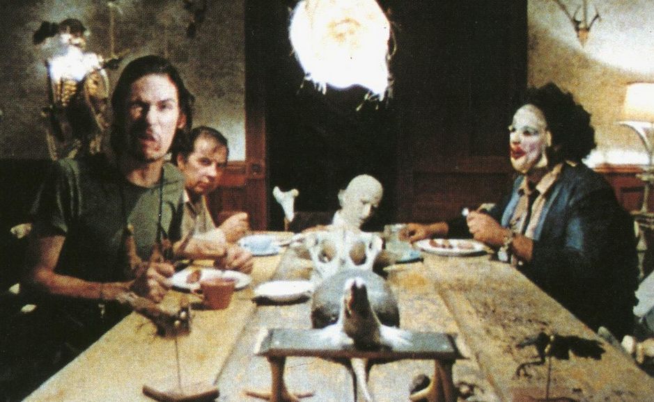
Nonetheless, the film still becomes a frantic and disgusting experience that demands a shower immediately after it ends. Perhaps this is accomplished because of the noticeably grainy footage. Like In Vanda’s Room, the use of the visual medium brings out the uncleanliness of the environment. Furthermore, it also adds a sense of realism – Mark Borchardt of American Movie fame mentions that it “looks like one of those 16mm accident films they’d show you in school.”
9. The Tree of Life (2011, dir. Terrence Malick) – Continul Use of Wide-Angle Shots
Winner of the coveted Palme d’Or at the 2011 Cannes Film Festival, The Tree of Life is a work of epic scope and beauty that could be described as almost celestial, frequently (and rightfully) compared to 2001: A Space Odyssey. Regardless, Terrence Malick’s sixth effort is an immensely polarizing film that is still discussed and debated to this day. With themes sprawling from faith and reconciliation to coming of age and family dilemmas, The Tree of Life may one day prove to be the current decade’s first masterpiece.
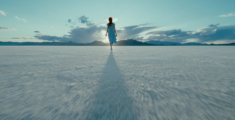
Visually, The Tree of Life is already one hell of a spectacle with all of the traditional Malickian aesthetic, exhibiting some of the most iconic shots of the current decade. Because of this, some may say this doesn’t belong in a list talking about subtle visual elements – a fair argument. It is not these aesthetics that are to be discussed, but rather an expansion of those aesthetics.
The coming of age aspect of the film, which is debatably its most explored aspect, and it further captures this aspect all because of one simple visual element: the wide angle lens. One’s early years tend to be recalled as a time when the world around them seemed bigger, an innocent time when the world could have been their oyster. Here is an observation of life that is perfectly captured in The Tree of Life, and may further prove the film to be one of the greatest about the journey through life itself.
10. Whiplash (2014, dir. Damien Chazelle) – Bright & Warm Color Palette
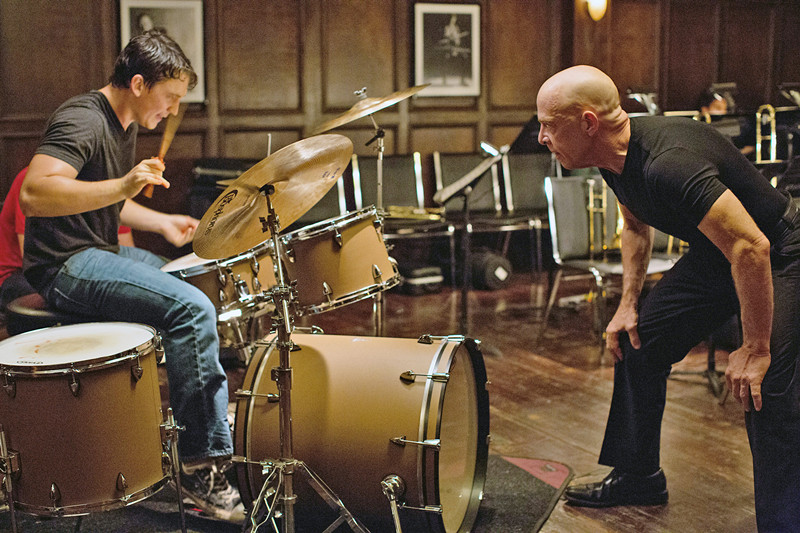
Though his reputation was solidified by the Oscar-sweeping La La Land, it was Damien Chazelle’s sophomore feature – Whiplash – that pinned his place in the realm of modern cinema. With an energy that can only be described as electric, Whiplash takes a transgressive spin on the teacher-student dynamic and a stressful and disconcerting look at the obsession for artistic perfection.
Andrew (Miles Teller) is a student at an elite music school where he is enlisted as drummer for the school’s top jazz band, iron-fistedly led by the unrelenting and merciless Fletcher (J.K. Simmons), who will settle for absolutely nothing less than perfection. Driven by an obsession to be the best at the mercy of Fletcher, the heat is on for Andrew, a sensation that is amplified by the film’s color palette.
Rarely does a frame roll that isn’t filled with bright yellows and oranges, almost as if the sets are lit by the proverbial fire that fuels Andrew’s drive. It is in the films finale – one of the best of the decade – that this visual design is used to its fullest effect, where this fiery color palette is so bright and overbearing that the audience may feel themselves sweating along with Andrew in the midst of his remarkable performance.
Author Bio: Jakob Miller consumes oxygen in Tucson, Arizona, where he enjoys donning Tripp NYC in 100+ temperatures, practicing off-putting stoicism, and enduring Whitehouse at obscene volumes on a daily basis. He also likes movies.