5. Inception (Edited by Lee Smith)
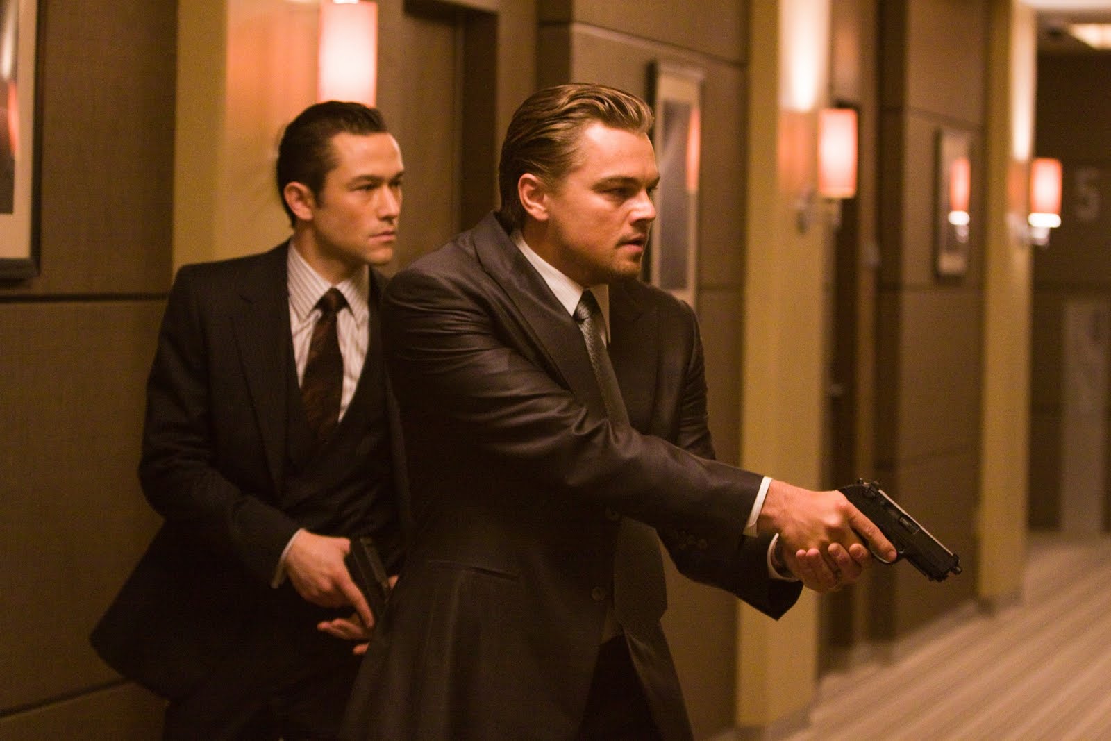
Inception is a complex film which deals with a multitude of several types of storytelling – both linear and non-linear. This could have resulted in a visual mess if it were not for editor Lee Smith’s impeccable editing.
The main editing technique used in Inception is parallel editing. Parallel editing is when separate scenes in different locations or periods are cut together to make it appear as if they are unfolding at the same time. One of the main advantages of using parallel editing is that it adds another layer of suspense or pacing to the narrative.
This is especially noticeable in Inception, where the narrative relies on the edit in order to reflect the tone and style of the film. In fact, nearly the whole film is a series of parallel edits.
Inception missed out on an Academy Award nomination for Best Editing, but it is widely regarded for its well structured and seamless editing. The film is a fluid watch, the interweaving dreams creating an almost dreamlike state of absorption for the audience.
4. Birdman (Edited by Douglas Crise and Stephen Mirrione)
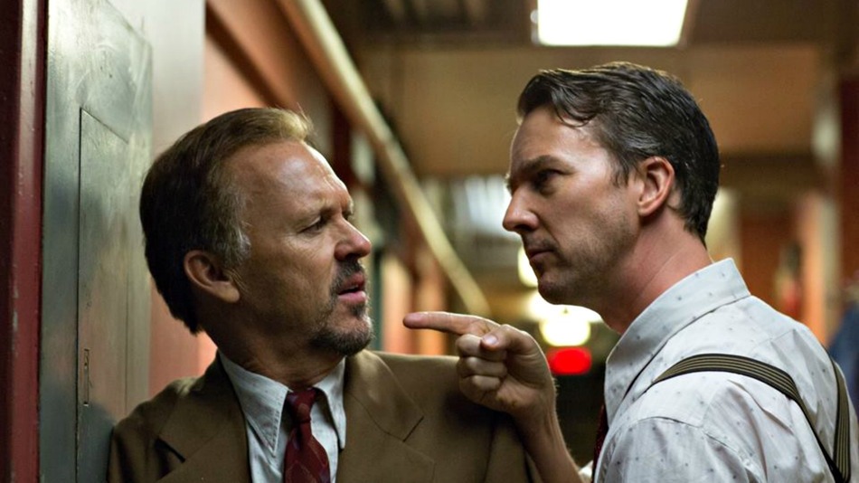
Winner of the Academy Award for Best Picture at the 87th Academy Awards, Birdman is often thought to be a single-shot film. However, this is untrue, and Birdman is actually just cleverly edited to look that way. Giving the illusion of there being no cuts presented a difficult task for editors Douglas Crise and Stephen Mirrione. Putting the shots together seamlessly and perfectly was a crucially important part of the edit. Something that made the edit even more tricky was that a lot of ‘stitching’ was required.
Director Alejandro Inarritu shot several different takes of each scene, but instead of just using one of those takes, he would choose different elements from different takes and then want them combined. This could mean that there were different performance takes from different actors. So not only were takes stitched together but also performances and in some cases, morphing heads and torsos.
It did come as surprise to some that Birdman was not nominated for an Academy Award for Best Editing, considering how effective and skilful the edit is. However, it is still widely acclaimed for the technical superiority and work that went into the edit. Birdman will certainly continue to be talked about and acclaimed as a great film, and a lot of that can be attributed to the editing.
3. Boyhood (Edited by Sandra Adair)
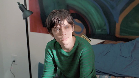
Because it was filmed over the course of twelve years, Boyhood presented a unique challenge for its editor Sandra Adair. The edit needed to be able to take the audience seamlessly from year to year, without it ever feeling jarring or unnatural. The creative ambition and scope of editing a film over twelve years also presented unique technical challenges.
For example, ADR (automated dialogue replacement) had to be carefully captured each year in order to account for the changing voices of the child actors. Adair also had to cope with the completely different production on each shoot. As technology advanced over the years, the equipment used on set was changed which inevitably led to changes in the look of each segment.
The results of the edit mean that Boyhood is a film which takes the audience on a journey which is effortless. The fluid transitions between each year never feel out of place or over the top. The cuts are not dramatic or sharp. And this easy and relaxed style fits perfectly with the tone and narrative of the film – a film which is about real life and the way in which time passes. Strangely captivating and fascinating, Boyhood is almost three hours long. But the brilliant editing means that the running time becomes obsolete, as the audience becomes utterly absorbed in this unique film.
2. Mad Max: Fury Road (Edited by Margaret Sixel)
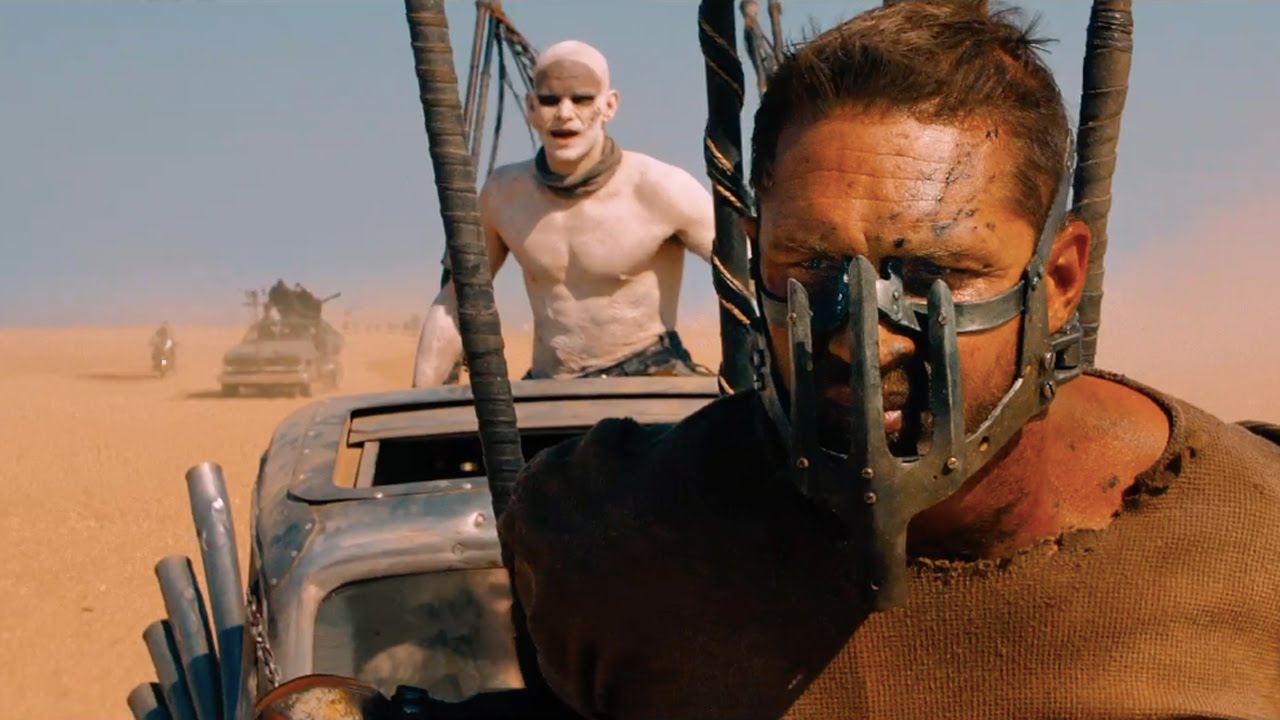
Editor Margaret Sixel was faced with a mammoth task when she set out to edit Mad Max: Fury Road. She was given almost 500 hours of footage to edit, and managed to present a final edit of 120 minutes which consisted of 2700 individual shots which then translates into 2700 cuts.
On average, a feature film edit usually consists of around 1270 shots. Editing 2700 shots into a smooth and coherent film, which also had to accurately represent the theme and style of the film, presented a difficult job. However, Sixel’s edit is one of the reasons that Mad Max: Fury Road is such a successful film. Consequently, Mad Max: Fury Road won the Academy Award for Best Editing at the 88th Academy Awards.
Sixel’s main concern when editing the film, was to keep the story moving along. She used speed ramps in certain scenes, but was always conscious of retaining clarity when necessary and also that there was a certain amount of focus needed to keep the emotional connections to the characters. Mad Max: Fury Road is an action film, but it is an action film with a difference. In most action films, the cuts are frantic and often fights are cut in a way wherefore you do not actually see hits connect with their targets.
In Mad Max: Fury Road, you see every hit. This means, the audience feels every hit. Another clever method used in the edit is the speeding up and slowing down of the frames per second. This keeps the audience engaged and interested, but is also done well in the way that it always keeps the visuals clear for the audience.
During filming, nearly every shot was centre framed which means that the point of interest for the audience is always clear. Putting all these aspects together in the edit, presented Mad Max: Fury Road as a visually engaging and full of kinetic energy film. Overall it is a masterclass on film editing.
1. Whiplash (Edited by Tom Cross)
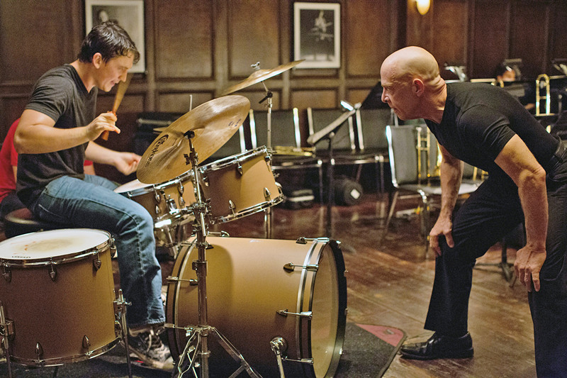
Whiplash, winner of the Academy Award for Best Editing at the 87th Academy Awards, is a great example of a film which has perfect synergy between narrative, tone and editing. Throughout Whiplash, the editing works to enhance the characters and the theme. At the heart of Whiplash is the music, and often the cuts are so cleverly done that they are almost rhythmic.
Like the jazz music in the film, editor Tom Cross is almost ‘cutting to the beat.’ There are times when the music is high tempo, and times when the music is slow and rolling. The same can be said for the scenes – some are high tempo and filled with drama and intensity, and others are slow and focus on looks and things unsaid.
Director Damien Chazelle said that he wanted Whiplash to be “an editor’s showcase.” Chazelle wanted the performance scenes to be like the boxing scenes from Raging Bull – full of suspense, tension and manic energy, and then to be thoughtful and calm in the scenes of personal development. Cross stated that he frequently used a smash cut method throughout the edit, and consequently Whiplash has become recognised for its smash cuts.
In particular, the film ends on one of the best smash cuts in film history. The edit is certainly one of the reasons that Whiplash was so well received and continues to be a go to for filmmakers and film lovers looking for an example of brilliant editing.
Author Bio: Cara McWilliam-Richardson is a writer with a passion for films and filmmaking. She has written several screenplays, and is currently working on her first novel. Her favourite genre to write is fantasy and science fiction.