5. Pan’s Labyrinth (Cinematographer: Guillermo Navarro)
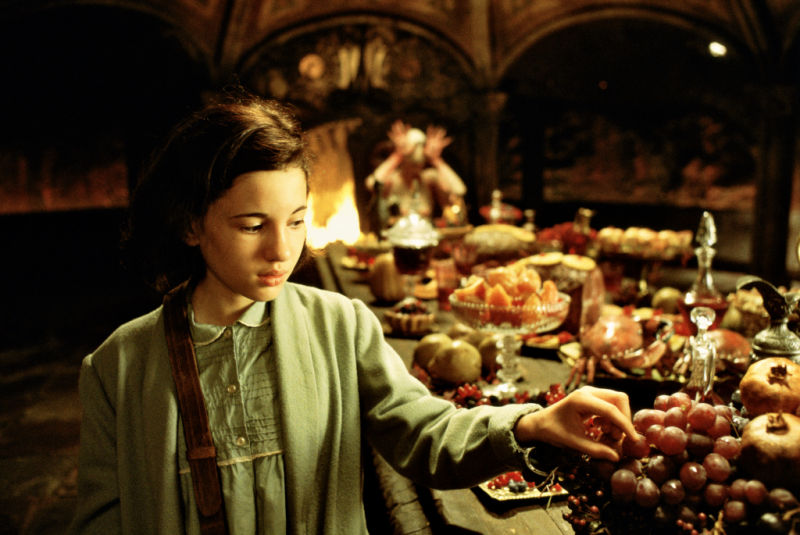
In 2006, most people in the non Spanish world had never heard of Guillermo del Toro, the now acclaimed director of Pan’s Labyrinth. It would be a film that captured the hearts and minds of millions around the world despite its status as a ‘foreign film’ and it would catapult the Mexican director onto the world stage in a major way, launching his stellar career to new heights.
With cinematography by that other Guillermo, Guillermo Navarro (Pacific Rim, Jackie Brown) and production design by Eugenio Caballero (The Impossible, Resident Evil: Extinction), Pan’s Labyrinth, sometimes translated as ‘The Labyrinth of the Faun’; is billed as a fantasy-war-drama, and in that sense, it does not disappoint. It has all three of those genres covered in spades.
Set in 1944 during the turmoil that occurred in Spain shortly after the civil war, the narrative follows the life of a young girl named Ofelia who is dealing with the cold, harsh reality of the frightening adult world with which she is surrounded. Slowly, over he course of the film she becomes drawn into an alternative reality of faeries and mythical creatures who both assist her and test her with obstacles, casting her into the Labyrinth of the Faun. (Note that Guillermo del Toro has emphatically denied that the faun in the movie is in fact, the Greek god, Pan, himself).
Using CGI, animatronics and make-up effects to bring its fantastical characters to life, the film is both wondrous and terrifying in turns and posits a story that can be interpreted on many levels. On the surface, the story is simply a fantastical and beautiful fairytale that recalls the old gods and pagan times. On a deeper level, one is left with the impression that Ofelia is either hiding from the senseless violence of the real world, in her imagination, or that it has driven her insane. On an even deeper, archetypal level, the film is about growing up and facing a kind of ego death.
Winning three Academy Awards and three BAFTA awards, as well as a HUGO award and a slew of other decorations at the time, Pan’s Labyrinth is one of the most beautifully orchestrated and visually stunning films of its generation and it may be some time before another such fairytale comes close to eclipsing its perfection.
4. Stalker (Cinematographer: Georgy Rerberg, Alexander Knyazhinsky, Leonid Kalashnikov)
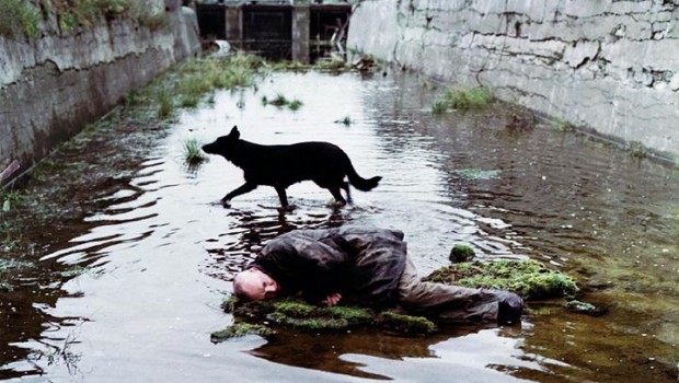
This low key sci-fi drama directed by Andrei Tarkovsky, with its slow meandering plot and enigmatic, tight cast of characters is among the most original and philosophically sound pieces you are ever likely to see. Tarkovsky is one of the pioneers and masters of the “long take”.
The film opens with a static, sepia colored, three to four minute shot of a man being served breakfast in a dingy bar while the opening credits fade in and out in yellow. At four minutes and fourteen seconds, this is followed by an interminably slow, minute long tracking shot towards a pair of dirty double doors and then peeks into a bedroom.
At five mins twenty eight seconds Tarkovsky cuts to a tight over-head shot of a side table. A glass of water is rattling and sliding on it from the vibrations of a passing train. The camera slowly begins to crab left, still overhead, to reveal, one at a time, a mother, a girl and finally a man. He is the only one awake. Now Tarkovsky crabs back across the bed again, still the same shot, over the girl sleeping between her parents. The mother is awake now too. She lays still, eyes open but despondent. The tray is also still too. The train noises have stopped and the camera finally rests. The film cuts to a wide shot now as the father climbs slowly from the bed and quietly gets dresses in real time.
The sequence would be painfully slow if not for the rich textures and playful mise en scene. It teeters on tedious but one quickly learns with Tarkovsky that there will always be a transformation or a point of interest, some kind of payoff, if you just pay attention a little longer.
In this way Tarkovsky pulls us into the story world by forcing us to try and see beyond the edges of the frame. We are given time to consider the many questions that each image presents and we would do well to do so if we want to make sense of his work.
On the one hand the narrative is a kind of absurd slipstream, loosely based on the novel Roadside Panic (also penned by Boris and Arkady Strugatsky). Here, deep in the heart of a post-apocalyptic territory, cordoned off by the government, lays a place called The Zone where all manner of strange and invisible dangers lurk.
Curiously, Tarkovsky uses sepia film stock for all the scenes leading up to and outside The Zone, transitioning to color footage as the narrative takes the characters within. Surely, the Zone is some kind of metaphor for life. Within The Zone is said to be a room that will grant wishes to whomever makes it that far and is able to enter.
The films simple, but rather strange narrative follows a Stalker, a kind of guide, in the movie, who is assisting a professor and a writer to gain access to the Room. “The shortest path is never the right path,” he says. As they move through the wasteland, they utilize various homemade devices, such as bolts tied to pieces of cloth, to test that gravity is still functioning correctly and to avoid pitfalls and hidden dangers. Eventually we are to discover that the room provides not necessarily what the occupants wants, but what he or she, unconsciously desires.
Despite few action-based scenes (especially after entering the Zone), the film is tense and highly dramatic. Its characters are interesting and cleverly polarized in ways that exploit the potential drama. Ultimately, beyond the raw beauty of the wilderness that is encompassed in the film; the beautifully executed cinematography (and so it should be, due to various mishaps, Tarkovsky shot the film three times, so he’d had some time to think about it), this film’s true inner beauty comes from the uniqueness of its narrative and the philosophical questions it raises for the astute viewer.
3. Lawrence of Arabia (Cinematographer: Freddie Young)
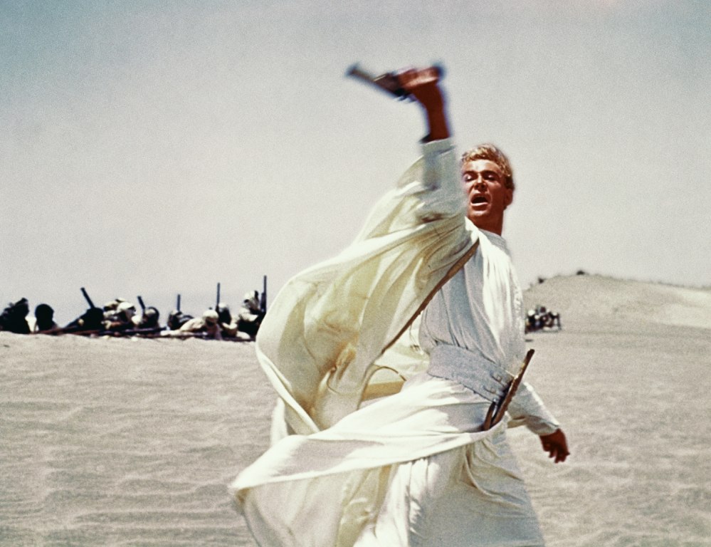
It hardly needs to be said that Lawrence of Arabia is a beautiful film. One that despite over half a century of cinema, remains as impressive as ever. No one who has seen the film will forget the moment that a rider emerges from the heat waves on the horizon and then in complete silence, over several long minutes, approaches the camera from the distance. It is one of the boldest and most intense experiences in the history of cinema.
The film is unabashedly stunning in its visual scope. Its tapestry of flowing, sand-filled vistas and panoramas, full of sunrises and shimmering heat waves, uses deep field lenses to masterfully exploit the cinema screen to its maximum potential. It is a film full of imagery that has become etched in the collective unconsciousness of both audiences and filmmakers to this very day. No one who has seen a 70mm print in an actual cinema will forget the majesty and grandeur of this triumph of the silver screen.
One that captures not just the epic expanses and extreme conditions of the Arabian desert, but also its stark beauty and landscapes. It seems to come close to capturing the very spirit of the famous British officer who united the Arab tribes against the Turks during World War I. Among its most enduring images are the intricate and human details of its lead actor, Peter O’Toole’s enigmatic, empathetic and endearing features. His face. In 70mm. Four stories high on the big screen.
Based upon the writings of T.E. Lawrence, and directed by master craftsman, David Lean, (Bridge over the River Kawai and Doctor Zhivago) Lawrence of Arabia is perhaps the finest and clearest example of how a director can effectively use the extreme aspect ratio afforded by that rare and extravagant medium, 70mm film.
At around four hours long, Lawrence of Arabia manages what few films ever do. Going beyond words and dialogue, it uses its vast cinematic power to seize the most elusive thing of all; sensations and feelings. It tells a compelling story with a minimal of fuss, a minimum of action and minimal distractions. It even leaves the (historic) sexuality of its lead protagonist ambiguous, without casting aspersions in any direction. Painting its hero as both complex and real, it remains a modern myth and leaves its viewers with a sense of awe and wonder at the desert.
2. 2001: A Space Odyssey (Cinematographer: Geoffrey Unsworth)
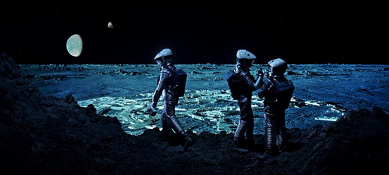
Long, tedious, dated and self indulgent, 2001: A Space Odyssey has long been hailed as Stanley Kubrick’s masterpiece of science fiction. Co-written with Arthur C. Clark, the relatively simple story would have made an impressive ten minute short film from the modern audience’s perspective. Filled with long, slow shots reminiscent of the Thunderbirds laborious stop motion launch scenes and a heavy emphasis on science over human relationships, the film is still undeniably beautiful. Every frame is carefully composed and expertly photographed.
Despite being a kitsch, retro vision of the future from 1968—a future that feels like it should exist today but was sidetracked by more immediate concerns on Earth—the film holds up incredibly well considering it has not one iota of CGI and relies entirely on analogue and mechanical effects. Even the famous star-gate sequence at the end was filmed using an old mechanical effect called a slit-scan. One can only assume the pace and tempo was designed to instill shock and awe in its cinema going audience with its extraordinary detail and deeply considered projection of the future.
Watching 2001, one must keep in mind that the popular sci-fi of this era was heavy handed and generally did not rely on very much actual science. Thus, when 2001 came along it immediately stood out as a prescient vision that would persist for decades to come. Modern audiences by contrast have been saturated and spoiled with zero-gravity special effects, spaceships and space stations. Think Gravity, Interstellar, Elysium, the modern Star Trek films etc. But to the audiences of 1968, A Space Odyssey must have appeared to be a direct window into a very real, very functional future that seemed almost inevitable at the time.
Comparing 2001 with the Tarkovsky masterpiece, Solaris, is like chalk and cheese. While Space Odyssey has incredible visuals that have (until recently anyway) stood the test of time, Solaris is by far the deeper, more interesting film. Solaris is not only more interesting, with deeper characters, with more complex motivations, it seems to understand exactly what it is trying to say and says it.
Kubrick’s space adventure, on the other hand, seems to be self obsessed with the physical plot, with little emotional subtext. There is almost no characterization throughout (the ship’s A.I., HAL is undoubtedly the most likable and interesting character) until the final end sequence. An ending that while certainly beautiful in a kind of retro-LSD trip kind of way, only suggests an ending while never actually providing one that is satisfying, logical or cathartic. It is instead left to interpretation. This, in and of itself is not a bad thing.
It is good to be made to think and not have one’s hand held. In this case however, it really only lends itself to one or two main interpretations, neither of which are really all that profound by modern literary standards. It is more of a kind of post-modern, reflexive cop out that seems to be telegraphing its depth and profundity (excessively, and in long, tediously slow sequences) rather than actually being all that clever.
2001: A Space Odyssey is beautiful because of its incredible, ground breaking cinematography, production design and special affects sequences. Despite its flaws as a commercial film, it is a stunning, two and a half hour long advertisement for Stanley Kubrick’s artistic vision. And for that alone it is impressive.
1. Baraka (Cinematographer: Ron Fricke)
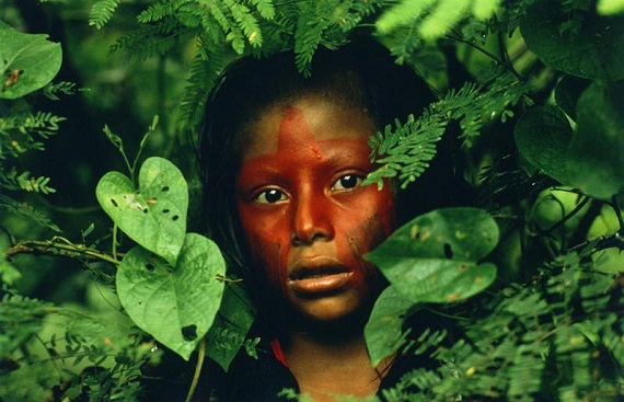
In 1992, Director and Cinematographer Ron Fricke offered up his documentary/art-film, Baraka, to the world. Shot on 70mm film in dozens of countries and locations around the world, and at a running length of 96 mins, Baraka is neither truly an art film, nor a documentary but something else instead.
Somewhere between an hour and a half long music video, with no dialogue, interviews or speech at all, and a transcendental mediation on nature, religion, culture and capitalism; drawing in themes from both the natural world and images juxtaposing our civilization’s industrial processes with our own lifestyles, this film is one step away from being eco-justice propaganda.
Drawing the line just thinly enough that one can flinch away without feeling morally compelled or obligated to do anything about it. In other words, it is a safe film to watch and it is as close as a commercial movie can ever really come to demanding that people stand up and take action for our environment and for our collective, cultural souls. It does this, in fact, without demanding anything at all, except that you pay the price of admission.
This is not to say the film is not inherently a worthwhile experience or that it lacks cultural, moral or artistic merit. It is unquestionably a cinematic masterpiece. There are powerful and important messages within its montage to be teased out—if one wishes to actually think about it. These messages, however, are not slammed over your head. Instead they are hidden for those with eyes to see within its subtle and intricate sequences. Among these sequences are some gobsmackingly beautiful scenes featuring cultural practices, architecture and dancing; some of which seem to have been filmed for the first time.
Later, the film moves into some more disturbing images of poverty, war and factory farming. One sequence in particular, portraying baby chicks being processed in a factory is juxtaposed against time lapse footage of human workers being ushered through a subway system. New York traffic, also shown in time lapse, is seen to make the city breathe.
Despite its occasionally dark themes, Baraka is overall a celebration of natural beauty, culture and diversity. There is a shot, held for a good ten seconds of three, unmistakably different looking, Asian girls. The social commentary continues with comparisons of abject poverty, working class people in their uniform blue-jeans, the higher strata of society in suits and tailored clothes.
We peek into the dangerous world of the Japanese Yakuza and glimpse their magnificent and terrifying tattoos. Another sequence shows a family, man, woman, child and baby, dressed for work or perhaps church, so it seems, together, on a single motorcycle navigating the slums of Asia. The shot seems to last forever until we have well and truly studied their faces and imagined where they are going and where they are coming from.
In all cases, the effect is a deeply humanizing one. One that connects the viewer with this range of diverse individuals from a plethora of cultures and backgrounds in a way that does not let you overlook them. Even if you do not think about them, you are at the very least forced to acknowledge their existence. For these reasons, Baraka is a beautiful film.
Author Bio: Russell W.B. Kirkby is a filmmaker from New Zealand whose short film, Nova played in the New Zealand International Film Festival. His second film Cogito, was fully funded by the Screen Innovation Production Fund and is much cleverer. Currently Russell lives with his wife Helen in Los Angeles and spends his time writing science fiction and watching movies!