Editing is a heavily overlooked aspect of films when it comes to casual audiences. Good editing makes the very existence of a film’s edits seem invisible; someone who wills to dissect movies will pay close attention to the pacing and cutting of a film.
Either way, a film that is well edited will never distract you from everything else that is going on. The only exception to this rule is a segment that blows you away with either something innovative or something swift. “Requiem For a Dream” features many cuts, but it boils an anxiety within its viewers to mimic the withdrawals the onscreen characters are facing.
Thelma Schoonmaker has famously turned every Scorsese film she has worked on into a cinematic waltz. If you pay enough close attention to the less-blatant examples as well, you will find a new respect for some of your favourite films. But, this list isn’t about that.
This is a list of 10 of the most toxic editing you can find. These are edits that will either give you a migraine within microseconds, confuse you beyond belief, or will be so pointless that the featured film will annoy you.
Unlike most good editing jobs, these examples detach you from a film and will make you aware of each and every little cut (or lack thereof). With that being said, here are 10 films with some of the worst editing in cinematic history.
10. Les Misérables
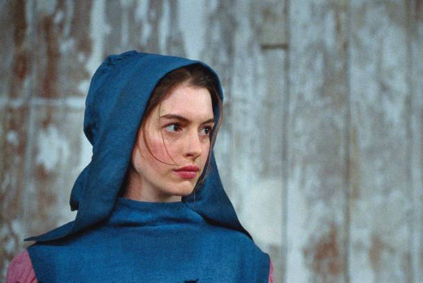
This is probably the only tolerable film on this list (excluding those that are hilariously bad). “Les Misérables” runs for over two hours, and it is carried by its seemingly endless singing. The music affects the pacing and editing of the film, as the cutting tries to catch up with every note and melody, and the result is a nauseating mess.
There are so many gorgeous images in this film that consist of religious gothic symbolism, dismal alleyways, destructed architecture and more. You get almost zero opportunities to enjoy any of these terrific shots, as the film jumps from image to image at an alarmingly fast rate.
It isn’t just a murder of many photographical shots, it also makes some parts incredibly difficult to follow. In a scene where Jean Valjean is on the move, you see a rope on a wall. With the jagged editing, it is extremely difficult to sense if he went up the wall or if he went down. It may seem like an insignificant detail, but you can only imagine how challenging some of the more important moments are if a simple sequence is hard to understand. The editing in “Les Misérables” will leave you feeling just that.
9. Transformers: Dark of the Moon

The one thing Michael Bay is indisputably great at is choreographing action sequences. Unfortunately, some of his films don’t allow for these scenes to shine because of their wretched edits. A number of his films (whether he directed or produced them) can be placed here, and in “Transformers: Dark of the Moon” (the candidate selected for this list), even the dialogue scenes feel very wonky.
It’s strange, and it doesn’t seem possible, yet this is a film where every shot (no matter how close together they match to others within a scene) still feels like it is from a different take.
Every cut feels like it comes from a rehearsal on a completely different day. Then you get to the car chases and battle escapades, and the edits almost feel like they were either done just too early or just too late. This is an example of a bad editing job heavily plagued by timing, because each scenario feels both lifeless and completely artificial.
8. Taken 3
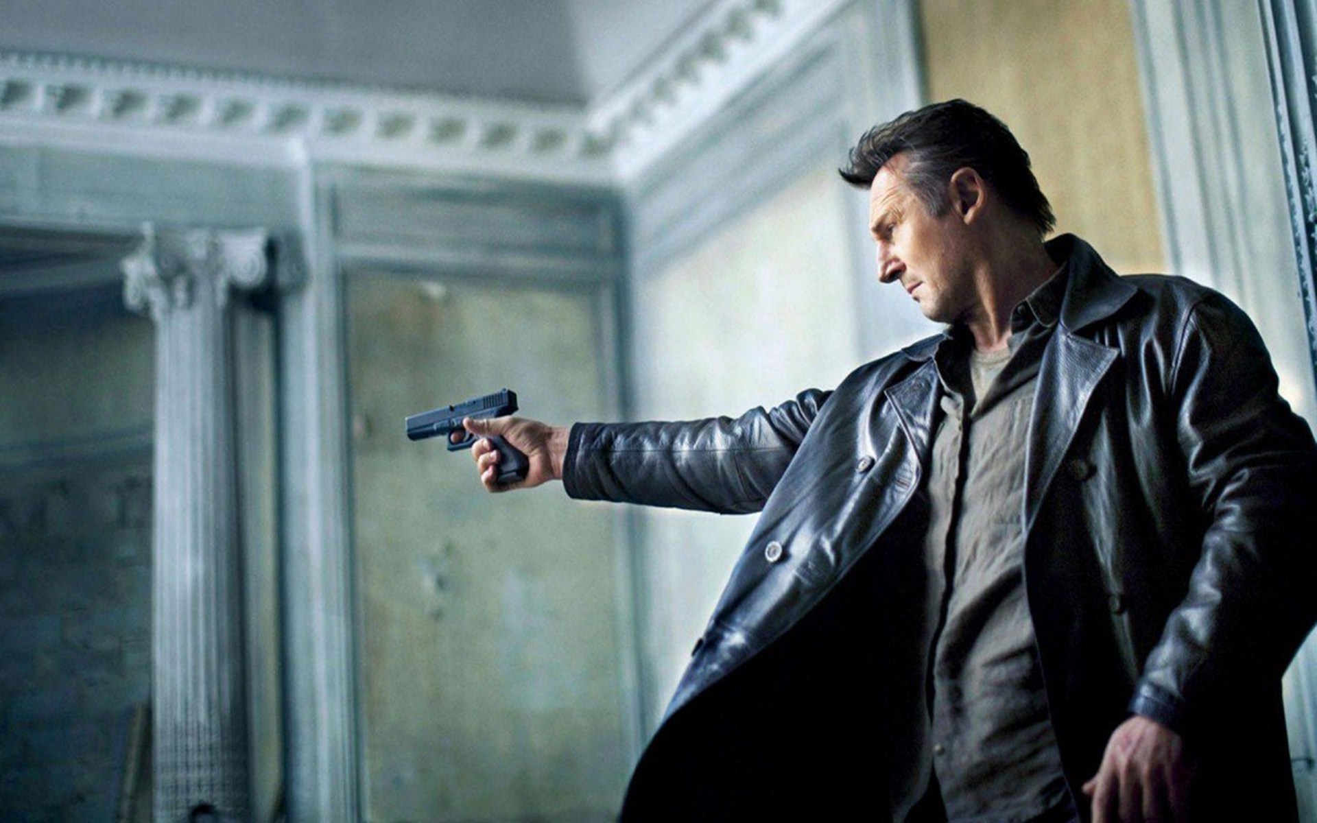
Many would agree that three ‘Taken’ films is far too many, but an action film that sparked a pop culture adoration for Liam Neeson as an action star eventually led to these two extra films (and even an abhorrent television show). These extra three segments are all terrible, but “Taken 3” takes the cake for having the worst sequencing of the entire series.
There are so many tiny cuts in the intense moments. The bigger problem is that these edits hop from shots with glaringly different angles and perspectives, so nothing flows well when you are lambasted with all of these quick cross-cuts. Some of these shifts are completely unnecessary (a shot of Neeson’s foot leads to another shot of his foot from a different angle as he kicks a weapon. Why?).
When a scene isn’t confusing, it is vomit-inducing. As well, a film with so many edits will make it abundantly clear that what you are seeing is clearly not actually happening, as so many leaps seem like an illusion is being made (rather than the illusion actually fooling you). It’s almost as if the editor of this film went to extreme lengths to commit murder, just like the star of this series.
7. Domino
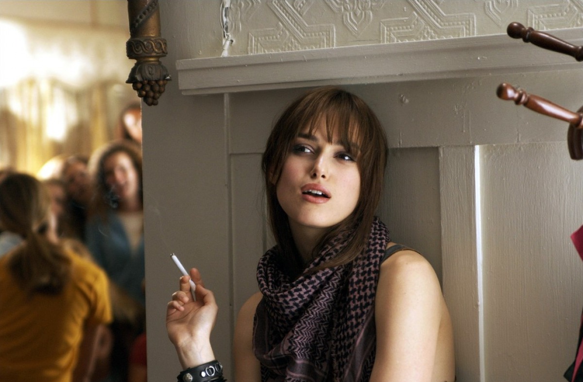
Watch the films of Wong Kar-wai and Quentin Tarantino, and you will find many instances of movies that play with the pacing more commonly found in music videos. These films experiment with speed, precision, effects and more. When done right, you will be placed in a cinematic universe that makes the everyday world around you beautiful (or the extreme worlds you can’t partake in fantastical). When it’s done wrong, you get films like “Domino”.
While this film’s editing isn’t sacrilegious the entire time (maybe only 95 percent of the time), it certainly has its share of worst moments. The quick-zooms are all shaky, so the final result is seizure-inducing and not sleek. The takes are purposefully blurred by the editor at times, and it is extremely off-putting (not to mention dated).
Many of the gruesome details of this flick get hidden by the inconsistent editing, and it isn’t the kind of film where you would care about piecing together what is happening in your head as well. There are also fast jumps in quieter scenes to, perhaps, add dramatic effect (where these scenes would have actually been better off without the extra “help”).
The ‘90s and ‘00s were an interesting time when many filmmakers tried to be like the previously mentioned innovators of this same era; “Domino” is the appropriately named film that led the downfall of the many films that failed behind it.
6. The Room
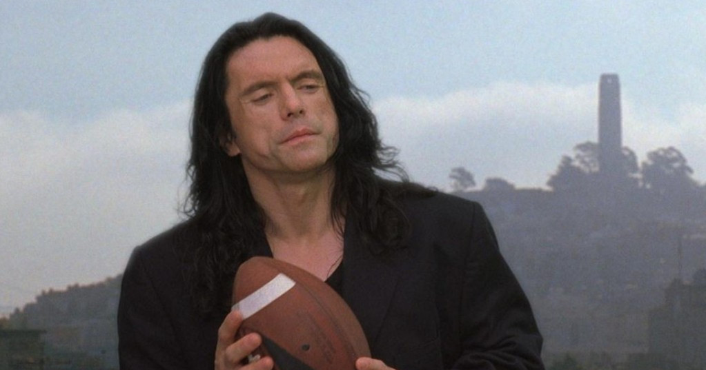
This film almost doesn’t deserve to be on this list, because every little thing about it is infamously atrocious, and yet every bad thing about it adds to its charm. It may be hard to notice over the fatal performances, putrid green screens, and Denny looking like a 30-year-old. Look closely the next time you go to a midnight screening of this cult classic, and you will perhaps have an even greater time.
Each shot is clearly a different take, and nothing syncs up correctly at all. Characters perform actions or give expressions that almost never match up to the conjoining shot that precedes each moment. The film occasionally focuses on the wrong people at the wrong times. Stock footage of bridges and skylines are shoved into the film for very little rhyme or reason.
People pop up in a scene with very little explanation (how the hell did Johnny and Mark end up on the roof when Denny is being attacked by Chris-R? Why were Lisa and Claudette magically right behind them too?). Some of these examples are well known and usually exploited at screenings, but the more subtle mess-ups will be yet another aspect to look forward to when you schedule your 80th viewing.