5. Samurai Cop
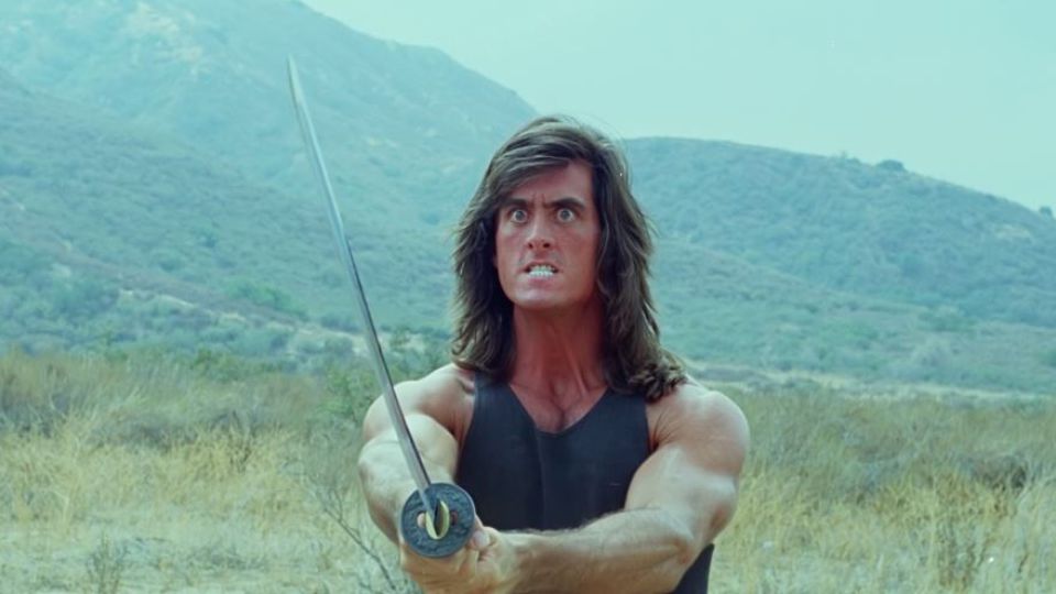
“Samurai Cop” is like “The Room” but without the same large following. It deserves just as big of a fanbase, because it is just ridiculous. The editing, believe it or not, is even worse than what you can find in “The Room”. The uncomfortable cuts—in all honesty—make it feel like a high school production; the back-and-forth jumping is done so sloppily that it feels like a premiere beginner’s exercise.
There’s almost no imagination as to how this film was pieced together. Most of the time, actors complete a full line before the film cuts to another portion. You are not a bystander in the room that observes the entire scenario, but more like the timer in a chess tournament who gets hit by whoever’s turn it is. When there are shots that are of surrounding factors (characters listening to dialogue, the scenery around them), it looks like it has virtually nothing to do with what is being said.
As there was clearly no sound editor or mixer on board, you can hear the different ambience of each shot clash with every adjacent shot as well. Of course, the awful dialogue and acting does not help, but the editing is some of the most elementary you will ever see.
4. Rampage (Turkish Rambo)
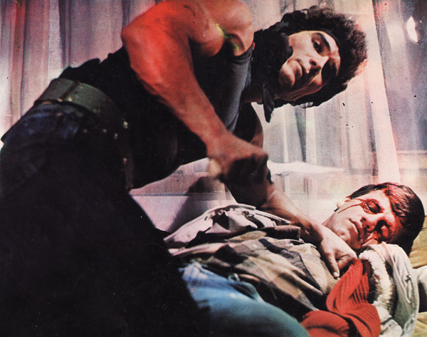
There are many ‘Turkish’ cult films that can be placed here, and another big favourite is “Turkish Star Wars” (actually titled “Dünyayi Kurtaran Adam”). If you do not know what these Turkish equivalents are, this is going to be one glorious eye opener.
There are a number of movie rip-offs created in Turkey that were meant to capitalize off of the success of other films (usually Hollywood), and they get labeled by their “inspirations” as a result. These films usually have extremely little to do with their originals when it comes to how the stories pan out, but they are heavily based on the basic premises of these films.
“Rampage (Turkish Rambo)” features a hunky hero that looks like Sylvester Stallone (only when it comes to how he is dressed, of course) that goes on the titular rampage. If we went into all of the faults this movie has, we’d be here all day. For now, the editing is so savage that some of these cuts feel like they are linked to scenes from completely different movies.
The cuts rarely line up with their Foley sounds, so the ugly transitions seem even worse. The sunlight and artificial lighting of a scene rarely match up with each shot. No actions truly flow well within this film. You will also have zero reference of where anything takes place. The only element “Rampage” got right was the bloodbath of the film that takes place, and many casualties took place in the editing room.
3. Battlefield Earth
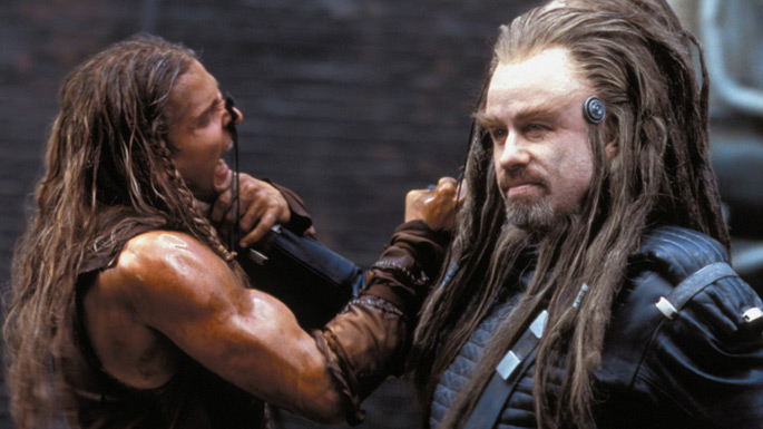
The editing in “Battlefield Earth” may not be as glaringly bad as some of the other films featured here. Let’s get some things straight, though. First off, while the entire movie isn’t poorly put together (it is in other ways, of course), the examples that can be found are absolutely blasphemous. Second, when the editing is bad, it is Windows Movie Maker bad.
The slowing-down of scenes that absolutely do not require to be slowed down (the boardroom sequence) is one example. Then you have the quick jumps that may not be “Taken 3” levels of bad, but they do not pair up well with the 129,376 Dutch angles this god forsaken movie has; you will feel like you have vertigo by the end of this movie.
You also have the A/B rule being broken (a camera should not cross its 180º view line in order to not break the illusion of having two characters in their respective seats, as crossing this line will have characters flip places on screen jarringly), which is a film school 101 no-no. Finally, let’s bring up the excruciating swipe transitions that felt dated even when this miasma of awful came out. At least “Taken 3” didn’t use the same transitions vacation slideshows feature.
2. Manos: The Hands of Fate
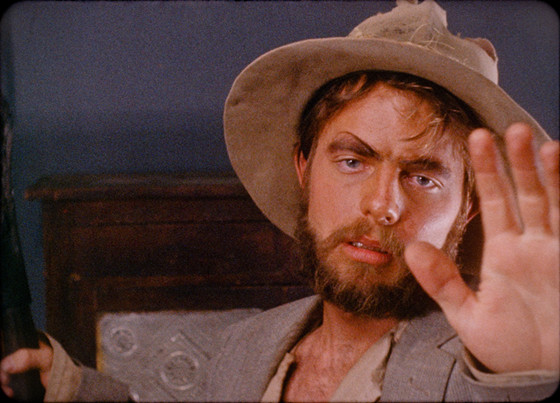
“Manos” is a very different entry, and its signature audacities are why it is placed so high. For any academic watcher, Manos is almost a dream come true, because it is a textbook example of everything that can go wrong in the editing room that isn’t what you usually see. Shots leave the empty silence actors have before they deliver their lines, so many responses feel like they needed to load in order to be said.
Then, the opposite happens, where some lines are cut before fully finished. You even get some lines included twice through different takes, and it’s not a good sign when both takes are horrendous.
Like “The Room” and “Samurai Cop”, none of the shots truly flow into one another, but it is abundantly worse here because of how drastically different each shot is; this is a brilliant example if you want to showcase continuity errors. Some parts simply do not feature edits at all, as if these portions were forgotten about. An iconic example is the close up of the demonic painting that simply does not waver for almost a minute, and an identical shot about 30 seconds later.
Finally, you can actually see tape splices throughout the film (a splice is where parts of the film are conjoined by either tape or cement, as this was an original way to edit film before the digital age). You can see the tape overlaying the actual footage in many scenes (it is the most obvious in any outdoor shots during the day). The hands that held the fate of “Manos: The Hands of Fate” butchered a film that was already one of the all-time worst.
1. Catwoman
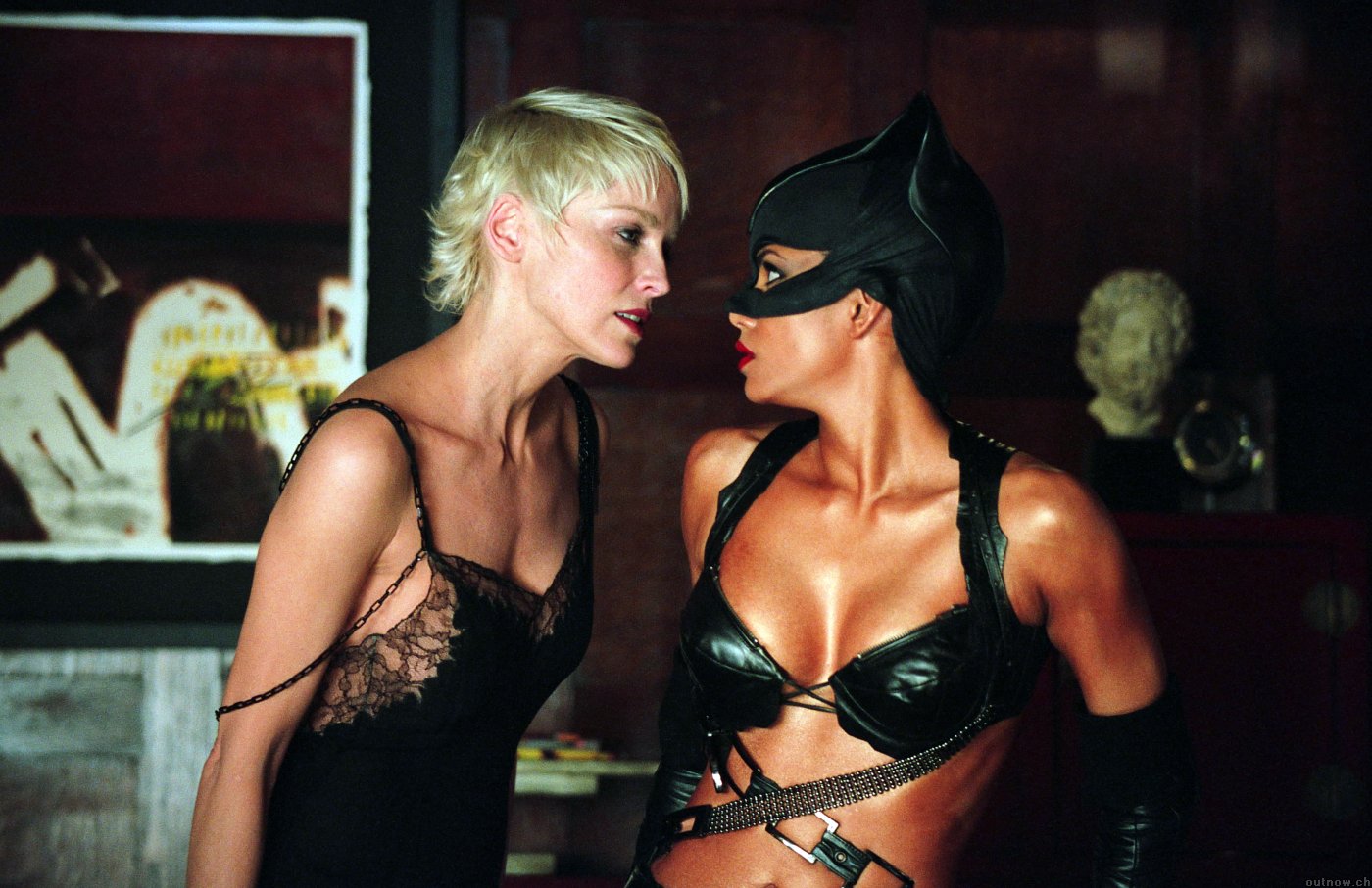
Never has action been so badly put together. Never has a specifically-paced film gone so poorly to the music it is meant to line up with. It is clear that Halle Berry isn’t a stunt master, and the crew that worked on post-production clearly knew this. “Catwoman” is placed at number one for a reason.
It isn’t like the majority of other films here where not much effort went into the editing process. In fact, “Catwoman” is a clear indication of what too much editing is like. Almost every cut has to be paired up with the beat of an R&B song that is featured, so you can already imagine how obnoxious that is. When Berry “performs” her acrobatics, the film is cut so messily to try and overcompensate how badly she pulls off these tricks. To see Catwoman do a flip, you have to put up with so many cuts.
Also, “Catwoman” also isn’t afraid to break the 180º rule. Put all of this together, and you get the worst scene in editing history: the notorious basketball scene. You won’t believe what was done to try and make Halle Berry look like a basketball superstar.
When she jumps off a wall and does a trick with the ball, you will have to deal with eight cuts in four seconds (ten, including close ups of Benjamin Bratt and the kids watching her). Every cut is so close to what happens immediately afterwards that your brain will feel like it is malfunctioning. You cannot properly put together what you are seeing.
The entire film, even when it is not an action sequence, feels like a collage of the worst takes hastily stapled together. To top it all off, you will barely be able to figure out what you have just seen even the tenth time you watch this film: 1.) you wouldn’t dare watch it even a full first time if you’re smart, and 2.) the whole point of editing is to piece together the cinematic story in a creative and understandable way. The editing in “Catwoman” fails on virtually every front (save for seeing tape splices), and there may not be a worse tampering job in film history.
Author Bio: Andreas Babiolakis has a Bachelor’s degree in Cinema Studies, and is currently undergoing his Master’s in Film Preservation. He is stationed in Toronto, where he devotes every year to saving money to celebrate his favourite holiday: TIFF. Catch him @andreasbabs.