10. Scooby-Doo: The Movie (2002) – Scooby Doo Himself

What’s this? A live-action version of Scooby-Doo? Then why doesn’t Scooby look, well, alive? Scooby looks so out of place you kind of wonder why didn’t they just make a 3D animated movie instead.
We get it, it was the early 2000s and non-human characters (especially of the furry kind) were hard to do, but still… it just added to the long list of things wrong with the movie.
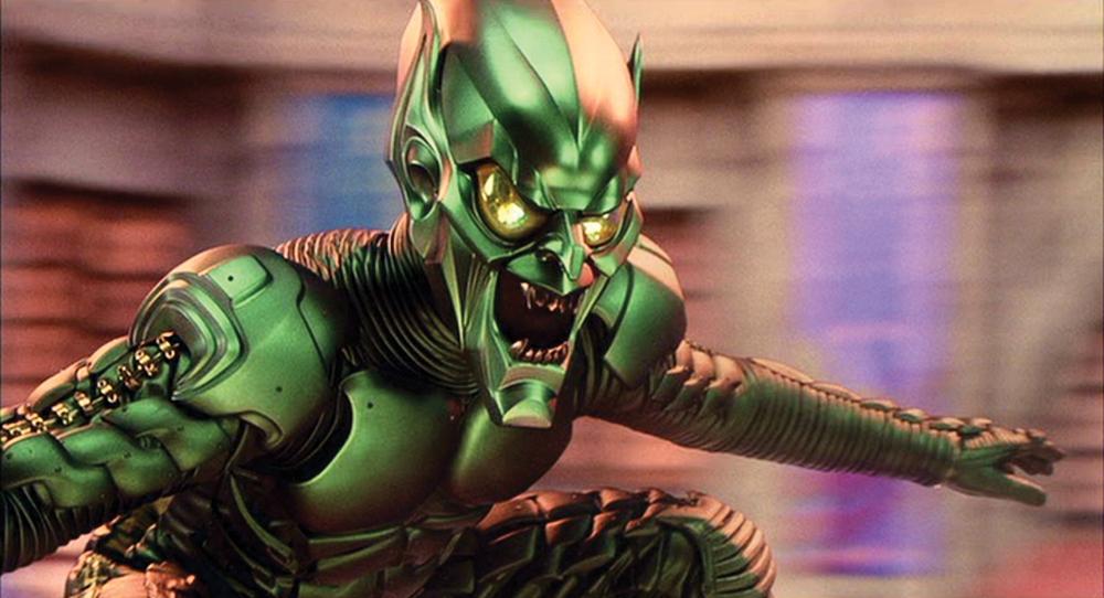
9. Spider-Man (2002) – The Green Goblin

Sam Raimi’s Spider-Man trilogy has its CGI issues throughout the series, but nothing quite as bad as the Green Goblin in the first entry. Looking more like a Power Rangers villain (unless there’s a crossover we’re not aware of), the Green Goblin looks more akin to a giant moving and talking toy (which probably was the point) and the costume sure didn’t help.
Aside from Willem Dafoe’s brilliant performance and mannerisms, the Green Goblin looked awkward and wrong.
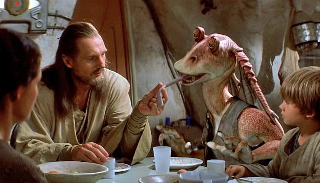
8. Star Wars: Episode I – The Phantom Menace (1999) – Jar Jar Binks

Undoubtedly one of the most hated entries in any franchise, “The Phantom Menace” has its share of problems – most notoriously Jar Jar Binks, who’s gone on to become one of the most hated characters in film history.
Personality aside, his design looks more like a rubber toy than anything convincing (which, again, was probably the point), and the human interactions with him are just as awkward. Including all the other non-human characters who also look very uninspiring (including Yoda, who looked better in the original trilogy), Jar Jar Binks is by far the worst.
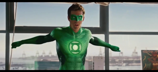
7. The Green Lantern (2011) – Green Lantern Himself

Thank the comic book gods for “Deadpool”, because Ryan Reynolds was finally cast in something good. With a $200 million budget, they probably spent a few dollars on Green Lantern’s suit with an emphasis on the ominous glow.
No wonder Deadpool asked for a suit that’s not animated or green. The rest of the CGI is nothing to write home about, but the green suit is the most distracting.
6. The Hobbit: The Battle of the Five Armies (2014) – Climax & Crowd Effect

The title battle is so bland and overstuffed with CGI that it’s hard to take it seriously or feel any sense of danger. This mostly comes down to the CGI crowd effect and terrible backdrops that are a far cry from any of the battles in the Lord of the Rings series.
At this point, everything feels like a videogame and contrived. Not to mention the CGI orcs that just fail to leave any impression and are throwaway characters.
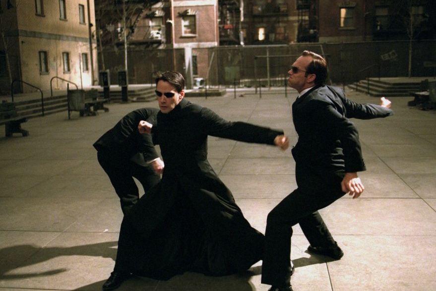
5. The Matrix Reloaded (2003) – The Burly Brawl

While the Matrix sequels are indeed inferior to the original and have their share of flaws (so much kissing), they’re nowhere as bad as people perceive them to be. It’s a shame how criminally underrated they are.
However, the series has some of the best choreographed fight scenes that Hollywood has ever dreamed up, thanks to the legendary Yuen Woo-Ping. The one that’s remembered the most is the Burly Brawl, both for good and bad reasons. The good being the directing, editing, choreography, and Hugo Weaving’s Agent Smith Army.
The bad being the characters changing from their regular selves to CGI versions when the fight gets complicated. Also, what’s the point if Neo is going to just fly away in the end?
4. The Mummy Returns (2001) – Dwayne “The CGI” Johnson

For reasons unknown, the filmmakers on this one decided it was better to go all plastic CGI on The Rock as the Scorpion King. Surely, getting The Rock to come in for a day, and using some practical makeup would’ve been better. Or just having him talk smack would’ve been less painful.
Even though this was the early 2000s, the first ‘Mummy’ movie was better in every possible way, including its special effects, so there’s really no excuse for this PS2 rendition.
3. The Twilight Saga: Breaking Dawn – Part 2 (2012) – CGI Baby

It’s ironic that the tacky werewolves (which are not real) in the movie look more convincing than the baby (which is real). Baby Renesmee is the scariest thing in a series filled with things that should be scarier. And it’s made even worse by the characters who act like she’s the cutest thing ever.
There’s a varied history of CGI babies in different movies, some more successful than others, but it’s surprising when “Children of Men” did such a superb job and that movie came out six years earlier.
2. Van Helsing (2004) – Big-Mouthed Vampires

Universal has yet to deliver a monster movie that is anywhere near as good as their classic output in the 1930s. “Van Helsing” may of sounded like a good idea on paper, but it fails in every possible way, most notably in the special effects department that’s chock-filled with bad effects that it’s hard to pick just one.
But the most notorious and most head-scratching are the vampires with their magnified mouths that look unnatural whenever they show aggression. While the whole movie seems to have an obsession with really big mouths, at least it looks like natural (sort of) when the other creatures open wide.
1. X-Men Origins: Wolverine (2009) – Wolverine’s Claws

When Wolverine finally got his own feature, the last thing you thought they’d get wrong are his claws, because we’ve seen them done well enough in the preceding trilogy.
But they did – Wolverine pops his claws for the first time and they look like they were superimposed as an afterthought than actually coming from his hands.