5. Enemy
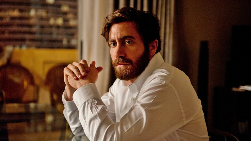
Nicolas Bolduc may be the least prolific of any Villeneuve’s cinematographers, but that doesn’t mean he’s any less capable than the competition. His work on Enemy proves that he has a bright future ahead of him. This is a darkly psychological film that plays things subtle throughout. It isn’t an edge-of-your-seat thrill ride but rather a quietly effective brain-teaser. Like most of the cinematographers on this list, Bolduc seeks to heighten the overall quality of the film rather than just the visual appeal.
This means that certain elements of the cinematography exist to match the overall nuance of the movie. Subtlety is the name of the game, and in that regard, Enemy is a success. The muted colors pair well with the overall mood of the film. Bolduc avoids using loud, expressive colors and lighting. Instead, the film almost feels like it was given a sepia filter.
In some ways, this could be viewed as a sort of insult because it could be considered lazy use of coloring. Luckily, Enemy makes it work. In fact, Enemy makes most elements of the cinematography work. It’s harder to praise the movie due to the less dramatic use of lighting and color, but it’s still quite an achievement.
4. Prisoners

Surprising absolutely nobody, the first Deakins-Villeneuve collaboration picked up an Academy Award nomination for Best Cinematography. Anything Deakins touches seems to turn to gold, and Prisoners is no exception. Villeneuve’s English language debut earned solid reviews for its top notch performances and suspenseful plot, but it also got plenty of love thanks to the fact that it’s really damn pretty. The fact that this is the least visually appealing collaboration with Deakins only further proves that he’s a some kind of cinematography god.
If you need some kind of convincing, it’s worth noting that there are entire blog posts dedicated to dissecting various shots within the film. Each and every shot is meticulously crafted with an unbelievable attention to detail. Certain shots exist to reinforce themes, silhouettes are frequently used to draw attention to the characters, colors change to keep up with the rapidly changing mood, and that’s just the tip of the iceberg. Deakins has every shot planned out. That’s impressive in this film, but it’s even more impressive to think that his work has only improved from here.
3. Arrival

Arrival relies less on pretty visual effects than it does on expressive lighting and unique color choices. The CGI alien is dazzling to look at, but it’s hardly the focal point. In an era where all sci-fi movies rely on giant budgets that result in elaborate special effects, it’s refreshing to see a movie that’s visually impressive in different ways.
It’s also impressive to see a fairly lesser known cinematographer create something so beautiful. Villeneuve took a risk collaborating with Bradford Young after working with the legendary Roger Deakins. Sure, Young did a solid job with movies like Pariah and Selma, but he hardly has the same reputation as Deakins.
Somehow, against all odds, Young outdid a lot of phenomenal cinematographers with his work on Arrival. The muted color palette pairs perfectly with the overall mood of the film, the lighting accentuates the beauty of the setting, and the camera work frequently does exactly what it needs to do.
The dull colors further exist to push themes tied to the mundane adult life. Dull may be an unfair word to use given the negative connotation, but the dull colors do a lot to create beautiful scenery. It’s hard to explain why Arrival is so attractive, but Young clearly pulled off some kind of artistic miracle.
2. Sicario
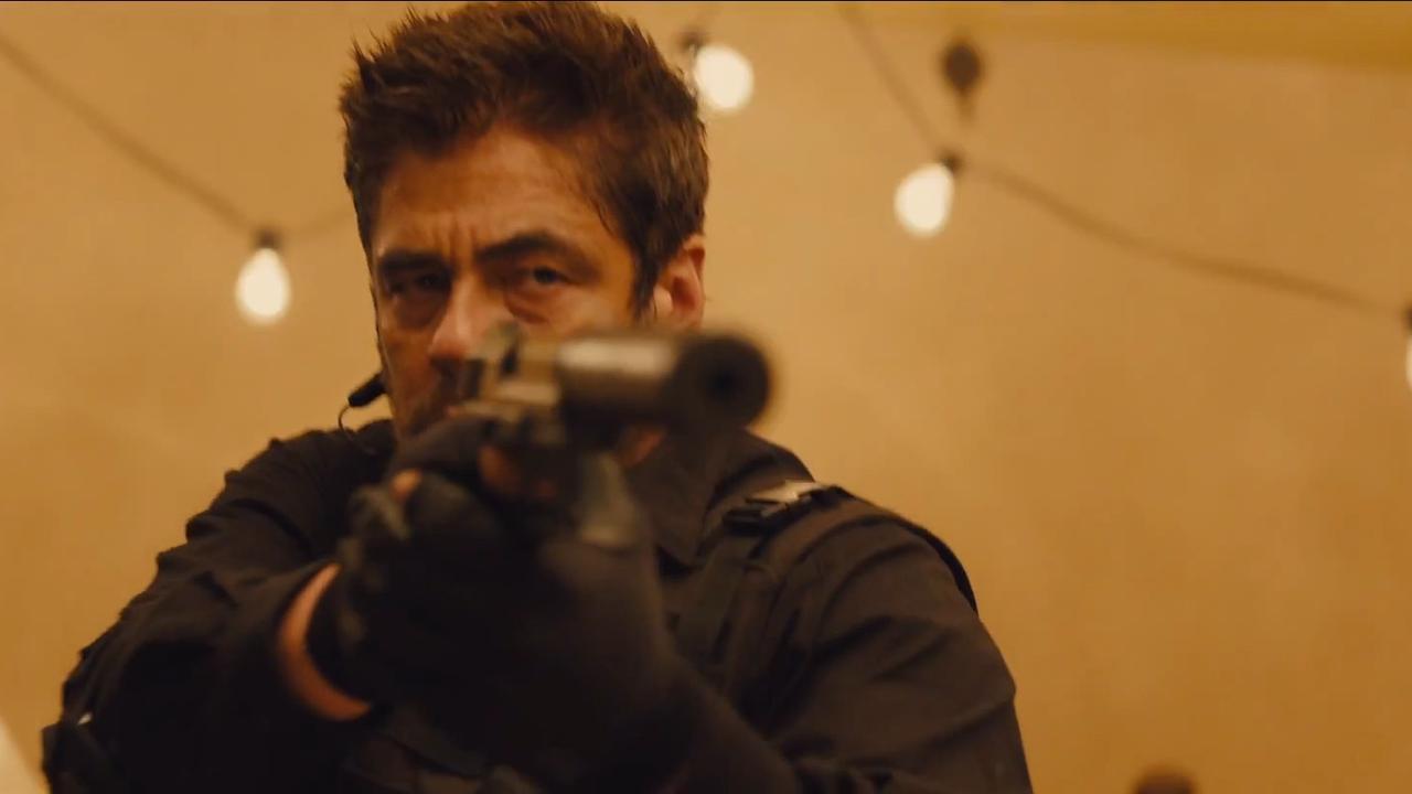
Deakins once again worked with Villeneuve in his critically acclaimed crime-drama Sicario. As usual, the collaboration earned heartfelt praise from critics for a variety of reasons. Deakins has stated on numerous occasions that the goal isn’t to create a beautiful movie. Instead, his cinematography exists to serve the story.
The fact that he’s able to create a beautiful movie in the process is just an added bonus. There are plenty of scenes within the film that exist to further the plot of the movie. However, there are just as many scenes that are flat-out gorgeous regardless of what purpose they serve. The fact that Deakins is able to kill two birds with one stone is impressive to say the least.
So how does the cinematography actually help the story of the movie? For one, the lighting, placement of objects, and use of color all affect the the tone of the movie, which subsequently affects the plot. By subtly tweaking the emotional reaction expected by the audience, whole scenes are given new meaning. Additionally, the decision to focus on certain characters just so happens to give these certain characters nuance during specific sections of the film. To put things simply, there’s a whole lot of complexity within each and every shot.
Once again, it’s worth noting that regardless of whether or not a viewer is actually aware of the effects, he or she can still conclude that this is a beautiful movie. The lighting is absolutely jaw-dropping, and the contrast in color throughout various scenes is hard to ignore. It’s impressive that Deakins can jam so much meaning into everything, but this is an aesthetically pleasing movie regardless of whether or not viewers notice the less obvious cinematic effects. When judging Sicario’s cinematography, there are countless elements that deserve heaps of praise. The more the viewer pays attention, the better.
1. Blade Runner 2049
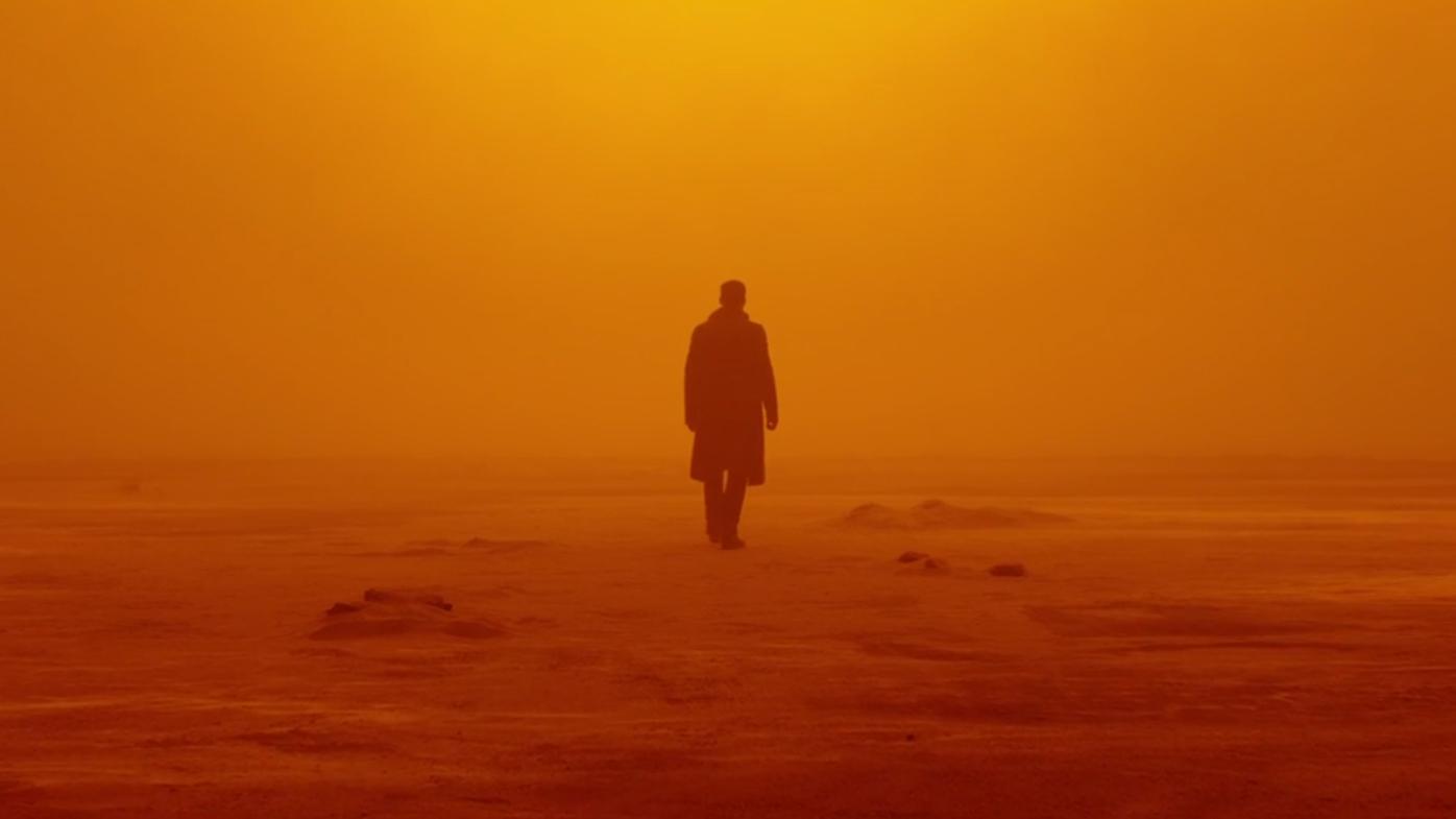
Blade Runner 2049 may be Roger Deakins’ crowning achievement. After thirteen nominations, people have pegged this as his first possible Oscar victory, and it’s easy to see why. This is easily the most visually stunning movie of the year. The visual effects are groundbreaking, but the cinematography is what really allows the movie to shine. In a film with so many positive aspects, it’s impressive that Deakins’ camerawork has been pointed out in almost every single major review. Somehow, it has managed to earn just as much recognition as the thought-provoking themes and vast scale.
Based on the opening statements, the critical reaction has been perfectly warranted. Deakins doesn’t just add some pretty lights to the long-awaited Blade Runner sequel. That would be too easy. He puts his heart and soul into every single frame. It’s not just about Ryan Gosling being well illuminated.
The cinematography works because of how intricate each shot happens to be. The actors and actresses all seem to be placed in certain areas for a reason, the types of shots all serve some kind of purpose, and the lighting brings life into a seemingly robotic world. Blade Runner is well known for creating a beautiful cyberpunk world. The sequel replicates the success of the original thanks to shots that are both beautiful and meaningful.
Deakins deserves an Academy Award for his work this time around. This may be his most visually impressive film to date. More importantly, it’s evident that he put an impressive amount of effort into making everything work. Villeneuve’s storytelling is impressive, but it’s helped so much by every little detail within the cinematography. The film presents viewers with an elaborate world, and Deakins does a great job bringing it to life.