Production designers, or art directors, are responsible for the look of a film. They often have a simple question to answer; will the narrative’s setting work better by being created in a studio, or by being filmed out on location?
It’s important to remember that everything that you see on screen in a film has either been placed there deliberately, or has been captured because it’s deemed narratively significant. These ten films offer famous examples of production designs. Where appropriate, these examples also point to the significance of the setting.
1. La Grande Illusion (1937)
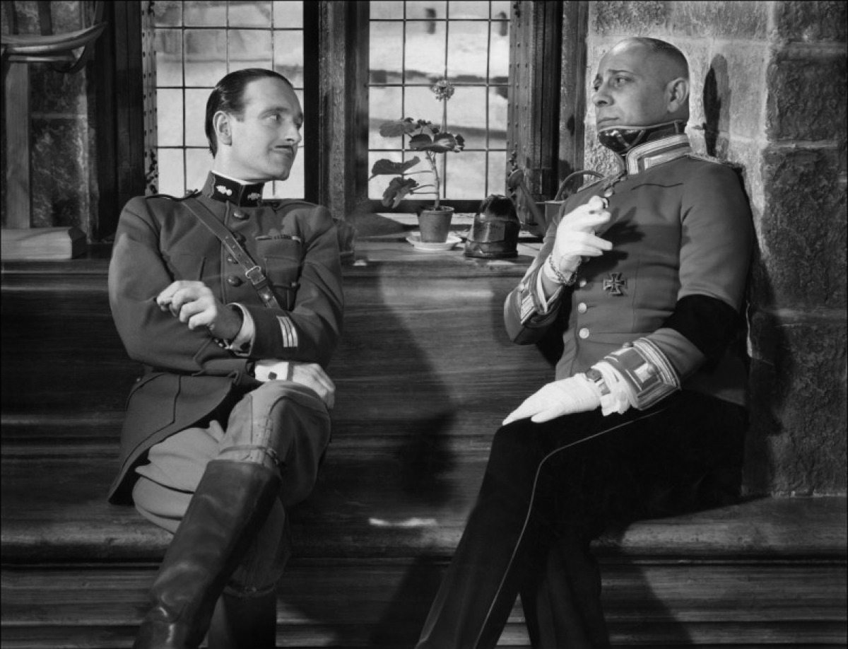
Realism is a key part of La Grande Illusion. Not only do all of the characters speak in their native languages (French, German, English or a mixture of all three) but all exterior shots are filmed on location.
Set close to the war, filming took place as close to Germany as possible, at the Haut Koenigsbourg Castle in Alsace, the Artillery barracks at Colmar, and at Neuf-Brisach on the Upper Rhine. All three locations refer back to an old, increasingly irrelevant way of living (nobody needs to live in a castle any more). These locations compliment La Grande Illusion’s subject matter; the old-school upper class are a dying breed. As such, it’s the working class that escape from the castles; the future is theirs.
Interestingly, it was decided that it’d be easier to shoot the interiors using studios. Despite using sets however, Renoir was keen to shoot an important scene through a window. Production Designer Eugene Lourie boldly decided to bring the wall of the farm set with him onto an exterior location. He then set up the freestanding set wall, allowing Renoir to shoot the scene as if the farmhouse was situated in the beautiful countryside.
2. The Lady Vanishes (1938)
When a budget is limited, production designers have to think outside of the box to help their directors tell stories.
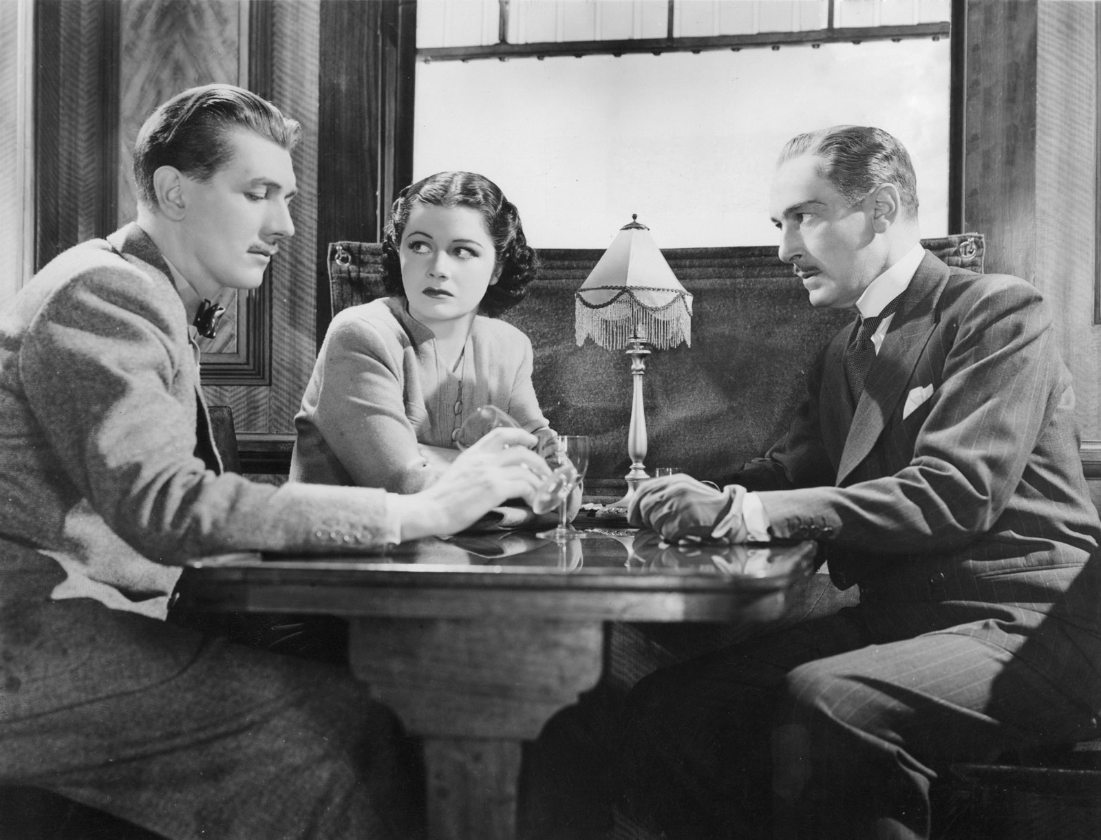
Hitchcock’s The Lady Vanishes is remembered as a lavish thriller, set in a remote and exotic part of Europe. The film was originally going to be (partly) shot in Yugoslavia. However, after Yugoslavian police discovered that they weren’t portrayed favorably in the script and the film crew were kicked out of the country.
Forced to shoot in England, and with limited means, Hitchcock relied on clever camera angles and innovative set design to create an international flavor. Essentially, just two main sets were used – one for the hotel, and one for the train. Variety was created by using rear projection, as well as using an (albeit dated) establishing model shot of the european hills. Characters are often filmed looking out of windows, and we rarely see shots from their point of view (as the hills of Islington aren’t exactly famous).
The results were so impressive that Hitchcock was soon snatched up in Hollywood, where he had access to bigger budgets and better locations for filming.
3. Ben-Hur (1959)
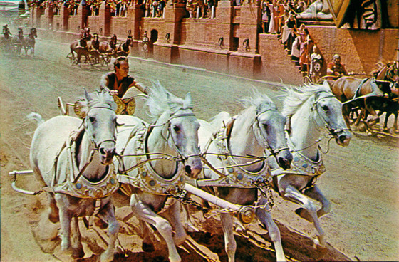
The makers of Ben-Hur set out to astonish their audience. Everything about the production design still looks epic today. There‘s an obvious reason for this; biblical blockbusters had become popular during the fifties, and were expected to generate a lot of income. Before Ben-Hur screened in cinemas, it was screened as a ‘roadshow‘ movie, in a limited number of state-of-the-art theaters that were fully able to show off its new MGM Camera 65 (65mm) picture with a widescreen aspect ratio of 2.76:1.
Ben-Hur was expected to be a hit even before production began, and that meant that a lot of money could be poured into the production design. As much of the sets were going to be open to scrutiny on massive cinema screens, attention to detail was important.
Some films (like The Lady Vanishes) might have settled for models and rear projection. Ben-Hur however, had as much created for it as possible (using over 300 sets for filming). It also reportedly took over a year for a thousand laborers to carve the chariot race track out of a rock quarry.
Some of the sets are so detailed, colourful and lavish, that you can’t help but think that you’re seeing something that you’ve never seen before (on screen or otherwise), almost as if you’re magically gazing back into the past.
4. Saturday Night, Sunday Morning (1960)
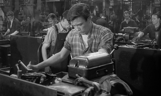
A film’s production design often reflects a film’s key concepts. Saturday Night, Sunday Morning is a classic example of a British ‘kitchen sink drama‘ – a cultural movement in film that aimed to highlight real issues that faced the working class in Britain. As such, the film’s production design illustrates the lives of industrial workers.
The opening scene is set in a greasy, sweaty factory. Much of the film takes place in cramped room in the English Midlands, or in other popular working class locations such as pubs or a local town carnival. There’s little variation in the set design, highlighting the plight of Arthur Seaton (Albert Finney); he’s trapped and bored, and there’s virtually no chance that he’ll every be able to break free from the drudgery of life.
5. The Graduate (1967)
Production designers will read over scripts, identifying themes and character motifs that can be reflected in the art direction. For the first half of The Graduate, everything that surrounds Ben Braddock (Dustin Hoffman) seems lavish and unnecessary. For his twenty first birthday, he’s given a diving suit that he pointlessly wears around the house and in his swimming pool. Ben himself often appears isolated and unable to share his experiences with others; adrift in a swimming pool or staring through a crowded fish tank.
Everything around Mrs Robinson (Anne Bancroft) is shown as decadent; overly lavish lamp designs, arty alcohol bottles, plants that look like they’ve been imported from the African jungle. The decadence foreshadows the affair that she’s about to enter in to with Ben.
