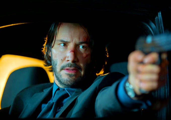
With all their shootouts and car chases and fist fights, action movies clearly exist in a heightened version of reality. The heroes and villains are very clear-cut and unambiguous, and the characters undertake death-defying stunts and come out without a scratch. It’s not the most realistic genre – but it has the potential to be most cinematic.
A lot of action movie directors see taking on one of these projects as an easy paycheck and take a simple point-and-shoot approach to capturing action sequences. But more artistic and creative directors, from John Woo to Oliver Stone to Quentin Tarantino, see the opportunities to create real cinematic art with their action scenes. We’ve had point-of-view shots taken from a speeding bullet’s perspective and flitting from color to black-and-white and back again within the same sequence.
These movies aren’t going for a gritty, realistic take on their action – they’re using an elevated visual style to give you a more mesmerizing moviegoing experience, and if it’s done right, it can pay off in spades. This is a list of the ten slickest and most stylized action movies in the history of cinema.
10. Wanted (2008)
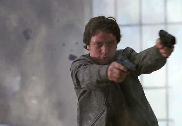
Director Timur Bekmambetov brought a glossy, stylized, saturated look to this adaptation of Mark Millar’s comic book series about an account manager with innate assassination abilities who joins a secret society of killers.
It begins by emulating the setup of David Fincher’s Fight Club – a bored office drone worries about his insignificance through a depressing voiceover narration and a bleak color palette – but it quickly devolves into a ludicrous, excessively violent action extravaganza when Angelina
Jolie shows up in a short skirt holding a giant, phallic gun.
All of the action in the film is so unrealistic – from the bullet-bending to the car-flipping – and yet so cinematic. The visuals are slick and the use of slow-motion gives Bekmambetov ample opportunities to use CGI effects to throw in little touches like the keys that fly off the smashed keyboard that line up to say “FUCK YO-” followed by one of Chris Pratt’s dislodged teeth in the shape of a “U.” The movie is full of moments like this.
Wanted was criticized for making gun violence seem sexy and glamorous, but it could be argued that the violence is so over-the-top and comic book-y that audiences will distinguish it from real-world violence and be able to enjoy the ride.
9. Natural Born Killers (1994)
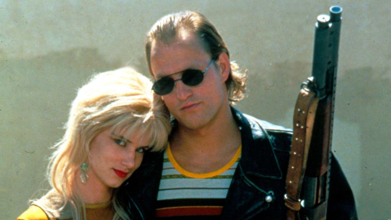
Oliver Stone’s scathing indictment of the media’s tendency to turn serial killers into celebrities is a rare action film that has a satirical point to make and can be critically analyzed. Natural Born Killers has a kinetic editing style inspired by Arthur Penn’s Bonnie and Clyde, specifically its final scene, and it makes for one hell of a ride.
The movie plays around with juxtaposition a lot. It’ll cut from the brutal violence of a grainy, black-and-white massacre to a dreamy, well-lit, romantic dance between the two leads in which they declare their love for one another. Natural Born Killers is absurdly stylized. It’s a feast for the eyes. One point-of-view shot is taken from a bullet’s perspective as it flies from the barrel of a gun into a waitress’ screaming face.
Stone utilizes techniques like cutting between color and black-and-white, and shooting on different types of film stock and with different speeds of film. Filming on these different mediums, editing in these different styles, and frequently cutting to irrelevant images like one recurring shot of a multi-headed dragon, blend the scenes together seamlessly and give the film a surreal, unstructured, dream-like quality. The ultimate way to watch Natural Born Killers is Stone’s twisted, ultraviolent, unrated director’s cut.
8. The Warriors (1979)
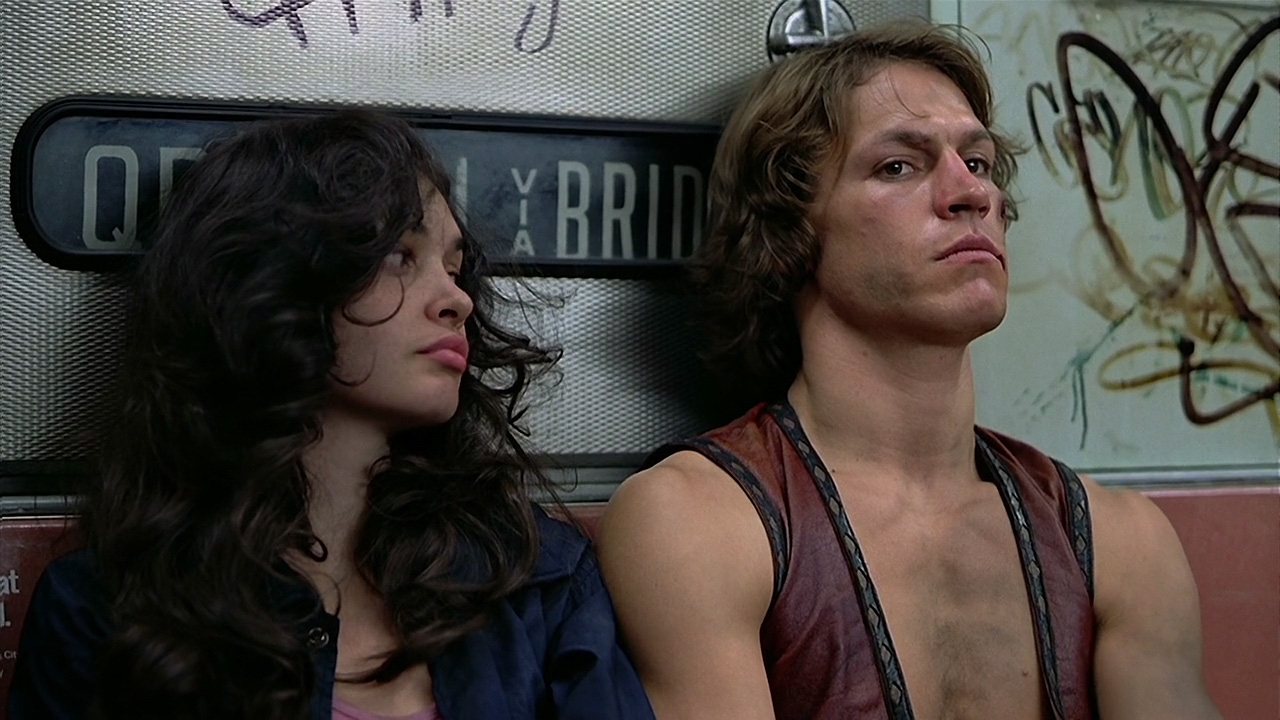
The Warriors is remembered for its corny depiction of the gangs who roam the streets of New York. The characters go by names like Cowboy and Ajax and Snow and they wear costumes and have meetings and conferences. This is not what real gang warfare is like.
The original script did feature a gritty and realistic portrayal of street gangs, but when director Walter Hill got his hooks into it, he decided to make the film feel more like a comic book. He divided the movie into chapters and framed each shot like it was a panel in a graphic novel. It has bright colors and flashy visuals, which look spectacular and make for a lively and stylish movie, but it also glamorized violence so much that it incited violence at movie theaters back in 1979.
The plot of The Warriors does not have much depth or complexity, but that’s what Hill was drawn to. It meant that there were plenty of opportunities for him to add in splashes of style. The movie was not appreciated in its time, but it has since become a cult hit.
7. Heat (1995)
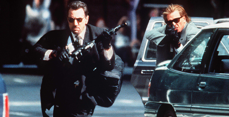
After the two had appeared separately in The Godfather Part II, Michael Mann finally put Al Pacino and Robert De Niro in the same scenes together in this tense cat-and-mouse crime thriller. The pairing of Pacino and De Niro is part of what makes Heat work so well – that, and the sleek and highly stylized direction by Mann.
The long shootout scene in the movie ended up being one of the most visceral and elegantly staged action scenes of all time. Meticulous pre-production planning can only go so far – what really made this scene stand out is that the actors were having a real-life gunfight (albeit with blank rounds instead of actual bullets).
Mann brought in ex-special forces sergeant Andy McNab to train the actors to shoot, first with live ammunition and later with blanks, so that when it came to filming, they were actually firing blank rounds from real guns at each other and they knew how to handle the guns and the scene comes off as worlds more realistic and engaging than most Hollywood action sequences because of it.
Mann elected not to shoot any scenes on a soundstage, so the entire movie was shot on location, giving it a much more visually striking and immediate feel. Scenes shot on a soundstage can tend to feel too intimate and closed-off as they’re only shot from certain angles and only half the street is actually there, but Heat has a vast and epic feel to it.
6. John Wick (2014)

Cinematographer Jonathan Sela used an Alexa XT camera to capture the slick, sumptuous visuals of this movie. Sela worked with directors Chad Stahelski and David Leitch to create two different visual styles for the film: one for John Wick’s retired life and another for when he re-enters the assassin-infested criminal underworld. Sela explained, “We wanted the first look to be soft and clean, and the second to be grittier, darker, and sharper.”
The look of the film was inspired by Japanese anime and Hong Kong martial arts movies, as well as, to a lesser extent, spaghetti westerns and the works of Jean-Pierre Melville. With all of these influences combined into a clear vision, John Wick’s aesthetic is realized beautifully through the use of both anamorphic and spherical lenses. It plays out as a slicker, more stylized version of John Boorman’s Point Blank.
Also, the neon visuals of the nightclubs in which Wick battles his way through legions of henchmen recalls the glossy neo-noir aesthetic of movies like Blade Runner and Drive.
The heart-racing action sequences in John Wick were created using the perfect blend of insane fight choreography and kinetic camerawork and editing. The use of long takes to take Wick through brawls and shootouts and knife fights is similar to what John Woo did with the climactic hospital scene in Hard Boiled.
That scene is considered to be one of the greatest action sequences ever filmed – well, Leitch and Stahelski employed those techniques for pretty much their entire movie.