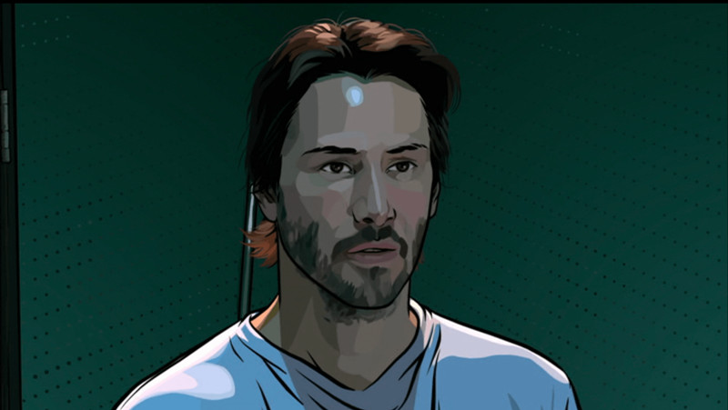
Rotoscoping, for those who may be unfamiliar with the term, is the technique of animating over film footage to create more realistic or lifelike characterizations. Created by animator and cartoonist Max Fleischer in 1915, the method was originally dubbed the “Fleischer process,” and utilized a device called a rotoscope to project film images onto a glass surface for the artists to trace or embellish as they wished. Today, rotoscoping often involves digital mediums to create the composite images, and the results are quite diverse, combining digital footage with a variety of modern or classic animation styles.
This process, as mentioned in the examples below, can vary a great deal in both style and proportion, with some animators using a lighter touch to emphasize the film footage while others use the footage more as a reference for more heavily animated sequences. In fact, rotoscoping is not just used for animated features but has become a staple of modern visual effects, used as much for omission as for inclusion or accentuation. Yet despite its ubiquitousness as an effects tool, the rotoscope form remains a style and a subgenre of animation, valued for its realism and admired for its versatility as a fusion of live action and animated conventions.
When rotoscoping was adopted by animators at Disney and other major Hollywood studios, it was often used sparingly. Some animators preferred the squash and stretch principles of classic animation to the realism of rotoscope. But others, such as the rotoscope pioneer Ralph Bakshi, would eventually embrace the technique entirely, initiating a golden age for the form in the late ‘70s and early ‘80s with films like the original animated “Lord of the Rings” (1978) and popular sci-fi and fantasy epics “Wizards” (1977) and “Fire and Ice” (1983), the latter of which was collaboration with artist Frank Frazetta, one of the most renowned fantasy illustrators of the 20th century. Bakshi was known for his blending of realistic, slightly touched up film footage with more animated settings and characters, even making use of newsreels and other stock footage to give his films a sense of veracity beyond the scope of conventional animated fare. Other films of the period, like the cult anthology “Heavy Metal” (1981), used a similar style to Bakshi’s, and it was in this era that the rotoscope film became a subgenre title associated with adult animation.
While there are similarities between modern rotoscoping and motion capture techniques used with CGI, there are some distinctions as well. Motion capture, for example, does not involve tracing by animators but instead uses specially designed programs to record objects or bodies in motion and translate (or render) them into the animation software. There can be crossover, of course, and some animators may even disagree about what actually qualifies as rotoscopy, but fans of the technique enjoy the form in its entire gamut, from hand-drawn traditionalism to the interpolated effects of modern digital composite animations. As long as the technique is used as a creative means to good storytelling, audiences tend to appreciate the effort, whether it’s a polished high-budget production or a labor of love.
The following list includes some of the most highly regarded rotoscope films created since the turn of the present century. Some are Hollywood productions while others were created outside of the American motion-picture industry. Diverse in form as well as in content, the films on this list demonstrate a considerable range of uniquely creative rotoscope styles. Each establishes its own individual niche in the overall culture of the form, and without question, every entry will have lasting significance in the future of animated cinema.
1. Waking Life (2001)
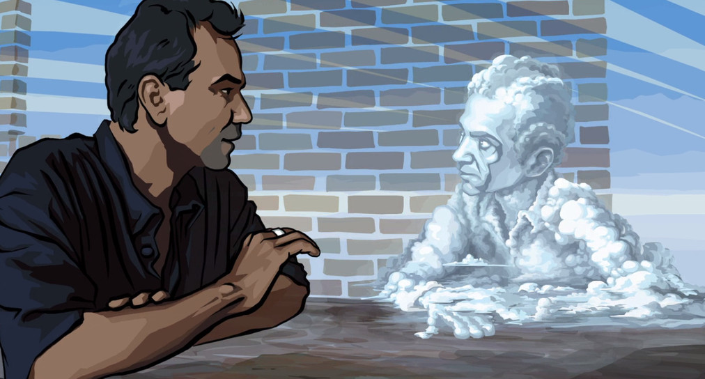
Director Richard Linklater’s first animated feature, “Waking Life,” is a meditation on lucid dreaming and the nature of consciousness. The film is animated using Rotoshop, a form of interpolated rotoscoping that allows for multiple mattes from single key frames. In other words, the programming allows for the automatic generation of intermediate frames, which are referred to in animation as in-betweens or tweening for short. This is, essentially, the digitization of rotoscoping, and it reduces the heavy workload of animating individual frames for each sequence. But what makes “Waking Life” so groundbreaking isn’t merely the efficiency of the technique. It’s the film’s use of that technology to tell a compelling, nuanced and transcendent story that may have lost its most alluring aspects had it taken another form.
In “Waking Life,” scenes are contextualized by an evolving style of animation that takes full advantage of the versatile capabilities of the rotoscope method. Some scenes are more spare with the animation, resembling slightly highlighted live-action footage, while other scenes are more animated, fluid and abstract. These alternating styles are presented not merely as eye candy but as accurate depictions of a dream world grounded in lucid consciousness, and every shift in the balance serves a narrative purpose.
With a narrative structure similar to that of Linklater’s breakout classic “Slacker” in 1990, “Waking Life” follows an unnamed protagonist (Willy Wiggins) as he explores his dream life, sometimes interacting with the people he meets and other times fading momentarily from the action as other characters take over the narrative. And like “Slacker,” “Waking Life” aims to resonate with its viewers. Its stories within stories often have a reflective nature that dissolves the fourth wall between audience and medium with layers of allusion and self-referential significance.
The frame narrative that follows the unnamed protagonist is like a stream-of-consciousness shadowing that observes the mise en abyme of other character paths, each of them as fleeting as his own proves to be in the end. But like a lucid dream itself, the film concludes without the conspicuous resolution of traditional Hollywood fare. It ends with an awakening, as many would expect, but not from the dream. It is an existential awakening that acts as a film version of a Zen koan, meant more as a question than an answer.
2. A Scanner Darkly (2006)
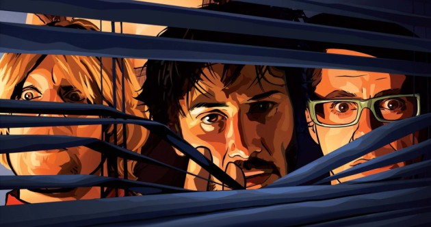
“A Scanner Darkly” is Linklater’s second animated feature. Created using the same Rotoshop technology as he used for “Waking Life,” “A Scanner Darkly” is much more grounded in a singular format and style. While on its surface, it appears very realistic, with clearly recognizable actors and settings, it is also subdued, hypnotic and at times, psychedelic in tone.
Based on a surreal and paranoia-infused novel by science fiction author Philip K. Dick, the story of “A Scanner Darkly” reads almost prophetic in relation to both the American drug problem and mass surveillance. Written in 1977, just before the popularization of drugs like crack, meth and ecstasy, the book depicts a dystopian future where a fifth of Americans are addicted to a new drug called Substance D. As the story’s protagonist (played by Keanu Reeves in the film) lives a double life as an addict and a government agent, the conflicting nature of his experience becomes both morally and psychologically complex. Thus, in the film version, the rotoscope form provides a fitting context for a schizophrenic character arc that is rooted in reality but becomes increasingly abstracted and hallucinatory as the tale unfolds (and especially fitting for science fiction that borders on speculative).
Rotoscope, at its best, is a tool that helps artists accentuate and reinterpret what is captured by the camera, and Linklater’s animated films are consistent examples of the method used confidently and to worthwhile effect, even if they do blur the line between rotoscope and motion capture CGI. With the accomplishments of “Waking Life” and “A Scanner Darky” (as well as a new feature film, “Apollo 10 ½: A Space Age Childhood,” released in the spring of this year), Linklater and his team have not only created some of the most highly regarded rotoscope features in the post-2000 era, but their films have been instrumental in the use and development of modern digital rotoscope technology.
3. Chico & Rita (2010)
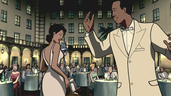
Created by Directors Fernando Trueba and Tono Errando, along with the Spanish Designer Javier Marical, “Chico and Rita” was the first Spanish-language film to receive a nomination for Best Animated Feature at the American Academy Awards. At first glance, some scenes in “Chico and Rita” may not appear rotoscoped due to its rigid animation style, but the technique is used extensively throughout. In this film, the character style is minimalistic while the settings and backgrounds are more elaborate and detailed, a contrast that emphasizes the film’s evolving sense of place. What makes this film stand out, aside from the pairing of rotoscope with simple and expressionistic features, is the romantic atmosphere created by its combination of exceptionally captivating music in a historical setting (late ‘40s onward).
The jazz score, composed by Bebo Valdés and performed by various artists, is a centerpoint and a driving force throughout the film, at times drawing attention away from the main storyline as the tunes themselves become animated and lifelike. In the tradition of a Latin balad called a bolero, the story of “Chico and Rita” follows the long-term, often tempestuous romance of its two main characters (Chico, voiced by Eman Xor Oña, and Rita, voiced by Limara Meneses), a saga of seduction and loss that seems to repeat itself indefinitely through the ages.
Spanning several decades and taking place in Havana, New York, Paris, Las Vegas and Los Angeles, “Chico and Rita” is far from a traditional cinematic romance. The on-and-never-quite-off affair between a nightclub pianist and pseudo-famous jazz singer is as much about music as it is about love, and the artistry of the images adds true-to-life flavor to those passions as they appear in the film. Without rotoscope, the film would still be a well designed animated feature, but the touch of realism allowed by the roto form is one of the reasons for its high level of seductiveness and emotional appeal, as well as a major reason for the film’s success.
4. Alois Nebel (2011)
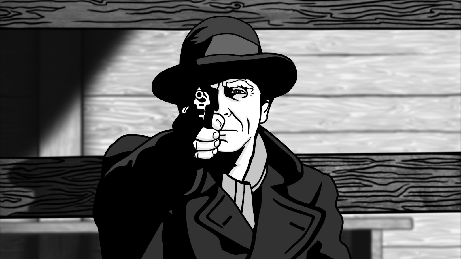
“Alois Nebel” is the first full-length feature film by Czech Director Tomáš Luňák. A black-and-white animated noir drama based on the graphic novel series by Jaroslav Rudiš and Jaromír Švejdík (known as Jaromir 99), “Alois Nebel” is set in the 1980s in a small Czech village where a lonely railroad employee encounters ghostly scenes from the period of German expulsion following the Second World War. As expected, the black-and-white rotoscope style is well suited for the dark subject matter, and its use of high contrast makes for a rather jarring visual experience that adds further tension to the scenes, particularly during the post-war images.
Moreover, the film’s tracing and outlining are uniquely dense, giving the characters a prominence in the frame that is slightly reminiscent of shadow plays or cutout animation, at some points appearing as if layered in three dimensions. The overall effect is like a blending of American noir with Eastern European historical significance, as both the story and the war are presented in a kind of timeless cultural environment.
Receiving a Best Animated Film Award at the 2012 European Film Awards (as well as being selected as the Czech entry for a Best Foreign Language Film nomination at the 84th Academy Awards), “Alois Nebel” has been recognized both for its animation style and its controversial subject matter. Expelling Germans from the region was a backlash to the horrors of German occupation during the war years, but many locals continued to feel conflicted about the period and its aftermath. Thus, the struggles of the eponymous Alois Nebel, both social and psychological, are temporarily subdued by chance romance and social progress (i.e. the falling of the Berlin Wall), but as a force of history, are never truly resolved.
5. The Case of Hana & Alice (2015)
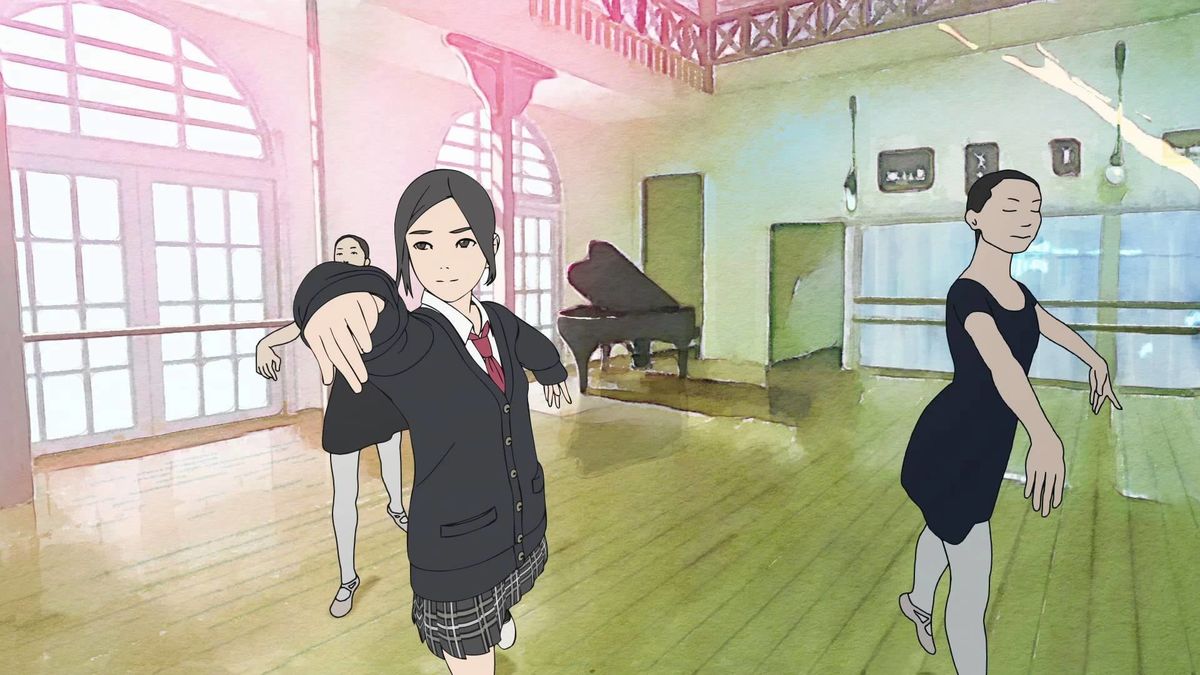
Rotoscoping has been used in anime films in the past, to varying degrees, but not always successfully. As recently as 2013 the television adaptation of the popular manga series “Flowers of Evil” received some criticism for its stylistic departures from the source material. But in “The Case of Hana and Alice,” directed by Shunji Iwai and based on the manga series drawn and written by Shūzō Oshimi, the rotoscope method does well to preserve the character and appearance of the original comic. While the style of the film is much more realistic than the art of the manga series—and in full color, rather than black and white— its characters still have the likeness of those in the comic, and its animation is so well done that audiences are likely more willing to forgive some of the obvious differences.
The prequel to Iwai’s live-action film titled simply “Hana and Alice” (2004), “The Case of Hana and Alice” follows the couple’s initial meeting and first adventure together in middle school. Like the series, it is a youth drama but also a mystery—or more accurately, several mysteries. And in the manga tradition, much of the film is focused on the couple’s emerging friendship, reuniting the actresses Anne Suzuki (Hana) and Yū Aoi (Alice) from the original live-action sequel. “The Case of Hana and Alice” may not be the most groundbreaking film on this list, but it does have its charm, and was the winner of the Bronze Audience Award for Best Animated Feature at the 19th Fantasia International Film Festival in Montreal. Further print adaptations of the Hana and Alice storyline continue to be published as Manga serials.